
Chapter 2
第二章
About Data Aggregation
关于数据聚合
By Alistair Croll
著:ALISTAIR CROLL,译:紫瑰
When trying to turn data into information, the data you start with matter a lot. Data can be simple factoids—of which someone else has done all of the analysis—or raw transactions, where the exploration is left entirely to the user.
当尝试着把数据转化为信息,你着手的数据非常重要。数据可能是其他人已完成了所有分析后得出的简单的信息,或者是用户可以在此之上做全面的数据探索的原始交易数据。

| Level of Aggregation | Number of metrics | Description |
|---|---|---|
| Factoid | Maximum context | Single data point; No drill-down |
| Series | One metric, across an axis | Can compare rate of change |
| Multiseries | Several metrics, common axis | Can compare rate of change, correlation between metrics |
| Summable multiseries | Several metrics, common axis | Can compare rate of change, correlation between metrics; Can compare percentages to whole |
| Summary records | One record for each item in a series; Metrics in other series have been aggregated somehow | Items can be compared |
| Individual transactions | One record per instance | No aggregation or combination; Maximum drill-down |
| 聚合层级 | 指标数量 | 描述 |
|---|---|---|
| 事实信息 | 最大化的上下文信息 | 单数据点,无深入分析 |
| 单序列数据 | 单指标,一个坐标轴 | 能比较变化频率 |
| 多序列数据 | 多个指标,相同坐标轴 | 能比较变化频率,指标间具有相关性 |
| 可求和的多序列数据 | 多个指标,相同坐标轴 | 能比较变化频率,指标间具有相关性,能与整体对比百分比 |
| 汇总记录 | 在一个系列中为每一项记录,其他系列的指标通过某种方式被聚合 | 项与项之间可比较 |
| 具体事务 | 每个实例一条记录 | 没有聚合或整合,可最大化地深入分析 |
Most datasets fall somewhere in the middle of these levels of aggregation. If we know what kind of data we have to begin with, we can greatly simplify the task of correctly visualizing them the first time around.
大部分的数据集介于这些聚合层级之间的某一位置。如果我们很清楚需要从什么样的数据开始,我们大约在第一次便可以极大地简化精准可视化数据的任务。
Let’s look at these types of aggregation one by one, using the example of coffee consumption. Let’s assume a café tracks each cup of coffee sold and records two pieces of information about the sale: the gender of the buyer and the kind of coffee (regular, decaf, or mocha).
让我们用咖啡销售的例子,来一个一个地讨论一下这些数据聚合类型。假设咖啡馆跟踪每一杯咖啡的销售情况,并记录对应的两种信息:消费者的性别和咖啡种类(常规咖啡、无咖啡因咖啡、或摩卡)
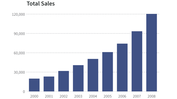
The basic table of these data, by year, looks like this1:
基于年份的数据基本表如下图:(顺便提一下,这些完全都是编造的数据)
| Year | 2000 | 2001 | 2002 | 2003 | 2004 | 2005 | 2006 | 2007 | 2008 |
|---|---|---|---|---|---|---|---|---|---|
| Total sales | 19,795 | 23,005 | 31,711 | 40,728 | 50,440 | 60,953 | 74,143 | 93,321 | 120,312 |
| Male | 12,534 | 16,452 | 19,362 | 24,726 | 28,567 | 31,110 | 39,001 | 48,710 | 61,291 |
| Female | 7,261 | 6,553 | 12,349 | 16,002 | 21,873 | 29,843 | 35,142 | 44,611 | 59,021 |
| Regular | 9,929 | 14,021 | 17,364 | 20,035 | 27,854 | 34,201 | 36,472 | 52,012 | 60,362 |
| Decaf | 6,744 | 6,833 | 10,201 | 13,462 | 17,033 | 19,921 | 21,094 | 23,716 | 38,657 |
| Mocha | 3,122 | 2,151 | 4,146 | 7,231 | 5,553 | 6,831 | 16,577 | 17,593 | 21,293 |
事实信息
A factoid is a piece of trivia. It is calculated from source data, but chosen to emphasize a particular point.
一条事实信息是一个小信息。它从原始数据计算而来,但是只选择性地强调一个特定的点。
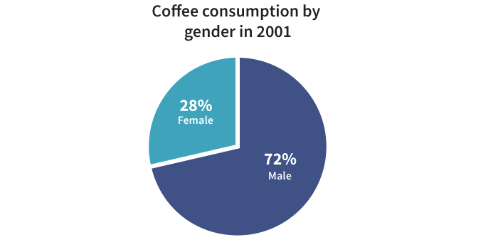
Example: 36.7% of coffee in 2000 was consumed by women.
例如:2000年,36.7%的咖啡是女性消费的。
Series
单系列
This is one type of information (the dependent variable) compared to another (the independent variable). Often, the independent variable is time.
这是一类信息(因变量)与另一类信息(独立变量)的比较。通常,自变量是时间。
| Year | 2000 | 2001 | 2002 | 2003 |
|---|---|---|---|---|
| Total sales | 19,795 | 23,005 | 31,711 | 40,728 |
| 年份 | 2000 | 2001 | 2002 | 2003 |
|---|---|---|---|---|
| 总销售量 | 19,795 | 23,005 | 31,711 | 40,728 |
In this example, the total sales of coffee depends on the year. That is, the year is independent (“pick a year, any year”) and the sales is dependent (“based on that year, the consumption is 23,005 cups”).
在此例中,咖啡的总销售量是基于年份的。也就是说,年份是自变量(“挑选一年,任何一年”),销售量是因变量(“那一年,咖啡的销售量是23005杯”)。
A series can also be some other set of continuous data, such as temperature. Consider this table that shows how long it takes for an adult to sustain a first-degree burn from hot water. Here, water temperature is the independent variable2:
单序列数据也可以是一些其他独立变量的连续数据集,例如温度。下表显示了一个成年人在不同温度的热水中忍受一级烧伤的时间。在此,温度是自变量。(美国政府报告,消费品安全委员会,彼得.L.阿姆斯壮,1978年9月15日)。
| Water Temp °C (°F) | Time for 1st Degree Burn |
|---|---|
| 46.7 (116) | 35 minutes |
| 50 (122) | 1 minute |
| 55 (131) | 5 seconds |
| 60 (140) | 2 seconds |
| 65 (149) | 1 second |
| 67.8 (154) | Instantaneous |
And it can be a series of non-contiguous, but related, information in a category, such as major car brands, types of dog, vegetables, or the mass of planets in the solar system3:
同时,它可以是同属一类的不连续但相关的单序列数据,例如:主要的汽车品牌,狗的种类,蔬菜,太阳系中行星的质量。4:
| Planet | Mass relative to earth |
|---|---|
| Mercury | 0.0553 |
| Venus | 0.815 |
| Earth | 1 |
| Mars | 0.107 |
| Jupiter | 317.8 |
| Saturn | 95.2 |
| Uranus | 14.5 |
| Neptune | 17.1 |
| 行星 | 相对于地球的质量 |
|---|---|
| 水星 | 0.0553 |
| 金星 | 0.815 |
| 地球 | 1 |
| 火星 | 0.107 |
| 木星 | 317.8 |
| 土星 | 95.2 |
| 天王星 | 14.5 |
| 海王星 | 17.1 |
In many cases, series data have one and only one dependent variable for each independent variable. In other words, there is only one number for coffee consumption for each year on record. This is usually displayed as a bar, time series, or column graph.
在许多例子中,单序列数据的每个独立变量有且仅有一个因变量。也就是说,在记录中每年的咖啡销售量只有一个数字。通常用条形图、时间序列或柱状图来展示。
In cases where there are several dependent variables for each independent one, we often show the information as a scatterplot or heat map, or do some kind of processing (such as an average) to simplify what’s shown. We’ll come back to this in the section below, Using visualization to reveal underlying variance.
在一个自变量对应多个因变量的例子中,我们通常通过散点图或热图来显示信息,或者是做一些处理(例如取平均值)来简化所显示的信息。我们将在下面的 利用可视化显示潜在变量 章节 中回到这一部分。
Multiseries
多系列数据
A multiseries dataset has several pieces of dependent information and one piece of independent information. Here are the data about exposure to hot water from before, with additional data5:
一个多系列数据集有若干因变量信息和一个独立变量信息。上例中显示了一个成年人把手放置于不同温度热水中忍受一级烧伤所用时间,下表中又添加了忍受二级烧伤/三级烧伤所用的时间。6:
| Water Temp °C (°F) | Time for 1st Degree Burn | Time for 2nd & 3rd Degree Burns |
|---|---|---|
| 46.7 (116) | 35 minutes | 45 minutes |
| 50 (122) | 1 minute | 5 minutes |
| 55 (131) | 5 seconds | 25 seconds |
| 60 (140) | 2 seconds | 5 seconds |
| 65 (149) | 1 second | 2 seconds |
| 67.8 (154) | Instantaneous | 1 second |
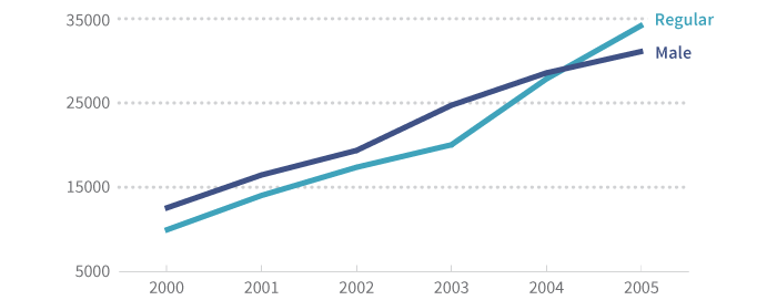
Or, returning to our coffee example, we might have several series:
或者,回到我们的咖啡例子,我们可能有多序列数据:
| Year | 2000 | 2001 | 2002 | 2003 | 2004 | 2005 |
|---|---|---|---|---|---|---|
| Male | 12,534 | 16,452 | 19,362 | 24,726 | 28,567 | 31,110 |
| Regular | 9,929 | 14,021 | 17,364 | 20,035 | 27,854 | 34,201 |
With this dataset, we know several things about 2001. We know that 16,452 cups were served to men and that 14,021 cups served were regular coffee (with caffeine, cream or milk, and sugar).
从此数据集中,我们可以了解到关于2001年的几个事情。我们可以知道,有16452杯咖啡提供给男士,有14021杯咖啡是常规咖啡(有咖啡因、奶油或牛奶、以及糖)。
We don’t, however, know how to combine these in useful ways: they aren’t related. We can’t tell what percentage of regular coffee was sold to men or how many cups were served to women.
但是,我们不知道怎样通过有效方式整合这些信息,因为他们不相关。我们不能得出常规咖啡在提供给男士的所有类型咖啡中的百分比,或者提供给女士的咖啡杯数。
In other words, multiseries data are simply several series on one chart or table. We can show them together, but we can’t meaningfully stack or combine them.
也就是说,多序列数据就是在一张图或表中简单堆砌的几个序列数据。我们可以同时显示它们,但是我们无法有意义地堆积或是整合它们。
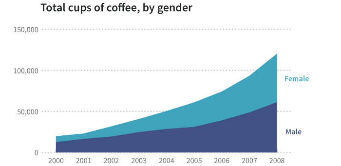
Summable Multiseries
可求和的多序列数据
As the name suggests, a summable multiseries is a particular statistic (gender, type of coffee) segmented into subgroups.
如名字所示,一个可求和的多序列数据是被细分成子组的特定的统计数据(性别,咖啡种类)
| Year | 2000 | 2001 | 2002 | 2003 | 2004 | 2005 | 2006 | 2007 | 2008 |
|---|---|---|---|---|---|---|---|---|---|
| Male | 12534 | 16452 | 19362 | 24726 | 28567 | 31110 | 39001 | 48710 | 61291 |
| Female | 7261 | 6553 | 12349 | 16002 | 21873 | 29843 | 35142 | 44611 | 59021 |
Because we know a coffee drinker is either male or female, we can add these together to make broader observations about total consumption. For one thing, we can display percentages.
因为我们知道一个喝咖啡的人不是男士便是女士,我们可以把这些数据相加而得出关于总消费量的更多发现。针对一个方面,我们可以显示百分比。
Additionally, we can stack segments to reveal a whole:
另一方面,我们可以累加分段数据从而显示一个整体:咖啡的总销售量,通过不同性别销售量的累加。
One challenge with summable multiseries data is knowing which series go together. Consider the following:
可求和的多序列数据面临的一个问题在于,需要能分辨哪些分段数据可以累加到一起。请思考下表:
| Year | 2000 | 2001 | 2002 | 2003 | 2004 |
|---|---|---|---|---|---|
| Male | 12534 | 16452 | 19362 | 24726 | 28567 |
| Female | 7261 | 6553 | 12349 | 16002 | 21873 |
| Regular | 9929 | 14021 | 17364 | 20035 | 27854 |
| Decaf | 6744 | 6833 | 10201 | 13462 | 17033 |
| Mocha | 3122 | 2151 | 4146 | 7231 | 5553 |
There is nothing inherent in these data that tells us how we can combine information. It takes human understanding of data categories to know that Male + Female = a complete set and Regular + Decaf + Mocha = a complete set. Without this knowledge, we can’t combine the data, or worse, we might combine it incorrectly.
这些数据中没有内在属性可以告知我们怎么整合信息。我们需要基于人类对数据分类的理解去了解 男士+女士=一个完整的集,常规+无咖啡因+摩卡=一个完整的集。没有这些知识,我们无法整合数据,或者是更糟糕的,我们可能错误地整合数据。
It’s Hard to Explore Summarized Data
探究汇总数据有些困难
Even if we know the meaning of these data and realize they are two separate multiseries tables (one on gender and one on coffee type) we can’t explore them deeply. For example, we can’t find out how many women drank regular coffee in 2000.
即使我们知道这些数据的意思,也意识到他们是两个不相关的多序列表(一个基于性别,一个基于咖啡类型),但是我们不能更深入地对其进行探究。例如,我们无法得知2000年中购买常规咖啡的女性消费者人数。
This is a common (and important) mistake. Many people are tempted to say:
这是一个常见的(也是重要的)错误。许多人忍不住会有如下的计算:
- 36.7% of cups sold in 2000 were sold to women.
- And there were 9,929 cups of regular sold in 2000.
- Therefore, 3,642.5 cups of regular were sold to women.
- 2000年中, 36.7%的咖啡卖给了女性消费者。
- 同时在2000年,有9929杯常规咖啡被卖出。
- 所以,有3642.5杯常规咖啡被卖给了女性消费者。
But this is wrong. This type of inference can only be made when you know that one category (coffee type) is evenly distributed across another (gender). The fact that the result isn’t even a whole number reminds us not to do this, as nobody was served a half cup.
但是,这是错误的。只有当你确定一个类别(咖啡类型)均匀地分布在另一个类别(性别)里的时候,才能做这类的推理。事实上,结果甚至都不是一个整数,这提醒我们不能这样计算,因为没有人买半杯咖啡。
The only way to truly explore the data and ask new questions (such as “How many cups of regular were sold to women in 2000?”) is to have the raw data. And then it’s a matter of knowing how to aggregate them appropriately.
能实现真实地探究数据和提出新问题(例如:在2000年,有多少杯常规咖啡被卖给了女性消费者)的唯一方式就是拥有原始数据。然后的事情就是了解如何恰当地聚合这些原始数据。
Summary Records
汇总记录
The following table of summary records looks like the kind of data a point-of-sale system at a café might generate. It includes a column of categorical information (gender, where there are two possible types) and subtotals for each type of coffee. It also includes the totals by the cup for those types.
下表所显示的数据看起来像一个咖啡馆的销售终端所生成的汇总记录。它包含一列分类信息(性别,有两种可能的类型),和每类咖啡的分类汇总。它也包含了这些类型的咖啡杯数的总和。
| Name | Gender | Regular | Decaf | Mocha | Total |
|---|---|---|---|---|---|
| Bob Smith | M | 2 | 3 | 1 | 6 |
| Jane Doe | F | 4 | 0 | 0 | 4 |
| Dale Cooper | M | 1 | 2 | 4 | 7 |
| Mary Brewer | F | 3 | 1 | 0 | 4 |
| Betty Kona | F | 1 | 0 | 0 | 1 |
| John Java | M | 2 | 1 | 3 | 6 |
| Bill Bean | M | 3 | 1 | 0 | 4 |
| Jake Beatnik | M | 0 | 0 | 1 | 1 |
| Totals | 5M, 3F | 16 | 8 | 9 | 33 |
This kind of table is familiar to anyone who’s done basic exploration in a tool like Excel. We can do subcalculations:
对于这种表,在Excel等工具上进行基本数据探究的人会比较熟悉。我们可以做如下的子计算。
- There are 5 male drinkers and 3 female drinkers
- There were 16 regulars, 8 decafs, and 9 mochas
- We sold a total of 33 cups
- 有5位男士消费者和3位女士消费者。
- 有16杯常规咖啡,8杯无咖啡因咖啡,和9杯摩卡
- 总计售出33杯咖啡
But more importantly, we can combine categories of data to ask more exploratory questions. For example: Do women prefer a certain kind of coffee? This is the kind of thing Excel, well, excels at, and it’s often done using a tool called a Pivot Table.
但更重要的是,我们可以整合不同类型的数据来提出更多探究型的问题。例如:女性消费者更喜欢某种咖啡?这类问题是excel中一个叫做透视表的工具甚为擅长的。
Here’s a table looking at the average number of regular, decaf, and mocha cups consumed by male and female patrons:
下表显示了男性消费者和女性消费者购买常规咖啡、无咖啡因咖啡、摩卡三种咖啡的均值。
| Row Labels | Average of Regular | Average of Decaf | Average of Mocha |
|---|---|---|---|
| F | 2.67 | 0.33 | 0.00 |
| M | 2.00 | 1.75 | 2.00 |
| Grand Total | 2.29 | 1.14 | 1.14 |
Looking at this table, we can see a pretty clear trend: Women like regular; men seem evenly split across all three types of coffee7.
请看此表,我们可以看到一个相当清晰的趋势:女士喜欢常规咖啡,而男士对三种咖啡的消费量相差不大。没有足够的数据来做出像这样统计上的可靠陈述。但是不管怎样,这些都是编造的数据,所以,请停止对咖啡消费量更深层的思考吧。
The thing about these data, however, is they have still been aggregated somehow. We summarized the data along several dimensions—gender and coffee type—by aggregating them by the name of the patron. While this isn’t the raw data, it’s close.
然而,这些数据仍然以某种方式被聚合。我们从几个维度对数据进行汇总,性别和咖啡类型,以消费者的名义对其进行聚合。然而这些不是原始数据,它接近原始数据。
One good thing about this summarization is that it keeps the dataset fairly small. It also suggests ways in which the data might be explored. It is pretty common to find survey data that looks like this: for example, a Google Form might output this kind of data from a survey that says:
这种整合的一个好处是它保持数据集相当小。同时它提供数据可能被探究的方式。找到像这样的调查数据是相当寻常的。例如,一个Google表单可以通过下面的调查从而输出这类数据。
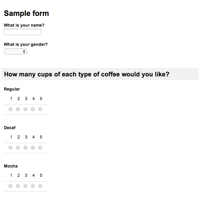
Producing the following data in the Google spreadsheet:
Google电子表格中生成下面的数据
| Timestamp | What is your name? | Gender? | Regular | Decaf | Mocha |
|---|---|---|---|---|---|
| 1/17/2014 11:12:47 | Bob Smith | Male | 4 | 3 |
| 时间戳 | 姓名 | 性别 | 常规 | 低咖啡因 | 摩卡 |
|---|---|---|---|---|---|
| 1/17/2014 11:12:47 | 鲍勃·史密斯 | 男性 | 4 | 3 |
Using Visualization to Reveal Underlying Variance
利用可视化显示潜在变量
When you have summary records or raw data, it’s common to aggregate in order to display them easily. By showing the total coffee consumed (summing up the raw information) or the average number of cups per patron (the mean of the raw information) we make the data easier to understand.
当你有汇总记录或原始数据时,通常会对其进行聚合以更容易地显示他们。通过显示咖啡总的消费量(原始信息的总计),或是每位顾客咖啡消费量的均值(原始信息的均值),我们可以使数据更容易地被理解。
Consider the following transactions:
请思考下面的交易记录:
| Name | Regular | Decaf | Mocha |
|---|---|---|---|
| Bob Smith | 2 | 3 | 1 |
| Jane Doe | 4 | 0 | 0 |
| Dale Cooper | 1 | 2 | 4 |
| Mary Brewer | 3 | 1 | 0 |
| Betty Kona | 1 | 0 | 0 |
| John Java | 2 | 1 | 3 |
| Bill Bean | 3 | 1 | 0 |
| Jake Beatnik | 0 | 0 | 1 |
| Totals | 16 | 8 | 9 |
| Averages | 2 | 1 | 1.125 |
We can show the average of each coffee type consumed by cup as a summary graphic:
我们可以通过摘要图形来显示每种咖啡被顾客消费的平均杯数:
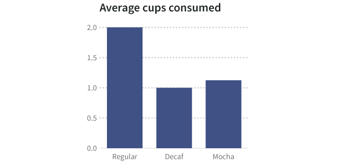
But averages hide things. Perhaps some people have a single cup of a particular type, and others have many. There are ways to visualize the spread, or variance, of data that indicate the underlying shape of the information, including heat charts, histograms, and scatterplots. When keeping the underlying data, you can wind up with more than one dependent variable for each independent variable.
但是均值会掩盖一些事情。也许有些人只消费了一杯某种咖啡,但是其他人消费了很多杯某种咖啡。有一些方法可以可视化数据的分布或变化,来显示信息的潜在形状,这些方法包括热图、直方图、和散点图。当保有基础数据,便可以为每一个自变量获得多于一个的因变量。
A better visualization (such as a histogram, which counts how many people fit into each bucket or range of values that made up an average) might reveal that a few people are drinking a lot of coffee, and a large number of people are drinking a small amount.
一个更好的可视化(例如,一个直方图,它计算每个桶或者形成平均值的区间里纳入多少人)也许可以显示出一小部分人消费了大部分的咖啡,而一大部分人消费了一小部分咖啡。
Consider this histogram of the number of cups per patron. All we did was tally up how many people had one cup, how many had two, how many had three, and so on. Then we plotted how frequently each number occurred, which is why this is called a frequency histogram.
请思考这个显示每个顾客消费咖啡杯数的直方图。我们所做的就是总结出有多少个人消费一杯,多少个人消费两杯,多少个人消费三杯,如此类推。然后,我们绘制每个数字出现频度的图形,这便是这种图形被称为频度直方图的原因。
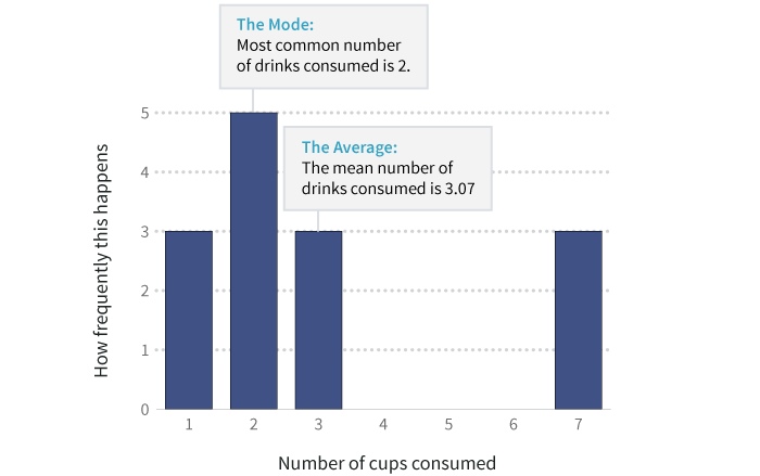
The average number of cups in this dataset is roughly 3. And the mode, or most common number, is 2 cups. But as the histogram shows, there are three heavy coffee drinkers who’ve each consumed 7 cups, pushing up the average.
此数据集中杯数的均值大约是3. 最频繁出现的杯数是2. 但是正如直方图所示,有三个咖啡重度饮用者,他们每个人消费的杯数是7,这直接提升了均值。
In other words, when you have raw data, you can see the exceptions and outliers, and tell a more accurate story.
换句话说,当你有原始数据,你便可以看到例外或离群值,便可以讲述一个更精准的故事。
Even these data, verbose and informative as they are, aren’t the raw information: they’re still aggregated.
虽然这些数据,表现的冗长且内容详实,但是它们不是原始数据。他们依然是被聚合的信息。
Aggregation happens in many ways. For example, a restaurant receipt usually aggregates orders by table. There’s no way to find out what an individual person at the table had for dinner, just the food that was served and what it cost. To get to really specific exploration, however, we need data at the transaction level.
聚合可以通过许多方式发生。例如,一个餐厅的收据通常都是通过“桌”来整合订单。我们无法知道在某一桌就餐的是什么人,只能找到所提供的食物名称以及其定价。无论怎样,要获取真正特定的数据探究,我们需要事务层级的数据。
Individual Transactions
具体事务
Transactional records capture things about a specific event. There’s no aggregation of the data along any dimension like someone’s name (though their name may be captured). It’s not rolled up over time; it’s instantaneous.
事务性记录能捕获每一个特殊事件。就像一个人的名字,它们没有任意维度的任何聚合(尽管他们的名字可能被捕获)。随着时间的推移,它不会被卷携,它是瞬时性的。
| Timestamp | Name | Gender | Coffee |
|---|---|---|---|
| 17:00 | Bob Smith | M | Regular |
| 17:01 | Jane Doe | F | Regular |
| 17:02 | Dale Cooper | M | Mocha |
| 17:03 | Mary Brewer | F | Decaf |
| 17:04 | Betty Kona | F | Regular |
| 17:05 | John Java | M | Regular |
| 17:06 | Bill Bean | M | Regular |
| 17:07 | Jake Beatnik | M | Mocha |
| 17:08 | Bob Smith | M | Regular |
| 17:09 | Jane Doe | F | Regular |
| 17:10 | Dale Cooper | M | Mocha |
| 17:11 | Mary Brewer | F | Regular |
| 17:12 | John Java | M | Decaf |
| 17:13 | Bill Bean | M | Regular |
These transactions can be aggregated by any column. They can be cross-referenced by those columns. The timestamps can also be aggregated into buckets (hourly, daily, or annually). Ultimately, the initial dataset we saw of coffee consumption per year results from these raw data, although summarized significantly.
这些事务数据能基于任何一列进行聚合。他们可以通过那些列进行交叉引用。时间标签也可以被聚合到桶中(每小时,每天,或者每年)。最终,虽然是通过明显的汇总,我们看到的每年咖啡销售量的初始数据集是这些原始数据的整合结果。
Deciding How to Aggregate
决定如何聚合
When we roll up data into buckets, or transform it somehow, we take away the raw history. For example, when we turned raw transactions into annual totals:
当我们卷携数据到桶,或者通过某种方式转化它,我们取走原始历史记录。例如,当我们将原始事务数据转化为年度总计的时候:
- We anonymized the data by removing the names of patrons when we aggregated it.
- We bucketed timestamps, summarizing by year.
- 当我们卷数据入区块,或者通过某种方式转化它,我们取走原始历史记录。例如,当我们转化原始交易为每年总和的时候:
- 我们对时间标签进行区块化,然后基于年份进行汇总。
Either of these pieces of data could have shown us that someone was a heavy coffee drinker (based on total coffee consumed by one person, or based on the rate of consumption from timestamps). While we might not think about the implications of our data on coffee consumption, what if the data pertained instead to alcohol consumption? Would we have a moral obligation to warn someone if we saw that a particular person habitually drank a lot of alcohol? What if this person killed someone while driving drunk? Are data about alcohol consumption subject to legal discovery in a way that data about coffee consumption needn’t be? Are we allowed to aggregate some kinds of data but not others?
这些数据也能告诉我们某人是一个咖啡重度饮用者(基于一个人的咖啡消费量,或是基于时间标签的咖啡消费频度)。然而,我们或许不会去想咖啡消费数据的影响,那如果我们的数据是关于酒精消费的呢?如果我们看到一个人习惯性地大量饮用酒精,我们是否有道义上的责任来提醒他?如果这个人因醉酒驾驶而使某人丧命呢?酒精消费数据是否在某种方式上倾向于法律发现,而咖啡消费数据并不需要?我们是否可以被允许聚合某些类别的数据,而不是其他类别的?
Can we address the inherent biases that result from choosing how we aggregate data before presenting it?
在展现数据前,我们能确定因选择怎么样去聚合数据而产生的内在偏差么?
The big data movement is going to address some of this. Once, it was too computationally intensive to store all the raw transactions. We had to decide how to aggregate things at the moment of collection, and throw out the raw information. But advances in storage efficiency, parallel processing, and cloud computing are making on-the-fly aggregation of massive datasets a reality, which should overcome some amount of aggregation bias.
大数据将要解决这其中的一些问题。曾经,因计算量太大而不能存储所有的原始交易。我们在采集数据的时候便要决定怎样聚合,然后丢掉原始信息。但是存储效率、并行计算和云计算技术的进步,使得大规模数据集的即时聚合成为现实,这应该克服了一定的聚合偏差。