
Chapter 14
第十四章
Anatomy of a Graphic
图像剖析
By Amanda Makulec
著:Amanda Makulec,译:
Once you’ve built a draft of your chart, the next step in creating an impactful visualization is making sure all of its elements are labeled appropriately. The text components of a graph give your reader visual clues that help your data tell a story and should allow your graph to stand alone, outside of any supporting narrative.
如果你想让可视化效果更好,当你画草图的时候,你就应该合理地标出图中的所有元素。图中的文字给你的读者提供了可视化的线索,辅助你的数据讲述一个故事并且让你的图独一无二,脱离任何的支持的叙述。
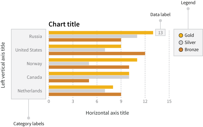
Let’s make sure a few terms are totally clear up front. When we’re talking about data labels, category labels, axis labels, and other pieces of text on your graph or chart, we’re generally referring to what is mapped out in Figure 1.
开始前确保一些术语完全弄清楚。当我们谈到数据标签、分类标签、轴标签以及你图表上的其它部分的文本,我们通常是指图1所标出的内容。
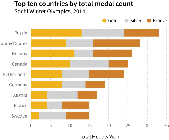
One of the most impactful ways to show the value added by text labels is by showing the same visualization with and without these labels. Let’s take these two graphs showing the number of Olympic medals won by country at the Sochi Winter Olympics in 2014.
通过文本标签呈现附加值的最有效方式之一是通过使用和不使用这些标签呈现一样的可视化效果。我们通过这两张图呈现2014年索契冬奥会上各国家获得奥运会奖牌的数量。
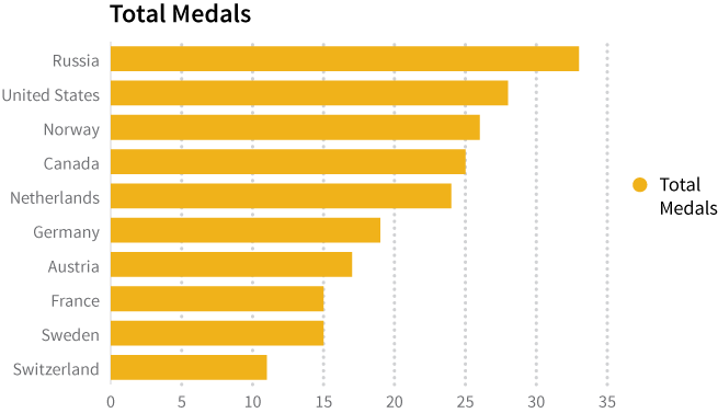
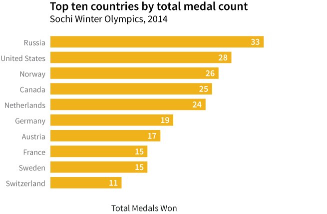
Both graphs display the same data (and show how home team Russia ran away with the medal count!). The first has the default text generated by Excel, giving limited information to the reader, while the texted added in the second shows how smart use of simple text can help your data tell a story.
以上两张图呈现一样的数据(并且说明了主场的俄罗斯是如何让奖牌跑掉的)。第一张图有由Excel产生的默认文字,给读者提供了有限的信息,然而,在第二张图中增加的文字说明了简单文字的合理使用,并且辅助你的数据讲述一个故事。
In Figure 2, the simple addition of different text clues helps the reader understand what he or she is reading. Check out the the chart title, axis labels, legend, and data labels. Each of these pieces of information is an opportunity to help your reader understand the message you want to share through your graph.
第二张图中,简单地增加不同的文字线索,辅助读者理解他(或她)正在读的内容。检查图表的标题、轴标签、图例和数据标签。这些内容可以辅助你的读者理解你想要分享的信息。
As important as text can be to help you tell your story, it uses prime real estate and should be as simple and direct as possible. Over-labeling axes or data points, or writing excessively long chart titles, is a quick way to clutter your visualization and reduce its impact. Graphs that pack a punch are often elegant in their simplicity. With the electronic tools we have for developing graphs and charts, changes can be made with the click of a button and a few keystrokes, so don’t be afraid to experiment with your labels to help you strike this balance! Try adding different labels, editing them, and then taking them away as needed until you find the right balance to most effectively communicate your message.
和文本一样重要,图表可以辅助讲述你的故事,它使用了主要的空间,应该尽可能的简单的直接。在坐标轴或数据点上标注,或写超长的图表标题,会很快混乱你的可视化,并降低效果。重拳出击的图形往往简洁优雅。使用开发图表的工具,我们可以通过点击按钮和敲键盘改变我们的图表,所以,不用担心,使用标签进行实验,来辅助你打破这种平衡!尝试增加不同的标签,编辑它们,必要的时候把它们消除,直到你找到正确的平衡来最有效地传达你的信息。
In most cases, you want a chart or graph to be able to stand alone, outside of any narrative text. Sometimes that means tacking on explanatory text to clearly articulate your message. This could be written as a caption above or beneath the graph to clearly articulate your message to a specific audience. For the sake of simplicity, we’ll focus here on the essential labels and legends within your graph, rather than crafting additional explanations.
大多数情况下,你想让你的图表独一无二,脱离任何叙述性文字。有时这意味着需要附上解释性的文字来清楚地表达你的信息。这可能写成说明放到图的上方或下方将你的信息清楚地传递给特定的读者。为了简便起见,我们将在你的图表中附上必要的标签和图例来说明,而不是编写额外的解释。
Clear and Relevant Axes
清晰且合适的坐标轴
Let’s be clear about a couple of terms up front so there’s no confusion about how we’re using them: category labels are the ticks and categories along the axis that identify the data. Axis titles are the short text titles included along an axis to identify what variable is being displayed. Refer back to Figure 1 for a quick reference if you need to!
我们需要提前弄清两个相关的术语,以更清晰地理解图表:类别标签是标识,而沿着坐标轴的类别确定数据。坐标轴的标题是短文本标题,依附在坐标轴上说明呈现的是什么变量。如果有必要,你可以参考下图1!
You should use axis titles to give your reader a summary description of the variable you’re displaying. Depending on the data you’re working with, you may have extremely long and descriptive names for each of your variables (if someone built your data table and added lots qualifying information), or very short, abbreviated variable names (as is often the case with machine-readable data). What you write along your horizontal and vertical axes should start with the axis title and be followed by the units you’re using to display information (percent, dollars, etc.). The axis titles remind your reader what information you’re sharing with them and help limit confusion about the units.
你应该使用坐标轴标题以汇总描述的方式告诉你的读者你所呈现的变量。依据你所处理的数据,可能你的变量有极长的描述性名称(如果有人建立了你的数据表,并且增加了大量的符合条件的信息),也可能是非常短的缩写的变量名称(通常是机器可读的数据)。沿着横纵坐标轴,你应该先写上坐标标题,然后写上你正在使用的呈现信息的单位(百分比,美元等等)。坐标轴的标题可以提醒读者你向他们共享了什么样的信息,结合单位,使你表达的信息更清晰。
Labeling Categories and Axes
标记类别和坐标轴
It’s important to find a balance between giving enough information to your audience and keeping your text simple. Make sure you include enough information to explain the data you’re presenting while keeping the text simple enough so it doesn’t clutter the graph.
在给你的观众提供丰富信息和保持简洁的文字间找到一个平衡是很重要的。确保你包含足够的信息来解释你所呈现的数据,同时要保持文字的足够简单,不致于混乱你的图表。
In our Olympic medal example, the horizontal axis shows the number of medals won at the Sochi 2014 Olympic Winter games. When creating a graph, it’s common to go through a couple of iterations of the axis labels and chart titles. Once you’ve picked an axis title, think about how your reader could interpret that information. An axis title of “Medals” seems straightforward enough, but what exactly do we mean? Medals won? Medals lost? Medals won in 2014 alone? Medals won in any winter Olympic games? Your chart title can help clarify these questions, and your axis title also gives you the opportunity to tell your story.
在我们奥林匹克奖牌的例子中,水平轴说明了在2014年索契冬奥会上赢得奖牌的数量。当创建图表的时候,通常需要经过坐标标签和图表标题的几次迭代也是很正常的。当你选择轴标题的时候,你应该想一下你的读者会怎么解释。轴标题“奖牌数”看起来足够直接,但是我们具体指的是什么呢?赢的奖牌数?输的奖牌数?仅在2014年获得的奖牌数?在许多冬季奥运会上获得的奖牌数?你的图表标题可以辅助弄清这些问题,同时你的轴标题也给机会讲你的故事。
Instead of Medals, let’s title the horizontal axis with “Total Olympic Medals Won (2014).” Using the word “total” ensures the reader knows you’re talking about all medals, not only one kind (gold, silver, or bronze) or from one event. “Olympic” ensures your reader knows that you’ve shared only the Olympic medals, not a total of Olympic and Paralympic medals for the same year. And finally, “2014” reminds your reader in what year the medals were won. Alternately, as we’ve shown here, you can include some of those details in the chart title, which we’ll talk about later in this chapter.
我们用“获得奥运会奖牌总数(2014)”作为横轴的标题,而不是用“奖牌数”。使用词“总数‘让读者明白你是在谈论总的奖牌数,而不是一类奖牌(金,银,或铜)或来自一个事件。”奥运会“确保你的读者明白你分享的只是奥运会的奖牌,而不是同年奥运会和残奥会总的奖牌。最终,”2014“提醒你的读者是在哪一年获得的奖牌。另外,正如这里说明的,你可以把这些细节包含在你的图表标题里,具体的内容我们将在本章的后继部分讨论。
Units
单位
When we refer to units, we’re talking about things like “percentages”, “dollars”, “millions”, or other descriptors that make sure your reader knows what kind of information you’re displaying. These are important if you’re sharing data that are in percents instead of counts or if a multiplier has been used (for example, millions of dollars instead of just dollars).
当我们说单位的时候,我们讨论的是如”百分比“,”美元“,”百万“,或其它能够让你的读者明白你所呈现信息的描述。如果你正在以百分比的形式而不是计数的形式分享数据,或者使用了乘数(比如,百万美元而不是美元),那么单位是很重要的。
It’s important to be clear in labeling your units. Some quick checks to walk through when you’re assessing your axis titles:
把你的单位标记清楚也是很重要的。当评估合适的轴标题时应该考虑如下细则:
- Make sure you’re consistent if you’re displaying multiple types of data using a dual axis graph: you don’t want to display two variables with one in months and a second in years on the same axis!
- Instead of using abbreviations or acronyms, write out the full unit (for example, millimeters instead of mm).
- Symbols can sometimes be a helpful alternative to words in text, but make sure to clearly state what a symbol represents. For example, you could use “$” instead of the word “dollar.” However, this symbol is used with the currency of more than 30 countries, so you should specify which country’s currency you mean (e.g. US$, A$, Mex$).
- 如果你使用双轴图来呈现多种数据类型,请确保内容的一致性:你并不想分别按月和年将两个变量放到同一个轴上!
- 不使用简写或首字母缩写,而是用完整的单位(比如,使用厘米而不是mm)。
- 符号有时在文本中是有用的替代词,但需要清楚地表达符号代表的意思。比如,你可以使用“$“而不是用”美元“这个词。然而,该符号是被30多个国家作为通用货币来使用的,所以你应该明确你表代表的是哪一个国家的贷币(比如,US$,A$,Mex$)。
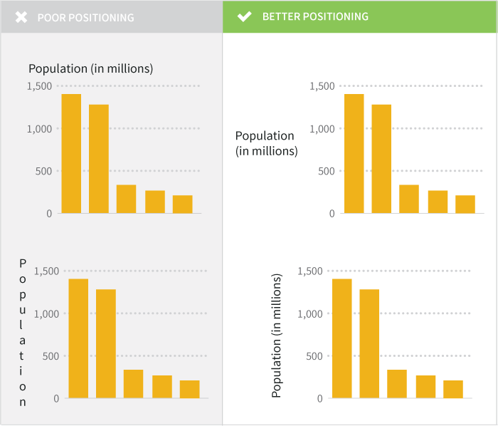
There are occasions where, for the sake of visual simplicity, you can get away with omitting the axis title if the categories you’re sharing are self explanatory. In our Olympic medal graph, we’ve listed the country names along the vertical axis. If you’re confident your audience will be able to recognize that the fields listed are countries, there’s no need to over complicate the graph by adding an axis title that says, “Country.” If you have any doubt about your audience’s knowledge of your categories, err on the side of caution and label your axes.
有时候,为了考虑视觉简洁,如果你的分类是不言自明的,可以忽略轴标题。在我们奥运会奖牌的图中,我们已经沿着纵轴列出了国家名称。如果你相信你的读者可以领会列出来的字段是国家,就没有必要增加一个”国家“的轴标题使得图表变得复杂。如果你对读者关于你的分类的知识感到怀疑,那么为谨慎起见,可以为你的轴作标记。
Position and Format
位置和格式
Horizontal axis titles should be aligned parallel to the axis labels. Format them in a font size large enough to read, but not so large that it dominates the graph.
水平轴标题应该与轴标签水平对齐。将它们的字体设置大一些以方便阅读,但也不要大到占满了整个图。
There’s some debate over whether or not vertical axis labels should be aligned parallel to the axis or not. On the one hand, aligning the text vertically makes it very clear that it’s directly associated with the vertical axis. There’s often more room to write the axis title text if it’s rotated at a 90-degree angle. On the other hand, humans are not very good at reading vertical text, and readers may find themselves squinting and turning their heads to understand the chart. If you have enough room and the axis title text is short, consider keeping the text level instead of rotating it. We’ve also included two examples below that show what to avoid when placing your vertical axis titles.
关于纵轴标题是否应该与轴平行对齐的问题有一些讨论。一方面,纵向地使文本对齐可以清楚地说明它与纵轴直接相关。如果旋转90度角通常会有更多的空间来写轴标题。另一方面,人们并不擅长阅读纵向的文本,并且读者也许发现他们斜着眼扭着头来理解图表。如果你有足够的空间并且轴标题很短,那么考虑保持文本的水平,而不要旋转它。我们通过如下两个例子来说明当放置纵轴标题的时候应该避免的问题。
Individual category labels should be clearly marked too. Make sure any words and numbers are easy to read: your reader should not have to play contortionist games with his or her neck to get a good look at what you’re trying to share in your graph. A few tricks for formatting your axis labels:
单独的分类标签也应该清楚地标注。确保作任何的词和数字容易阅读:你的读者不必使用他的或她的脖子来玩揉体游戏来很好地看看图表中你想要尝试分享的内容。下面是一些技巧,可以格式化你的轴标签:
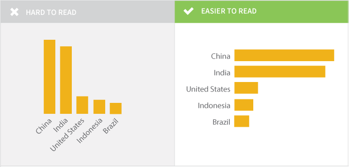
- Where possible, avoid rotating text on an angle, which is often used in vertical bar charts to force long text labels to fit but is difficult to read. If you find yourself with a horizontal axis using rotated, dense labels, try changing your chart type to a horizontal bar which will make the labels easier to read.
- 在可能的地方,避免按一个角度旋转文本,这种方式通常使用在垂直条形图表中将长长的文本标签旋转来更好地呈现,但是比较难以阅读。如果你发现你有一个水平轴使用旋转的密集的标签,尝试改变你的图表类型为横向条形图,它可以让你的标签更容易阅读。
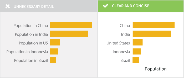
- Simplify your labels. Even if your data were originally formatted with long strings of text for each category you’re trying to display, think about what you can simplify without losing meaning.
- 简化你的标签。即使你的数据中你所要呈现的每个分类都有长长的文本,考虑如何简化而不失去它本来的意思。
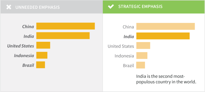
- Use boldface text and italics sparingly and only where they have meaning. For example, you might use boldface for a category label for a data point you’re highlighting.
- 尽量少用粗体和斜体文本,最好在它们有意义的地方使用。例如,你可能对一个分类标签使用黑体来标亮一个数据点。
Labeling Your Data
标记你的数据
To label or not to label, that is the question. A data label is most commonly added as the data value associated with a bar or point on a graph. When you want to make sure your audience has access to the precise data points, adding data labels works well. What labels to add, if any, depend on your audience and the story you’re trying to tell with your chart or graph. Labels can add detail and value to your visualization, but can just as easily clutter it and confuse your reader.
标记或不标记,那是个问题。一个数据标签最常用作数据值被添加到图中与一个条形或点关联。当你想要确保你的读者已经访问到精确的数据点,增加数据标签很有效。 标签添加什么内容,如果有的话,取决于你的读者和你想通过图表或图形讲述的故事。标签可以向你的可视化中添加细节和价值,但也可以带来混乱,从而使你的读者感到疑惑。
You don’t have to limit your data labels to the data values themselves, though the numeric values are the most common ones added. Instead, you can label the bars/dots/etc. to highlight specific pieces of information with a text description where appropriate. For example, if you’re creating a complex chart that shows the number of Olympic medals won by a country over the past 50 years you may want to label the year with the highest total as “most medals” to help it jump out for the reader for its value (and not just the raw number).
你不必限制数据标签到数据值本身,尽管数值是通常添加的内容。然而,你可以标记条形/点等等在合适的地方使用文本描述来突出特定的信息。比如,如果你正在创建一个复杂的表来说明某个国家过去50年所获得的奥运会奖牌数,你也许想用最高的总数来标记年份,来帮助读者跳出对年份数值的理解(不仅是原始数据)。
When deciding how you can use data labels to create impact, think about your audience. Do they need to know the precise numbers you’re displaying on your chart? Are you trying to show a trend? Are you using a graph to help your audience easily see highs and lows? Depending on what information your audience needs, you could choose one of three approaches towards labels.
当你决定如何使用数据标签来构建这种影响时,请考虑一下你的读者。他们真的需要知道你呈现在图表中的确切数字吗?你正在呈现一种趋势吗?你正在使用一个图表辅助你的读者能够轻易地看到高潮和低谷吗?依赖于你的读者需要的信息,你可以选择如下三种方式之一来使用数据标签。
Option 1: Label Every Point
方式1:标记每个点
Data labels for every point ensure your reader can easily read the precise value of each data point. On bar and column charts, this also eliminates the need for grid lines. Color and position are important to consider when adding all of these values to the graph. For bar charts or pie charts, placing the labels inside the bars can help the reader quickly identify the important information. On a bar chart, you can place the data label on the inside or the outside of the bar. Placing the label inside the bar often makes it more clear where the bar ends, and reduces the chance that the reader will misinterpret the data.
每个点的数据标签可以确切让读者知道到每个数据点的精确值。在条形图和柱形图中,这也消除了对网格线的需要。当增加所有值到图中的时候颜色和位置需要重点考虑。对于条形图或饼图,将标签放置在条形图内可以辅助读者快速地识别出重要的信息。在条形图中,你可以把数据标签放到条形图里面或都条形图的外面。将标签放置在里面条形末端,通常让表达的意思更加清晰,从而减少读者误解数据的机会。
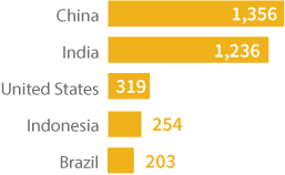
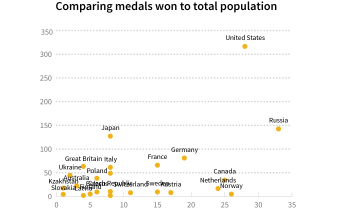
Labeling each point can provide detailed information, but also make your graph look messy when you have a large number of fields. Scatterplots are a great example of a graph type that typically looks messy with all data points labeled, particularly if the labels are text (country names) like in Figure 4. So many labels! So much overlap! So…hard to read.
标记每个点可能提供详细的信息,但当你有大量字段时,它会让你的图看上去比较乱。散点图是一个很好的例子,这类图标记了所有的点,看起上混乱不堪,尤其当标签是文本(国家名称)的时候,如图4所示。这么多的标签!这么多重叠!这么难以阅读。
Determine if your reader really needs to know each precise value or if you’re trying to show trends, highs, or lows, in which case move onto Option 2.
想确定是否你的读者真正地需要知道每个精确的值或者是你正尝试呈现的趋势、高潮、低谷,那么请看方式二。
Option 2: Label the Data You Want to Highlight
方式2:标记你想突出的数据
When you’re trying to emphasize how specific data points compare to others (for example, highlighting the data from one country across many in the same region) or emphasizing the high and low values, having selective data labels can guide your reader. Here are two examples for different audiences.
当你正在努力尝试特定数据点如何区别于其它点的时候(比如,突出显示从同一区域中跨越多个国家的一个国家的数据)或强调高潮和低谷,拥有选择性的标签可以指导你的读者。对不同的读者,如下有两个例子。
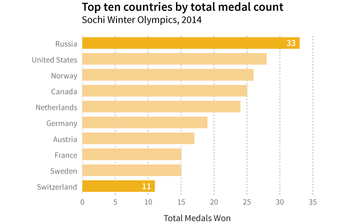
If your audience is interested in the range of values for number of medals won by the top ten countries, label the high and low values. By highlighting the highest and lowest values, you establish the range of the values. Additionally formatting the choices, like making the high and low bars different colors, also calls out these values.
如果你的读者对前10个获胜国家拥有金牌数量的范围感兴趣,标记出高潮值和低谷值。通过突出显示最高和最低的值,你建立起了值的范围。另外,可以在高低值之间通过颜色条来表示不同的值,以此来呈现这些数值。
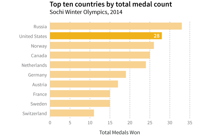
If your audience is from one specific country and wants to see how their medal wins compare to the other top ten countries’ medal totals, highlight and provide the data point for the single county (for example, the United States).
如果你的读者来自于特定的国家,并且想要知道他们获得的奖牌如何区别于其它前10位国家的奖牌总数,突出显示并为该国家提供数据点(比如,美国)。
Option 3: No Data Labels
方式三:不用数据标签
We often build graphs to simplify the visual presentation of information. If you can effectively convey your message without complicating your visual with extra labels and text, just say no to adding data labels. Reserve the use of labels for the occasions when you need that level of detail: make your default to be no labels and then add as needed.
我们通常创建图表来简化信息的可视化展示。如果你不通过额外的标签和文本来复杂化你的可视化却能高效地传递你的信息,那么你可以不会添加数据标签。当你需要详细信息的时候,你可以保留标签的使用:默认不使用标签,根据需要添加。
Because of the way that the human brain interprets angles and area, it can be tough to visually assess the values associated with slices of pie charts. For that reason, it’s a good idea to add data labels to pie charts for clarity.
因为人脑解释角度与面积的方式,形象地评估与饼图切片相关联的值会很难。因此,向饼图中添加数据标签来更好的理解是一个好办法。
Simple and Powerful Legends
简单而强大的图例
A legend ensures that your reader knows what your graph’s colors or patterns mean. When you’re only showing one kind of data where color or pattern doesn’t carry any special meaning, you don’t need a legend (as in the earlier bar charts, only showing total medal count). If you have multiple kinds of data represented on your graph or chart, a legend is essential.
一个图例确保你的读者知道你图中颜色或模式的含义。当你仅仅呈现一种数据,并且颜色或模式不传递任何特定含义的时候,你不需要图例(就如前面的条形图,仅仅呈现总的奖牌数)。如果你有多种数据呈现在你的图表中,图例是必须的。
Say that instead of showing total medal count, you want to show the total count broken down by medal types (gold, silver, and bronze). You could include them all one bar chart with a different color to represent each medal type.
就说不显示总的奖牌数量,而是呈现按奖牌类型(金、银和铜)分解的总数量。你可以把它们包含在一个条形图中,使用不同的颜色来表示不同的奖牌类型。
Here, each color represents a single medal type and is clearly defined in the legend on the top of the graph. Consider how your reader will look at your graph: obscuring the legend in a corner can make it difficult to find quickly, while laying it over white space on the chart (for example, where there are short bars) can be distracting.
这里,每种颜色代表单独的奖牌类型并且在图的上方由图例清晰地定义了。考虑到你的读者会如何看你的图:将图例隐藏在一个角落会很难快速地被发现,然而将它放在图表听空白区域(比如,短条形图所在的地方)却很容易发觉。
This graph is a great example of the importance of position for the legend. By aligning the legend along the top of the bar chart, it’s easy to visually place which color aligns with which data category. While the placement of the legend is partially an aesthetic choice, its placement can visually assist your reader in interpreting your graph.
该图对于说明图例位置的重要性是一个很好的例子。通过沿着条形图顶部对齐图例,很容易直接地用不同的数据类型对应上不同的颜色。然而图例位置的选择部分是审美的选择,它的位置可以直接地帮助你的读者解读你的图表。
Concise but Impactful Titles
简洁而有效的标题
At last! You’ve labeled your axes. You’ve added (or decided not to add) data labels. You’ve ensured that the categories or values along your axes are clear. Now comes the opportunity to tell your story in 1-2 lines of text: your chart title. The title should succinctly tell your reader what message this graph or chart has been designed to convey. It doesn’t have to be a complete sentence, but it should be free of complicated language and syntax.
最终,你已经标记了你的坐标轴。你已经增加(或决定不增加)数据标签。你已经确保沿着你的坐标轴的分类或数值含义是清晰的。现在用1到2行的文本给你讲故事的机会来了:你的图标题。标题应该简洁地告诉读者已经设计的图表传递的什么信息。它不必是一个完整的句子,但它应该是没有复杂的语言和语法的。
It’s important to think about who your audience is and where your graph is going to be published when writing your chart title: are you a journalist adding the chart to an article, a blogger creating a very visual post, or perhaps a scientist going for a peer-reviewed publication? Scientists may need to clearly articulate the relationship displayed between their variables whereas a journalist may want to give some spin to the title to emphasize the message they want to share.
当你写图标题的时候,需要重点考虑谁是你的读者,并且你的图表将会出版在哪里:你是一个新闻工作者需要将图标添加到文章中吗?你是一个写博客的人,需要创建一个视觉较好的帖子吗?或者是一位科学家,需要为同行评议的出版物而奔走吗?科学家也许应该说清楚所呈现变量的关系,然而新闻工作者也许想要为标题润色以强调他们所想要分享的信息。
The most basic graph titles clearly state the relationship between the independent variable on the horizontal axis and the dependent variable on the vertical axis. For example, we called our medal count graph, “Top Ten Countries by Medal Count, Sochi Winter Olympics 2014.” This title tells that reader that we’re looking at the total medals won (medal count) by country, limited to the top ten winners at the Sochi Winter Olympic Games in 2014. Each element of the chart title we’ve created adds value and tells something to the reader. There’s nothing wrong with titles like these: while somewhat dry, they’re straightforward and clearly tell your reader what is on the graph.
大多数基本的图表标题清晰地陈述了在横轴上的自变量与纵轴上的因变量之间的关系。比如,我们把我们奖牌计数图叫做“Top Ten Countries by Medal Count, Sochi Winter Olympics 2014.”。该标题告诉读者我们正在按国家看赢得奖牌的总数(奖牌数量),并限定2014索契冬奥会前10位获奖者。我们创建的图标题中的每个元素增加了价值,并且告诉读者一些事情。像这些标题是没有问题的:虽然内容有些少,但是他们直截了当并且清晰地告诉你的读者图上是什么。
You can also approach a title as an opportunity to state the conclusion your reader should draw from your graph. For example, take where we highlighted the US medal count. If you want to highlight the US ranking second in overall medal count, you could title the graph, “US ranks second for total medals won, Sochi Winter Olympics 2014.” Often you see these leading titles in newspapers and other publications telling a specific story. The chart title provides an extra opportunity to emphasize and amplify your message—use it!
你可以将图的标题作为一个陈述你读者应该从你的图中得出总结的机会。比如,我们要在一个地方强调美国的奖牌数。如果你想强调美国在所有奖牌数中排名第二,你可以这样写图标题“US ranks second for total medals won, Sochi Winter Olympics 2014.”。通常你在报纸或其它出版物上看到这些头条标题都在讲述一个特定的故事。图表的标题提供了一个额外的机会以强调和放大你的信息-使用它! 寻找反馈
Looking for Feedback
寻找反馈
One of the best ways to see if your chart or graph clearly communicates your message is to ask an impartial party to take a look. This is the time to call in that favor and ask a friend or colleague for five minutes and some honest feedback. Ask your reviewer to identify if there’s any information they feel is missing. Remember not to take it personally if there are edits that need to happen; the best charts and graphs happen through multiple drafts and with the help of collaborators.
确定你的图表是否清晰地传达了你的信息的最佳方式之一是问一个公正党看一看。这是向你的朋友或同事打五分钟电话问一些诚实反馈的时候。问下你的评论者是否他们感觉有缺失信息的情况。记住,当需要编辑时不要一个人来做。最好的图表都是拟过多个草稿并在合作者的帮助之下完成的。
The contributors for this book have also set up a group to give you feedback on your visualizations. If you’re looking for honest feedback from an impartial party, HelpMeViz is a community feedback site that can help.
本书的贡献者已经建立了一个群为你的可视化作品提供反馈。如果你正在寻找来自公正党的诚实反馈,HelpMeViz(http://helpmeviz.com/)是一个可以帮助你的社区反馈网站。
This final check is a great way to make sure you’ve provided enough detail in your axis labels, axis titles, chart title, and legend. If some thoughtful changes are suggested, go back to the file and make a few edits: it will be time well spent, and at the end of the day your visualization will be better for it!
通过最终检查的方式来确保你已经在你的轴标签、轴标题、图标题和图例上提供了足够详细的信息。如果有一些经过充分考虑的建议需要修改图表,可以返回到文件做一些编辑:这会非常值得,并且在一天结束的时候,你的可视化作品会更好!