序
Data are all around us and always have been. Everything throughout history has always had the potential to be quantified: theoretically,one could count every hu¬man who has ever lived,every heartbeat that has ever beaten,every step that was ever taken,every star that has ever shone,every word that has ever been uttered or written. Each of these collective things can be represented by a number. But on¬ly recently have we had the technology to efficiently surface these hidden num¬bers, leading to greater insight into our human condition.
如今数据无处不在,事实上,他们一直都在。历史上的所有发生的事情都有被量化的可能性:理论上来说,活过的每个人,跳动过的每一次脉搏,走过的每一步路,闪耀过的每一颗星,被说出或被写下的每一个字。这些可以被收集的事务都可以用一个数字来表示。但是直到最近,我们才拥有了足以呈现这些隐秘数字的技术,而这些数字将让我们对人类社会具有更深的洞察力。
But what does this mean, exactly? What are the cultural effects of having easy access to data? It means, for one thing, that we all need to be more data literate. It also means we have to be more design literate. As the old adage goes, statistics lie. Well, data visualizations lie, too. How can we learn how to first, effectively read data visualizations; and second, author them in such a way that is ethical and clearly communicates the data’s inherent story?
但是这件事到底意味着什么?了解这些数据会对产生哪些文化上的影响?这件事意味着我们需要更了解数据,我们也需要更了解设计。正如老话所说,统计会撒谎。事实上,数据可视化也会撒谎。我们如何才能学会阅读数据可视化以及创造数据可视化?我们需要确保创造的方式合乎伦理并且能够清晰地表达数据背后的故事。
At the intersection of art and algorithm, data visualization schematically abstracts information to bring about a deeper understanding of the data, wrapping it in an element of awe.
在艺术和算法的交叉领域,数据可视化用图示化的方法提炼信息,挖掘出对数据更深层次的理解,并用一种令人敬畏的方式将其封装起来。
My favorite description of data visualization comes from the prolific blogger, Maria Popova, who said that data visualization is “at the intersection of art and algorithm.” To learn about the history of data visualization is to become an armchair cartographer, explorer, and statistician.
我最喜欢的数据可视化的描述来自于一个多产的博主,玛丽亚·波波娃。 玛丽亚说过,数据可视化是“艺术和算法的交叉领域”。了解数据可视化的历史意味着你将成为一个足不出户的制图员,探险家和统计学家。
Early visual explorations of data focused mostly on small snippets of data gleaned to expand humanity’s understanding of the geographical world, mainly through maps. Starting with the first recognized world maps of the 13th century, scientists, mathematicians, philosophers, and sailors used math to visualize the invisible. Stars and suns were plotted, coastlines and shipping routes charted. Data visualization, in its native essence, drew the lines, points, and coordinates that gave form to the physical world and our place in it. It answered questions like “Where am I?”, “How do I get there?”, and “How far is it?”
早期的数据可视化探索集中在地理信息的刻画,主要方式就是地图。从13世纪第一个被公认的世界地图开始,科学家,数学家,哲学家,和水手使用数学来可视化哪些不可见的世界。行星和太阳被绘制出来,海岸线和航道被绘制成图表。就其本质来说,数据可视化就是描画能够描述物理世界的点,线和坐标。它回答了诸如“我在哪里?”,“我怎么去那儿?”和“有多远?”这些问题。
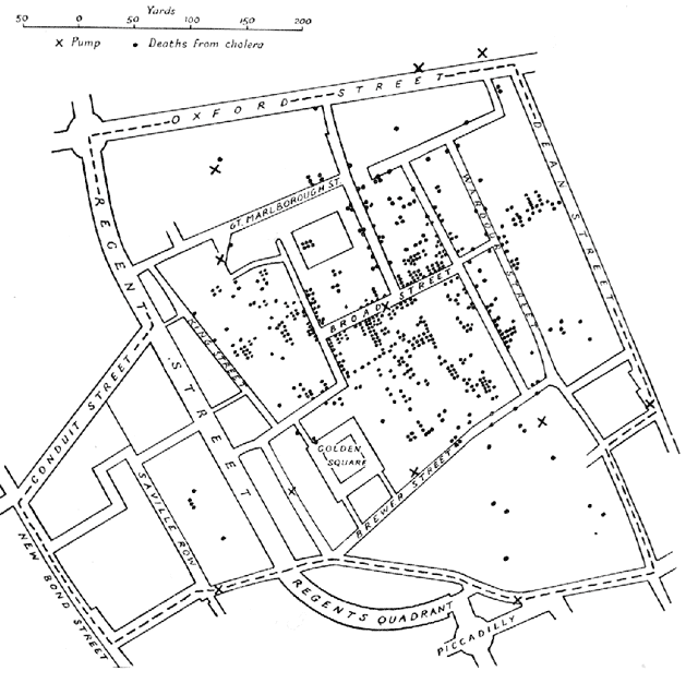
Early data visualizations were also used to answer questions pertaining to issues of public health. Epidemiologist John Snow’s 1854 London cholera map was created to record instances of cholera in a London neighborhood, pinpointing the cause of the outbreak to a single well. This knowledge gained from patterns in lists of names, numbers, and locations was then used to persuade London’s populace to install sewer systems to alleviate the proliferation and spread of disease. The human brain is particularly adept at recognizing patterns, and a good data visualization, like Snow’s, optimizes displays of these patterns through effective use of Gestalt theory, design principles, and color. (Or lack of it, as this case may be.)
早期的可视化数据也被用来回答和公共健康有关的问题。流行病学家John Snow于1854年建立了伦敦的霍乱地图,这幅地图记录了霍乱在伦敦附近的散布状况,并明确指出其根源来自于一口井。这个从一串名字、数字和地点的特定模式中分析得出的信息被用于向伦敦市民推广建立排水系统,以减缓疾病的散布和传播。人类的大脑尤其擅长识别模式。就如同流行病学家John Snow所做的那样,一个优秀的可视化的数据,通过有效地利用格式塔理论,设计原理和色彩,可以把这种模式用最直观的方式呈现出来。(这里是充分不必要条件,John Snow的研究里就没有用到色彩)
Snow’s visualization, with its absence of color, optimizes Gestalt’s theories of visual perception, most notably “Proximity” and “Figure and Ground.” The small black dots, each one representing a single case of cholera are small black figures standing out in contrast against the ground: in this graphic, the lines and white space representing streets. The proximity of these dots around the affected well are what enabled Snow to determine the exact source of the outbreak. Today, even with our advanced computing systems and sophisticated tools for creating data visualizations, there is little you could do to improve the effectiveness of this chart. It is simple, beautiful, and true: a data visualization that saved lives.
Snow的可视化尽管没有用到色彩,但是通过使用格式塔理论,尤其是“邻近”和“图形与背景”的方式使得视觉体验达到了最优。每一个小黑点都代表一例霍乱,线条和白色的空白区域代表街区,黑色的图形和背景形成形成鲜明反差。在传染源井水周围密集的黑点让Snow得以发现这场瘟疫准确的源头。如今,我们已经拥有了高级计算系统和可以自动创建数据可视化的复杂工具,但这张图表的有效性在我们这个时代也依旧不过时。这是一个拯救了万千生命的数据可视化,它简单、优美并且真实。
Florence Nightingale, famous more for her nursing skills than her analytic prowess, was nonetheless also a master data scientist and storyteller. Through data presented via her signature Coxcomb diagram (also known as polar or rose charts), she convinced the British army to invest in sanitation measures after illustrating that the majority of deaths in the Crimean War were the result of preventable diseases caused by the horrible sanitary conditions in hospitals. “Why are we sick?” she asked, then answering the question herself by giving visual form to data.
佛罗伦萨·南丁格尔,以她的护理技能闻名于世,但她同时也是一个优秀的数据科学家和一个优秀的叙述者。通过她的鸡冠花图(也被称作玫瑰图或者极坐标图)中呈现出来的数据,她成功说服了英国军队在医疗设备上投入重金。她通过图表说明了在克里米亚战争中的大部分死亡都是由于恶劣的医疗条件引起的疾病导致的。而这些疾病,都是可预防的。“我们为什么生病?”她通过提供这些数据的可视化形态解答了自己的问题。
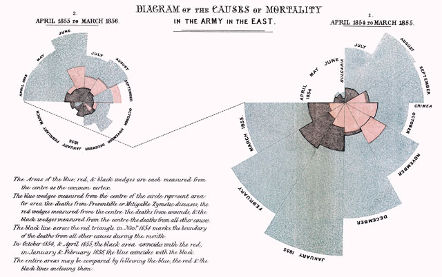
Looking at this graph, it is readily apparent that preventable diseases outnumbered all other causes of death. The area in blue represents deaths by preventable diseases, measured from the center, with red representing deaths caused by injuries and black indicating all other causes. Design principles at play here include the addition of color theory to take advantage of more Gestalt principles: “Similarity” and “Continuity”. Color makes it easy for us to tell which segments belong to which category. It also helps to draw the eye in a continuous path around the graphic, making it easier to read.
从这幅图中,我们可以很明显的看出可预防的疾病导致的死亡人数大大超过其他原因导致的死亡人数的总和。这张图的坐标是由中心向外的,蓝色区域表述可预防的疾病导致的死亡人数,红色区域表示外伤导致的死亡人数,黑色区域表示其他原因造成的死亡人数。这里的设计原则使用了色彩理论来更好地诠释格式塔理论的思想:“相似性”和“连续性”。色彩让我们更容易分辨出哪个部分属于哪个类别。它也使得这个图表中连续的路径更加突出,更易识别。
There is debate over the quality of this chart. Some claim it one of the best, most memorable visualizations ever created, not solely because of its visual communication strength, but in spite of it. It is remembered because of the change it inspired. Others deride it, claiming it’s just a glorified pie chart, suffering from the same misrepresentation of the information by distorting the data: in terms of visual perception, humans have a hard time accurately judging measures represented by differences in area. Despite their ubiquity, pie charts, for this very reason, are an incredibly poor way to visualize data. A simple stacked bar chart with reference lines, while not as beautiful or visually intriguing, would have communicated more effectively and on a quicker read.
有一些关于这张图质量的争论。有的人说它是迄今为止最好的、最让人难忘的可视化,不仅仅是因为它的视觉传播力。事实上,不管它的视觉传播力如何,它被人们记住更因为它激发了一些改变。而另一些人对它很不屑,声称它只是一个华而不实的饼图。这张图中的数据是被扭曲的, 所以它呈现出来的信息也不具有代表性。在数据可视化这个问题上,人们是很难通过面积上的差异来准确地判断数量的。尽管饼图无处不在,然而因为饼图自身的不精确性,饼图对于可视化数据来说并不是一个明智的方法。一个简单的堆积条形图,加上参考线,尽管不是那么美观或是在视觉上那么有趣,但是堆积条形图能够更加快速和有效地传递信息。
We still ask the same kinds of questions that Snow and Nightingale posed, and as curious humans, probably always will. But the major differences today are that we have the means with which to gather much larger, richer datasets. And we also have the tools with which to automate visualizing our data.
我们仍然会提出Snow和南丁格尔提出过的问题,并且作为具有好奇心的人类,一直都会提出这些问题。但是现在和过去主要的不同在于,我们能够收集到更大更丰富的数据,我们还拥有可以自己生成可视化的数据的工具。
This isn’t to say that small datasets, like the ones Nightingale and Snow observed, are any less valuable or interesting. Thanks to data gathering technology and advances in wearable computing and the Internet of Things, to the contrary. My friend Jen Lowe, a data scientist and artist working in New York, recently published her heartbeat on the internet. As a flat, static visualization, it would be beautiful but not especially informative. But by adding interactivity and live data feeds of her pulse via wearable sensors and API calls, her heartbeat is a living, beating, digital thing, viewable by anyone, anywhere, at any time. What you have is insight into another human being like you’ve never seen before.
这并不是说小的数据集,就像南丁格尔和snow观察到的数据集一样,没有价值或是不那么有趣。相反,这一切要感谢数据收集技术、可穿戴设备的进步以及互联网的发展,我的朋友Jen Lowe,一个在纽约工作的数据科学家和艺术家,最近将她的心跳数据发布到了网上。这是一个扁平的静态的数据,它或许看起来很漂亮但是它所呈现的信息并不多。然而通过添加交互性以及添加可穿戴设备感应到的实时的心率数据,她的心跳是一个鲜活的,跳动的数字。它可以在任何时间任何地点被任何人看到。 (技术提供了一种可能性,让)我们能够对哪怕是从未谋面的陌生人也能了如指掌。
Unique insight is the essence of data, both big and small, and the result of the tools that allow us to access, probe, poke, prod, dissect, visualize, and hopefully, make sense of it. Tools which, through the democratization of data visualization, allow us to change our lens on the world, creating pictures of humanity from different perspectives, bringing into focus stories about humanity and the world that were previously invisible, allowing us insight into ourselves like we’ve never seen before.
数据的实质是独一无二的洞察力,不论是大数据还是小数据。技术工具允许我们访问,调查,探索,可视化数据,最好的结果是让它有意义。通过数据可视化的民主化,工具让我们有可能改变我们看世界的视角,呈现人性的多个方面,挖掘出更多关于人性以及我们以前未知的世界的故事,以及,让我们看到我们从未见过的自己。
Callie Neylan
Senior Designer, Microsoft
凯丽·妮蓝
资深设计师,微软公司