
Chapter 18
第十八章
Common Visualization Mistakes
常见可视化错误
By Kathy Chang, Kate Eyler-Werve, and Alberto Cairo
作者:Kathy Chang, Kate Eyler-Werve, and Alberto Cairo
Welcome to the last (but certainly not least) chapter of the book! We hope you’ve learned enough to appreciate how much good data and good design can help you communicate your message. Professional data visualizers get excited by the stories they want to tell as well, but sometimes they forget to follow some best practices while doing so. It happens to the best of us. So in this chapter, we’re going to cover what those best practices are.
欢迎来到本书的最后一章节,但不代表不重要哦!通过前面章节的学习,相信你已经领会到好的数据和设计能够有助于传递信息、表达诉求。数据可视化专家也为他们讲的故事而感到兴奋,但在实践中他们也会偶尔忽略数据可视化的基本原则,犯些小错误,其它人更是无一例外。所以在本章,我们将通过案例枚举数据可视化的基本原则和常见错误。
Don’t Truncate Axes
不要截断坐标轴(保持坐标轴的完整性)
One of the ways a graph can be distorted is by truncating an axis. This happens when an axis is shortened because one or both of its ends gets cut off.
当坐标轴的一端或两端被截断时,就会使图形扭曲。
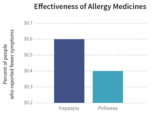
Sometimes a distortion like this is really obvious. For example, let’s say there are two allergy medicines called Happajoy and Pollaway. The bar graph below compares how effective these two medicines are at reducing the tearful, congested misery known as allergy symptoms. If you quickly glance at the bars, you may think that Happajoy is twice as effective as Pollaway is because its bar is twice as tall. But if you examine the graph more closely, you’ll see that the y-axis is truncated, starting from 30.2 and going up to only 30.7 percent. The truncated y-axis makes the difference between the two bars look artificially high. In reality, Happajoy’s effectiveness is only 0.2% higher than Pollaway’s, which is not as impressive as the results implied by the bar graph.
有时截轴引起的图形扭曲非常明显。比如,有两种治疗过敏的药:H和P。下面的条形图反应了这两种药在减轻过敏反应的痛苦时的有效性。粗看这张条形图,你可能认为H的有效性是P的2倍,原因是H的条形高度是P的两倍。但当你再仔细观察图形,会发现y轴是被截断的,启于30.2%,止于30.7%。被截断的y轴人为地使得两个条形的高度差异很大。而事实上,H的有效性只比P高0.2%,并不像条形图所显示得那样差异明显。
Sometimes a truncated axis and the resulting distortion can be more subtle. For example, the next graph shows the quantity of Happajoy sold from January through April 2014.
但是有时候一个截断的轴扭曲的结果很细微。比如,下图显示了H药在2014年1月到4月的的销量情况。
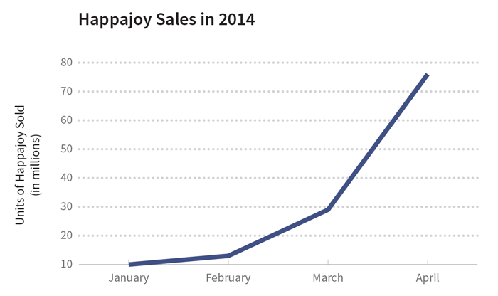
At first glance, there doesn’t appear to be a truncation issue here. The y-axis starts at zero, so that’s not a problem. The critical thing to understand is that it’s the x-axis that’s been truncated this time: we’re seeing sales from less than half the year. Truncating a time period like this can give the wrong impression, especially for things that go through cycles. And—you guessed it—the sale of allergy medicine goes through a seasonal cycle since allergy symptoms are typically higher in the spring and lower in the winter.
初看,并没有明显的截断问题。y轴从零开始,没有问题。问题是这次是表示时间的横轴被截断:我们看到的销量是半年以内的。像这样截断一个时间段会带来错误的认知,尤其是对于那些需要时间来表示的事情。相信你能猜得到,由于在春天的过敏症状显著高于冬天,所以治疗过敏类药物的销量也会随之呈现季节性和周期性的变化。
What would be a better way to show sales of Happajoy? Something like the graph below:
有没有更好的方法呈现H药的销量呢?可以用下图的方式:
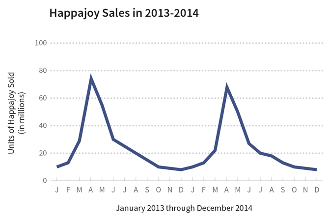
This graph shows the same dataset of Happajoy sales, except this time the y-axis is proportional and the x-axis covers two full years instead of just a few months. We can clearly see that sales of Happajoy went down in the winter and up in the spring, but that the rate of sales didn’t change much from year to year. In fact, sales were a little lower in 2014 than in 2013.
这个图显示出了H销量的数据集,除了这次纵轴是按比例的并且横轴覆盖了整整两年而非仅仅几个月。我们能够清楚的看到H的销量在冬季下降而在春季增长,但是增减的比率每年的变化不大。实际上,2014年的销量比2013年的稍微少些。
When you compare the last two graphs of Happajoy sales, do you see how different their stories are? If you were an investor in Happajoy’s company and you saw the graph with truncated axes, you might dance happily through the streets because it seems like the company is doing really well. On the other hand, if you saw the graph with proportional axes, you might reach for some aspirin instead of Happajoy because of the headache you’d get worrying about the overall decrease in sales.
当你对比以上两个H销量图时,能看到什么不同?如果你是H公司的投资者,并且你看到的是截断轴的图,你会觉得公司做的很好而高兴的要飞起来。另一方面,如果你看到的是后一张图,你可能会吃点阿司匹林来缓解下销售额总体下滑而引起的头痛。
So watch out for truncated axes. Sometimes these distortions are done on purpose to mislead readers, but other times they’re the unintentional consequence of not knowing how truncated axes can skew data.
所以要小心这些被截断的轴。有时候这些扭曲的信息是故意用来迷惑读者的,但有时候是因没有意识到截断的轴能曲解数据,而无意中产生的。
Don’t Omit Key Variables
不要忽略关键变量
The first principle is that you must not fool yourself — and you are the easiest person to fool.- Richard Feynman, 1974 Caltech Graduation Address
第一守则就是你自己一定不能骗自己-而且你是最容易的被骗的了。- 理查德费曼,1974 加州理工毕业地址
You know how famous people are sometimes criticized for something they said, and they often reply that they were quoted out of context? Context is important, especially when it comes to data. It’s very easy to fool yourself by leaving out variables that could affect how you interpret the data. So whenever you’re examining a variable and its relationships, carefully consider the ecosystem in which that variable exists and deliberately seek out other variables that could affect the one you’re studying.
众所周知,有时名人会因为说就了某些话而被指责,而他们的回复通常是他们的话被断章取义了。上下文是重要的,特别是涉及到数据时,有些关键变量影响着我们对数据的理解,如果忽略了它们,我们就骗了自己。所以当在查看变量和变量间的关系时,仔细考虑变量所处的系统并留心其它变量对你所研究变量的影响。
This is easier said than done. For example, the map below shows each state’s market leader in allergy medicine: Happajoy is the leader in dark blue states, while Pollaway is the leader in light blue states. On the surface, it might seem like Happajoy is the market leader nationally, ahead of Pollaway. But to get the complete picture you have to pay attention to other variables.
言易行难。下图标注了抗过敏药物在各个州的市场份额:深蓝色表示H药在该州销售额领先,浅蓝色表示P药在该州销售额领先。表面上看,全国范围内 H药的销售额领先于P药,但需要注意其它的变量才能看到全局而无疏漏。
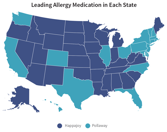
For example, the bar graph below shows a breakdown of market share in each state. (We’re only going to look at the western continental states for now.) The margins by which Happajoy leads are significantly less than the margins by which Pollaway leads.
比如,如下的条形图对各个州的市场份额做了拆解(暂且只关注西部大州),Happajoy份额领先的州在数量上明显少于Pollaway领先的。
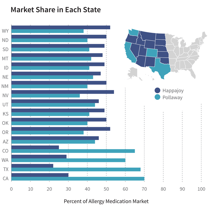
Combine the information from the bar graph with the table below. The total sales in states where Happajoy is the leader is also significantly less than the total sales in states where Pollaway is the leader. When you add up the numbers, Pollaway’s total sales are more than twice that of Happajoy’s. Assuming that a similar pattern holds for the rest of the country, would it still be accurate to say that Happajoy is the national market leader in allergy medicine?
将条形图和如下表格的信息结合起来,H药领先的州的销量显著低于P药领先的州,把这些数字加起来,P药的总销售额是H药的2 多。假设其它的州情况一样,那么说“H药是全国范围内抗过敏药的市场领先者”还准确么?
| States | Happajoy | Pollaway |
|---|---|---|
| Wyoming (WY) | 299,734 | 219,037 |
| North Dakota (ND) | 349,814 | 279,851 |
| South Dakota (SD) | 408,343 | 341,675 |
| Montana (MT) | 482,400 | 422,100 |
| Idaho (ID) | 782,040 | 654,360 |
| Nebraska (NE) | 872,320 | 798,080 |
| New Mexico (NM) | 1,043,000 | 834,400 |
| Nevada (NV) | 1,489,860 | 993,240 |
| Utah (UT) | 1,313,300 | 1,256,200 |
| Kansas (KS) | 1,414,140 | 1,183,260 |
| Oklahoma (OK) | 1,907,500 | 1,526,000 |
| Oregon (OR) | 2,027,480 | 1,481,620 |
| Arizona (AZ) | 3,014,380 | 2,883,320 |
| Colorado (CO) | 1,297,000 | 3,372,200 |
| Washington (WA) | 2,069,100 | 4,138,200 |
| Texas (TX) | 5,733,200 | 17,720,800 |
| California (CA) | 7,608,000 | 26,628,000 |
| Sales Totals | 32,111,611 | 64,732,343 |
The lesson here is that if you want to provide a fair picture of what’s going on, you have to expand your scope to show the variables that put things in their proper context. That way, you can provide your readers with a more complete and nuanced picture of the story you’re trying to tell.
想要说清楚故事的来龙去脉,公正、客观得描述全局,需要拓宽思路,带入故事的上下文、语境,以及其中的变量。这样一来,就能向你的读者展现一幅有全局、有细节的故事脉络图。
Don’t Oversimplify
不要过份简化问题
Life is complicated, right? Data can be complicated, too. Complicated is hard to communicate, so it’s only natural to want to simplify what your data are saying. But there is such a thing as simplifying too much. Oversimplifying is related to the previous point about not expanding the scope enough to provide a clear picture of what’s going on.
生活是复杂,对吧?数据同样也可以是复杂的。复杂了就难以沟通,所以会自然地想简化数据传达的信息,但是简化多了就会存在问题。之前提到的,没有扩展观察的范围,就无法清晰的描述数据背后的故事,这就是过份简化问题。
For example, let’s say you’re an investor of RediMedico, the maker of Happajoy, and you attend the annual sales meeting. The CEO of RediMedico starts off the presentation with the following graphic:
比如,如果你作为H药制造商RediMedico的投资者,出席年度销售大会。RediMedico的CEO以下图作为报告的开始。
Now the investor in you might look at that graphic and start daydreaming about all the wonderful things you’ll do with such a great return on your investment. But then the data pro in you kicks in, and you start wondering about what that 18% increase means. You ask yourself:
看到这幅图后,投资者中开始有人做白日梦,想像自己的投资会有巨大的回报。但你的数据敏感度敲醒了你,你问自己:18%的增长意味什么?
- Compared to what?
- Compared to when?
- Compared to whom?
- 与什么东西比较?
- 与什么时候比较?
- 与什么人比较?
These are all worthwhile questions to answer with a visualization! Thankfully, the CEO of RediMedico agrees and presents the next graphic, which compares the revenues from the five top-selling medicines RediMedico makes:
这些问题都是值得用可视化方法回答的。幸运地是,RediMedico的CEO同意并展示了下一张图,这张图对比了RediMedico生产的销量最好的五种药的利润:
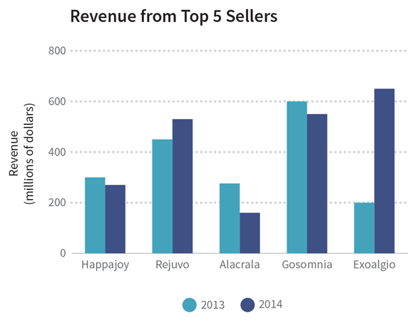
If we do some number-crunching, we see that the average increase in revenue between 2013 and 2014 is indeed 18%. However, we also see that this increase is primarily due to a whopping 225% increase in revenue from a single medicine, Exoalgio. Revenue from 3 out of 5 medicines actually dropped. So RediMedico’s first graphic tells part of the truth, while the second graphic tells the whole truth by presenting the details behind the single number.
通过计算,就能发现2013到2014的平均利润增长确实是18%。然而,我们也注意到增长主要来自于某药物Exoalgio利润猛增了225%,五分之三的药物利润是下降的。由此可见,第一张图仅说明了部分真相,而第二张图通过细节说明了隐藏在单一数字后的全部真相。
Using a graphic with a single number and no breakdowns is like writing a news headline without the news story. Keep the headline—that revenue improved by 18%—and then provide the context and the background to flesh out the full story. Try to be true to the underlying complexity by digging deeper into the data and providing readers with a better understanding of the numbers you’re presenting.
仅用一个数字而没有任何分解的图形,就像只有标题而没有正文的新闻。“利润提高了18%”作为标题,然后提供更多的背景和上下文信息来充实正文。复杂的数据可以试着进一步深层挖掘,帮助读者更好的理解数字。
Don’t Choose the Wrong Form
不要误用样式
Creating a data visualization is a balancing act between form and function. When choosing a graphic format for your data, you’ll have to figure out how to effectively communicate to your audience in an aesthetically pleasing way. This may seem like a daunting task, but fear not! There’s actually a lot of research that can help us with this. In fact, you’ve already been introduced to some of this research in the previous chapter: Cleveland and McGill’s “Graphical Perception” paper, in which they rank how well different graphic forms help people make accurate estimates.
创建数据可视化是为了平衡样式和功能。为数据选择了一个图形化样式后,你需要明白如何用美观的形式,高效地与你的观众交流。这似乎是个艰巨的任务,但不要被吓倒!事实上,现在已有很多研究可以帮到我们,在之前的章节中已经了解了一些研究,比如:在克利夫兰和麦吉尔的关于“图像知觉”的论文中,不同的图像样式能帮助人们做不同程度的精确估计。
You can use this scale to help you choose the best graphic representation of your data. Area and shading are good at giving readers a general overview that helps them understand the big picture. Graphs with a common baseline (such as bar graphs) are good at helping readers make accurate comparisons.
以下的方法可以帮助你为数据选择最适合的图形展现形式。面积和阴影表现数据总览,便于读者理解宏观和大局。带有基准线的图形(如条形图)适合读者做精确的比较。
Since we’ve already looked at examples of bar graphs and line graphs in this chapter, let’s take a look at a couple graphics that use area and shading.
在本章前面已经看过条形图和线形图的例子了,现在来看些面积图和阴影图的例子。
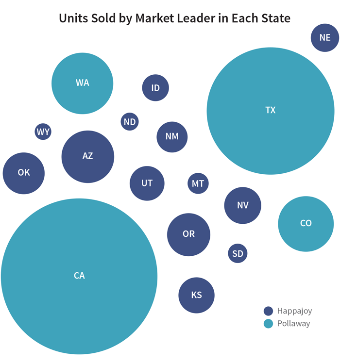
The bubble graphic uses area to display the units sold of the top selling allergy medicine in some states. Based on bubble size, you can generally tell that more Happajoy was sold in Arizona than in New Mexico. But can you tell by how much? Is the Arizona bubble three times bigger than the New Mexico bubble? Four times? It’s hard to tell. It’s even harder to tell when the bubble sizes are closer together: Did Utah or Kansas sell more Happajoy?
气泡图用面积来表示畅销的抗过敏药在某些州的销量。基于气泡的大小,能看出来H药在亚利桑那州比在新墨西哥州卖得好。 但是能看出好多少么?亚利桑那州的气泡是新墨西哥州的三倍么?还是四倍?当气泡大小接近时就更难说清楚了:是犹他州还是堪萨斯卖出更多的H药?
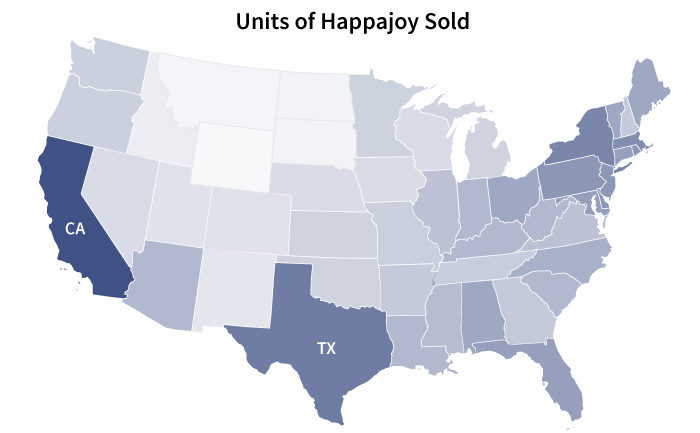
We run into the same problem with the next graphic, which uses shading to represent Happajoy sales: California is definitely darker than Texas, but how much darker? Two times? Three times? Who knows? This is why area and shading are better for giving an overall picture instead of making precise comparisons.
下图中会遇到相同的问题,这张图用阴影来显示H药的销量:加州显然比德州深,但是深多少呢?两倍?三倍?鬼知道呢?这就是为什么面积和阴影更适合表现整体情况而不适合做精确的比较。
In addition to area and shading, angles also give us a tough time when it comes to making accurate estimates. This is why it’s so hard to compare two pie charts, as in the example below.
除了面积和阴影,角度也很难被精确估量。如下图中的两个饼图,就很难被比较。
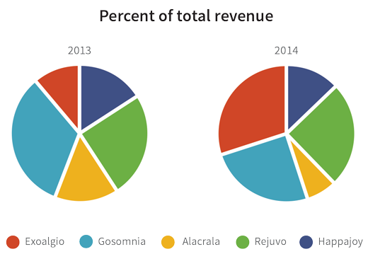
It’s already hard to precisely compare the slices within the same pie chart. It’s even harder to compare slices across different pie charts. If the goal of this graphic is to help readers compare revenues from one year to the next, then something like a bar chart would have been a better choice.
本来在同一饼图中比较不同片已经很难了,在不同饼图间比较就更难了。如果图形时为了帮助读者比较逐年的利润,那么更适合用条形图。
That’s the key thing: think about which graphic forms will best facilitate the tasks you want your readers to do.
考虑哪种图形样式最有利于引导读者去看数据,才是最关键的。
Do Present Data in Multiple Ways
用多种形式展示数据
We just covered how different graphic forms are good at doing different things. So what do you do when you have a lot of data and you want to show different aspects of those data, but you also don’t want to overwhelm your audience with an overly complicated graphic? One way to deal with this challenge is to present your data in multiple ways. You can individually show multiple graphics, each one showing a different aspect of the data, so that taken together your audience gets a more accurate picture of the data as a whole.
刚刚说到了不同的图像形式适合展示不同的数据。当有大量的数据,想从不同角度展示这些数据时,并且你也不想用过于复杂的图像让你的读者无法接受,该怎么做?解决问题的一个方法是用不同的图形展示数据。你可以独立地使用多种图形,每个图形展示数据的一个方面,它们结合在一起,能给读者一个整体而又精确的数据认知。
For example, let’s say the CEO of RediMedico wants to show investors how Happajoy has been selling in the United States since it was first introduced to the market ten years ago. The available data consists of Happajoy sales in every state for every year since 2004. You’re the lucky data pro who gets to figure out how to present both the big picture and the small picture inside this data.
比如:RadioMedico公司的CEO想给投资者展示H药从十年前首次进入美国市场到现在的销售情况,数据涵盖了2004年开始H药在每个州的销售情况。数据专家负责呈现隐藏在数字里的全局和细节,幸运的是,你就是数据专家。
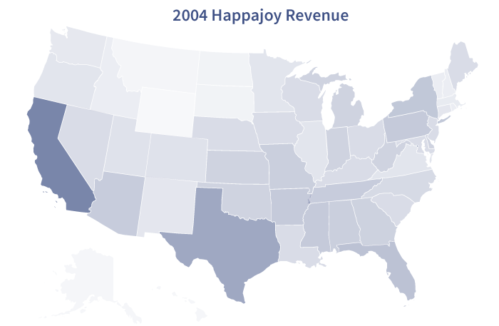
Let’s start with the big picture. Remember how graphic forms that use area or shading are best at giving a general overview? For every year that Happajoy has been on the market, a map that uses shading to represent sales can give people a general sense of how sales have changed across time and location:
让我们先从全局图开始,还记得面积图或阴影图是展现整体情况最好的选择了么? 在地图上,用深浅着色表现H药的销售情况,可以向人们传递出随着时间的变化,不同区域销售额变化的总体情况:
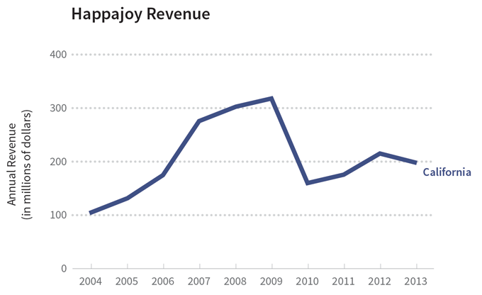
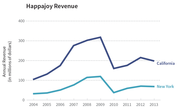
Now let’s move on the small picture. Let’s say RediMedico started to advertise heavily in California and New York a few years ago, and the investors are wondering how sales in those states are doing. Using the same dataset, you can give a more detailed picture of the sales in one state:
现在让我们聚焦到细节。RediMedico公司几年前开始在加州和纽约大规模投放广告,投资者向知道这些州的销售情况,基于相同的数据,你可以给出某个州更为明细的数据展现图。
Or you can compare the sales between different states:
也可以选择比较不同州之间的销量
See? Same data, different presentations. So if you want to show your readers different sides of the same story, give them multiple graphic forms.
看到了么?相同的数据,不同的展现方式。如果从不同角度呈现数据给读者,那就使用不同的图形样式吧。
Do Annotate with Text
请使用注释
They say that a picture is worth a thousand words, but that doesn’t mean you should forget about words entirely! Even your most beautiful and elegant visualizations can use text to highlight or explain things to your audience. This is especially useful when you’re presenting multiple layers of information because your annotations can help readers connect the various pieces into an understandable whole. And obviously, you’re not reading this book in order to make boring visualizations, right? Good visualizations engage an audience, so adding text is a great way to address questions that may come up as curious readers examine your graphic.
常说;“一图抵万言”,即便是最漂亮和优美的图形,仍需要使用文字来标注和向读者解释,而不是把文字抛到脑后。当从多维度展现信息时,更需要通过注释串起一系列的片段,帮助读者整体理解数据。本书的目的显然不是教大家做繁冗的图形,好的可视化图形负责吸引眼球,而辅以注释则帮助好奇的读者更好地审视数据。
For example, let’s go back Happajoy sales. If you see a graphic like the following:
现在,让我们从下图再来看H药的销量:
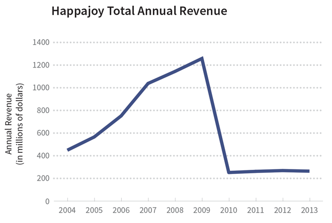
Then you might be wondering what happened between 2009 and 2010. Why was there such a sharp drop in revenue? In this case, it would be helpful to add some text:
你可能想知道为2009年至2010年发生了什么。为什么利润会暴跌?在图中,加入文字注释就可以回答这个问题了。
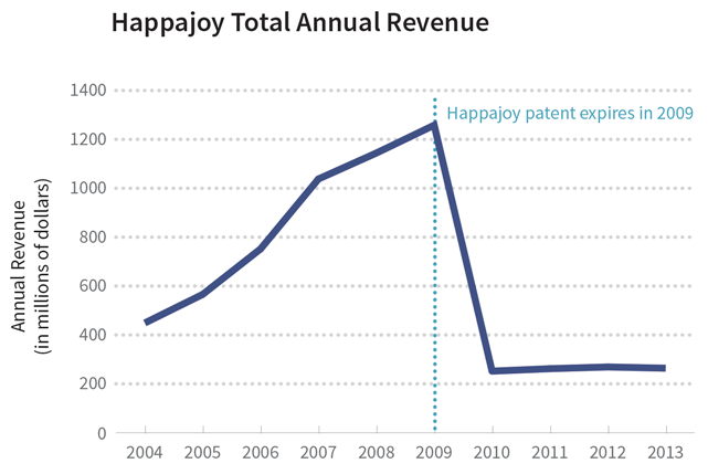
So whenever you create a visualization, think about the “So what?” of your graphic: Why should people care about the information you’re presenting? Add annotations to help them understand why they should care. Write a good headline that catches their attention, a good introduction that highlights interesting data points, and a good narrative that structures your visualization logically. Good writing is an important part of good visualizations.
每当创建数据的可视化图形时,思考一下:为什么读者关注你所展示的信息?添加注释能帮助他们理解他们所关注的信息:一个好的标题就能抓住他们的注意力,一个好的介绍能突出有趣的数据点,一个好的叙述可以从逻辑上构建可视化图形。恰到好处的描述是出色的可视化图形的重要组成部分。
Case Study of an Awesome Infographic
优秀信息图的案例学习
To close out this chapter, let’s take a look at all of these pro tips in action by going through a visualization made by real data pros: an infographic by The New York Times about breast cancer. The designers organized the information as a narrative with a step-by-step structure. This is an interactive graphic, so it’s best if you click through the link to get the full experience.
接下来介绍的纽约时报关于乳腺癌的信息图作为实际案例,会结合以上提到的三个注意点,作为本章的结束。设计者采用一步步的叙事结构来组织信息。可以通过点击链接充分体验一下交互页面的魅力。
On the first screen, you see a bubble graphic that gives you a general sense of which countries have the most new cases of breast cancer . After clicking “Begin”, you see a scatterplot with proportional axes. The scatterplot shows that there is an inverse correlation between breast cancer detection and mortality: as more women are detected with breast cancer, fewer women die from it. A scatterplot is a good way to show correlations between variables, and a bubble graphic is a good way to show a general overview, so the designers chose graphic forms that matched well with what they wanted to show.
第一幕看到的气泡图,会给你一个初步的感知:哪个国家是乳腺癌最新的高发国家。点击“开始”后,会看到一个有比例轴的散点图,该图显示出乳腺癌检查率和死亡率的负相关:检查出的乳腺癌越多,死亡率越低。散点图能很好的表现变量间的相关性,而气泡图则能更好的表现总体,所以设计者们会根据他们想表达的,选择合适的图形样式。
Notice how the designers use text to write a good headline that grabs the reader’s attention (“Where Does Breast Cancer Kill?”) and to highlight another aspect of this scatterplot—that highly developed countries have higher diagnosis rates (and lower mortality rates) while the opposite is true for the developing world. As you keep clicking “Next”, the designers guide you deeper into the scatterplot by highlighting a cluster of countries and providing an annotation that gives you further insight into that cluster. Without these notes, we would be left with a relatively straightforward scatterplot that leaves little room for us to explore the data further. By providing useful and well-placed annotations, the designers help us see relationships that we otherwise may have missed.
请注意设计师是如何运用文字打标题,抓住读者眼球的(乳腺癌在何处杀戮?),并且突出了散点图中的另一个规律:在发达国家,高诊断率,低死亡率;在发展中国家则是低诊断率,高死亡率。点击“下一步”后,图中突出了一组国家,注释文字进一步引导读者关注这组国家。如果没有注释,对读者来说只有一个直观的散点图,那么进一步探索数据的空间也几乎没有了。通过恰到好处的注释,设计师帮助读者发现常常会忽略的数据间的关联性。
The designers also present the data in multiple ways. They use color to add another layer of detail: the development status of various countries. In addition, if you’re curious about the statistics for a specific country, you can mouse over that country’s dot to get those numbers.
设计师用多种方式展示数据。他们使用颜色添加更多的维度:不同国家的发展状态。此外,如果对某个国家的数据感兴趣,移动鼠标到图中国家的电上,就看得到数据了。
Finally, by adding useful annotations and showing the data in multiple ways, the designers present the data within a context that doesn’t leave out important variables or oversimplify. By following through on some good data visualization practices, the designers created a clear, balanced, and engaging infographic.
最后,添加合适的注释、并用多种展现形式、注意数据的上下文、不丢失重要变量、也不过分简化问题, 遵照这些数据规范多加练习,设计师们就可以创建一个清晰、和谐并吸引人的信息图了。