
Chapter 16
第十六章
Print Vs. Web, Static Vs. Interactive
打印版 vs. 网页版,静态的 vs. 交互的
By Sarah Rigdon
著:Sarah Rigdon,译:紫瑰
Whether you’re designing graphics for static environments or for interactive ones, it’s important to address a few key things up front. First of all, what do we mean by static and interactive?
无论你是要为静态环境或是交互环境设计图像,事前解决几个关键点都是很重要的。首先,什么是我们所谓的静态的?什么是交互的?
Defining Print Vs. Web; Static Vs. Interactive
定义打印版 vs. 网页版;静态的 vs. 交互的
You can design static graphics for print, the web, or both. With static graphics, you’ll provide everything you want your viewers to see without requiring any input from them. The most a static image demands from a viewer is to turn a page or scroll or perhaps enlarge an image. Typically, static graphics display information that isn’t subject to change.
你可以为打印版或网页版设计静态图像,或者为两者都设计。通过静态图像,你将会提供所有你希望读者能看到的信息,而不要求他们有任何的输入。一副静态图片要求读者做得最多的莫过于翻页、滚页、或者是放大图片。通常,静态图像显示不易改变的信息。
You can also design interactive graphics for print or the web or both. Interactive graphics typically provide viewers with the option to dive deeper into the information, often requiring some degree of input. Now, you may be thinking, “Interactive print?” Actually, yes, though of course it’s not as common as interactive graphics on the web. Some examples include:
你也可以为打印版或网页版设计交互式图像,或者为两者都设计。交互式图像通常为读者提供更深层地潜入信息的选择,并要求一定程度的输入。现在,你可能要问,“交互式打印版?” 事实上,YES,但它当然并不像网页上的交互式图像那么普通。实例有:
- Interactive projects
- Art installations
- Flip books/analog animations
- Popup books
- 交互式项目
- 艺术装置
- 翻转书籍/模拟动画
- 弹出式书籍
So, static isn’t a stand-in for print, nor is interactive a stand-in for web.
所以,静态不是打印版的代名词,交互式也不是网页版的代名词。
One more thing: the antonym to static isn’t interactive. It’s changing, moving, or dynamic. Motion graphics don’t require viewer interaction, but they’re not static, either. Any given cable news network will give you examples of these. Do they display necessary information? Not usually. Adding motion to infographics can keep viewers’ attention, at least at first. But over the course of a segment or a show, viewer fatigue sets in. Motion graphics often look impressive, but you should always ask whether motion is necessary for conveying the information and be wary of overusing it.
另外一件事:静态的反义词不是交互的, 而是变化、移动、或动态。动态图像不要求读者的互动,但是他们也不是静态的。任一个有线电视新闻网都能提供关于此的例子。它们提供必需的信息么?并不总是。给信息图中增添运动至少在最开始的时候可以保持观众的注意力。但是一段或一个节目之后,观众便开始感到疲惫。动态图像往往看起来令人印象深刻,但是你应当时常提醒自己,此移动对传递信息是否有必要,并对过度使用它保持警惕。
Now let’s shift gears and talk about some of the core design concepts you should consider when creating static and interactive print-based and web-based graphics.
现在让我们转变一下方向,讨论一些在制作打印版或网页版的静态或交互式图像时应当考虑的一些核心设计理念。
Color
颜色
As for color, there are a lot of questions to take into consideration before you break out your palette, especially if you’re working in print. Are you working with full color or black and white? If you’re working with color, consider what you’re gaining that makes it worth the cost difference from black and white. After all, grayscale and two-tone printing can still communicate a lot of information. Is a full-color print job really necessary?
对于颜色,在你打开调色板之前有许多问题需要考虑,尤其你在为打印版工作时。你是在用全彩色,还是黑白色?如果你在用全彩色,请考虑你想得到什么,并确认为其付出的比黑白色高的成本是值得的么。毕竟,灰度和双色印刷还是能传递很多信息的。全彩色打印真的是有必要的么?
How many colors are available for the print job? What kind of paper are you working with? Colors work differently with news print, magazine, and printer paper. Or are you getting fancy and putting the graphic on merchandise? A good merchandising company will work with you to make sure your t-shirts, totes, buttons, or stickers look great, but you’ll want to anticipate these concerns in advance.
有多少种颜色可供打印?你将用什么样的纸张打印?打印纸张不同(例如:新闻纸、杂志纸、打印纸),颜色的效果也将不同。或者你正在发挥想象力,把图像放在某件商品上。一个好的销售公司可以和你一起来确保你的T恤、手提包、纽扣、贴纸看起来很棒,但是你需要提前预测到这些关注点。
On the web, a lot of these restrictions go away, but not all. Many designers have to work within a website’s color palette. They have to ask questions such as: does the website’s green color scheme completely clash with this bright pink graphic? Does it subtly complement the branding and logo design? The answers to each of these can have an impact on how the viewer receives the final design.
在网页版上,这些限制中的许多都没有了,但并不是全部都没有了。许多设计师都必须在一个网站的调色板内工作。他们必须提出一些问题,例如:此网站的绿色色彩配置是否完全与明亮的粉红色图像冲突?它有巧妙地对品牌和logo设计进行补充么?对这些问题的回答将影响到观众如何接收最终设计成果。
Size
尺寸
Step back and take a look at the space you’re working with. You have to consider size for both print and the web.
退一步,看看你正在工作的空间。你必须考虑尺寸的问题,无论是对于打印版还是网页版。
With print, you have the page size constraining your graphics, but that can also be a blessing because you only need to design for a single width and height.
在打印版,页面尺寸会限制你的图像,但是,这也是一个好处,因为你只需为一个高度和宽度设计图像。
On the web, you can often include image-zooming functionality or allow viewers to open a larger version of a graphic in a separate browser tab, but you should consider the effects that zooming and scrolling can have on a user’s experience. A well-designed graphic should provide key information in a clear and elegant manner with minimum effort required by the user.
在网页版,你经常须涵盖图像缩放功能,或者让观众能在一个单独的浏览器选项卡中打开一个图像的放大版本, 但是,你同时应当考虑缩放与滚动对用户体验可能带来的影响。一个具有良好设计的图像应该对用户投入的要求最小化,用一种清晰优雅的方式,呈现最关键的信息。
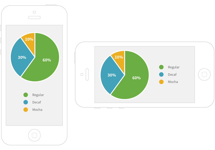
Mobile devices are also a concern, as more people are using cell phones and tablets to browse the web. Keep in mind that nearly two-thirds of cell-phone owners now use their phones to browse the web, and twenty percent use their phones to do most of their web browsing.1 It’s hard to see a lot of detail on a tiny touchscreen, but you don’t want users to have to squint to understand your graphic! You could build a responsive graphic — one that automatically changes its layout according to the dimensions of the viewer’s screen size — or you could design a completely different graphic specifically for display on small mobile devices. Given the state of mobile web browsing trends, it’s something you should consider when publishing a visualization on the web.
移动设备也是一个关注点,因为越来越多的人使用手机和平板电脑浏览网页。请记住,现在近三分之二的手机持有者用他们的手机浏览网页,20%的手机持有者用手机完成他们生活中大部分的网页浏览。2 在微小的触摸屏上看到很多细节是比较困难的,但是你不希望用户必须眯着眼睛来了解你的图像。你可以建立一个应答式图像,它可以根据观众屏幕尺寸的方向自动地改变其布局,或者你可以专门为小型移动设备设计一个完全不同的图形。鉴于移动网页浏览的趋势,这些是你在网页上发布一个可视化的时候需要考虑的问题。
Many mobile devices (and increasingly, laptop and desktop monitors) have high-resolution displays, often referred to as retina displays. A static image designed at the standard web resolution of 72 dpi (dots per inch) will usually look blurry when viewed on a retina display. You’ll need to make double-resolution retina versions of your image-based graphics if you want them to look sharp on, say, a modern iPad. You can also create them using web fonts and SVGs, and they will always look crisp, no matter what the screen resolution. One downside to this is that some older browsers (notably Internet Explorer 8 and below) do not natively support SVG format.
许多移动设备具有高分辨率的显示屏(以及越来越多的笔记本电脑和台式电脑显示屏),它通常被称为视网膜显示屏。一个基于72dpi(每英寸的点数)的标准网页分辨率而设计的静态图像在视网膜显示屏上看起来通常都是模糊的。如果你想让基于映像的图像在一台现代的iPad上看着清晰,你将需要为之制作双分辨率的视网膜版本。你也可以使用web字体和SVGs来制作它们,那样的话无论在什么分辨率的显示屏上他们都会是清晰的。有一个缺点是,一些老的浏览器(尤其是Internet Explorer 8及其以下的版本)本身不支持SVG格式。
What’s an SVG?
什么是SVG?
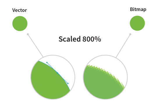
SVG stands for Scalable Vector Graphic: it’s a web-friendly format for displaying vector images—images that can scale to any dimension without pixellating by using mathematical expressions to draw paths. Vector images will look crisp even when blown up to very large sizes, unlike bitmap images (also known as raster graphics), which use bits of specific colors which are mapped to certain regions in the image. Bitmap images will look blurry when viewed at a high resolution, but they are often necessary when the color combinations are complex. A photograph is a great example of a bitmap image, and a simple circle is a great example of an image that can easily be drawn as a vector image.
SVG表示可缩放矢量图形:它是用来显示矢量图像的网页友好格式,它可以在不用数学表达式进行像素化的前提下扩展到任意尺寸来绘制路径。即使是放大到非常大的尺寸,矢量图看起来也还是清晰的,不像位图(也称为光栅图),使用的是被映射到图像特定区域的特定色的比特。位图图像以高分辨率看时会显得模糊,但在颜色组合复杂时它们通常是必需的。一幅照片是位图图像的一个极好例子,而一个简单的圆圈是能容易地画出来的矢量图像的一个极好的例子。
Many of the tools for building web-based interactive charts and graphs (such as D3.js) use SVGs to render visualizations, especially interactive ones. Most of the static infographics, however, are published in bitmap image formats, such as JPEG or PNG.
许多用于构建基于网页的交互式图表和图形的工具(例如 D3.js (http://d3js.org/))使用SVGs来渲染可视化效果,尤其是交互式的。然而大部分的静态信息图则通过位图格式发布,例如:JPEG 或者 PNG。
Size doesn’t just refer to how big an image appears. Pay attention to the size of your file as well. People all around the world use mobile devices to browse the web. Not only can it take a long time to download a large image across a mobile network, but in some parts of the world, each megabyte of data is an added cost. Be nice to your viewers and work to reduce your final image size.
尺寸并不仅仅指一个图像看起来有多大,请同时也关注你文件的大小。世界各地的人都在用移动设备浏览网页。在移动网络中,下载一张大图不仅仅是花费时间的问题,在世界上的一些地区,数据的每兆字节也是需要额外成本的。请善待你的观众,努力降低图像的最终大小吧。
Layout
布局
With static images, the point is to provide everything you want to convey in one or more frames. There are no mouseovers, you can’t click around and select certain details and un-select certain others (e.g., show only state rodeos from 1988 to 1996). Make sure that your key points are visible. If you’re creating a static version of an interactive graphic, keep in mind that you might not be able to show everything that was accessible in your original interactive graphic. If possible, provide URLs so that your readers can also access the raw data and the interactive version of your graphic. That way, they’ll have the option to dig deeper and find more information about the parts of the data that didn’t make it into the print version.
在静态图像中,重要的是在一个或多个帧中提供你想传递的所有信息。没有鼠标悬停,你不能随意点击来选择一些特定细节而不选择其他特定细节(例如:只显示1988年到1996年的洲竞选)。请确保您的关键点是可见的。如果你在为一个交互式图像制作静态版本,请记住你也许不能呈现在原始交互式图像中所能访问到的所有信息。如果可能的话,请提供URLs,这样你的观众也能连接到原始数据和此图像的交互式版本。这样,他们就可以选择进行深入挖掘,找到在打印版本中不能呈现的那部分数据的更多信息。
With interactive graphics, make sure to test any clickable controls that manage the interaction. Are there buttons or slides off to the side, or are they a part of the graphic? Does the viewer have to scroll around to see everything with several options engaged? Test your graphic in different browsers to make sure it all fits—and functions—the way you want.
在交互式图像中,请确保检测任一个管理交互的可点击控件。在侧边有无按键或幻灯片?它们是图像的一部分么?观众需要用几个可用的选项来上下左右滚动才能看到一切么?在不同的浏览器上测试你的图像,以确保图像及其功能按照你所想的方式呈现。
A Note on Static Graphics on the Web
网页上静态图像的一则笔记
These aren’t necessarily interactive, save in that viewers can enlarge them. Because the graphic itself doesn’t change, the main considerations of layout still apply. But just by being on the web, static graphics give us more interactivity than print. For example, they can be linked to their data source, another related graph, or a different web page. Mobile screen sizes still remain a challenge for static graphics specifically because their layout doesn’t change to accommodate smaller screen real estates or different width-to-height ratios.
它们不必是交互式的,保存之使观众可以放大它们。因为图像本身不会变化,布局中的主要关注点依然适用。但是仅仅是在网页上,静态图像也比打印版图像提供给我们的交互性多。例如,它们可以被连接到它们的数据源、另外一个相关的图像,或者是一个不同的网页。手机的屏幕尺寸对于静态图像来说依然是一个挑战,尤其因为它们的布局并不为适应更小的屏幕或不同的宽高比而变化。

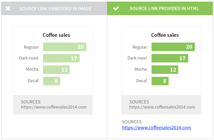
Although URLs displayed as part of a static image can’t be directly clicked on, it’s common for thoughtful publishers to paste reference links just below the graphic so that readers can easily access the source data.
虽然作为静态图像一部分而呈现的URLs不能直接被点击,考虑周全的发布者通常还是会在图像的下部粘贴上参考链接,使读者能够轻松地访问源数据。
Weighing the Need for Interactivity
掂量交互的必要性
Making interactive graphics is getting easier all the time with new software and applications. Interactivity can be not only extremely impressive but also useful, highlighting different types of information more effectively than a static image ever could. But sometimes, you’ll come across an interactive image that actually makes the information more confusing. Other times, you’ll come across an interactive image that seems neat at first, but as you play with it, you realize it’s just bells and whistles. You’re not learning anything new, and the information could just as clearly have been presented in a static image. What a let-down!
新软件和应用使制作交互式图像变得更为容易。交互性不仅非常令人印象深刻,而且还很有用,可以比静态图像更有效地突出不同类型的信息。但是有时候,你也会遇到一个实际上使信息令人困惑的交互式图像。其他时候,你会遇到一个第一眼看上去很整洁的交互式图像,但是当你与其玩耍,便会意识到它其实是花里胡哨的。你并没有学习到新的东西,其信息也是在静态图像中已经清晰呈现了的。好让人失望啊!
Why spend time making a graphic interactive when it doesn’t need it? Interactivity is a tool in the designer’s toolbox. Interactivity should be used when it improves upon a static graphic or adds value to the information and does something that the static image alone could not.
当不需要交互性的时候,为什么还要花时间去制作一个交互式图像?交互性只是设计师工具箱里的一件工具而已。只有在对静态图像进行改进,为信息增添价值,和做一些仅通过静态图像无法完成的事情的时候,交互性才应该被使用。
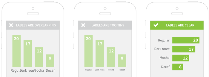
For example, consider the following bar chart:
例如,请思考下面的条形图:
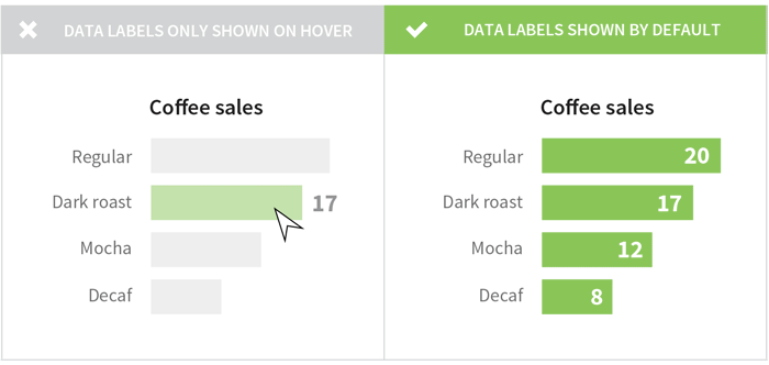
In the figure above, the interactive labels (e.g., the hover effects) aren’t necessary for the viewer’s comprehension. The labels can be added to the chart before hovering, which makes the chart easier to understand and requires less effort from the viewer. When you’re presenting a small, simple chart with a single variable, interactivity can actually detract from your message.
在上图中,交互式标签(例如:悬停效果)对于读者的理解来说是不必要的。此标签可以添加到悬停之前,这样可以使此图表更容易理解,同时对读者投入的要求也有减少。当你是用一个简单的变量呈现一个小的、简单图表的时候,交互性实际上会有损你的信息。
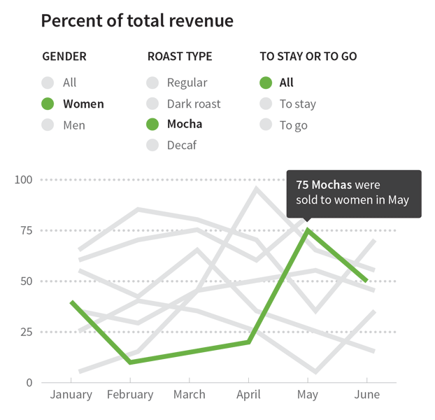
There are plenty of amazing use cases where interactivity adds value to a visualization, but you shouldn’t make yours interactive just because it looks cool. Make sure you’re actually improving the user’s experience. For example, interactivity can help greatly enhance any graphic that illustrates a rich data set you want the user to explore. Let’s say you want to show how different groups of consumers drink coffee. An interactive visualization might allow your user to filter by demographic groups and explore coffee consumption patterns.
有许多使用交互性为可视化增添价值的精彩案例,但是你不应该仅仅因为它看起来很酷而使你的图像成为交互式的。请确保你在真实地提升用户体验。例如,交互性可以极大地帮助增强有些图像的效果,这些图像是在说明一个你想让用户去探究的丰富数据集。比方说,你想显示不同消费群体是如何喝咖啡的。一个交互式的可视化也许可以让你的用户通过人口统计群体进行筛选,并探究咖啡的消费模式。
Interactive graphics can add a lot of value when you have a rich dataset that you want the user to explore. For example, let’s say that you want to know how different groups of consumers drink coffee. An interactive visualization might allow you to filter by demographic groups and explore coffee consumption patterns.
当你有一个丰富的数据集希望用户来探究,交互式图像便可以增添许多价值。例如:比方说你希望知道不同消费群体是如何喝咖啡的。一个交互式的可视化也许可以让你通过人口统计群体进行筛选,并探究咖啡的消费模式。
In static graphics, you can’t rely on visual effects like movement or color changes to make your point. On the other hand, while interactive graphics can incorporate visual effects to show trends across time, they do introduce room for technical difficulties. Be mindful of compatibility across computer systems and browsers. Some of the more complex interactive visualizations require a lot of computational power and can be slow on less-powerful machines such as smart phones. Visualizations made using Flash won’t render on iPhones or iPads, and those made using SVGs won’t work in Internet Explorer 8 or below. Interactive visualizations built for a computer with a mouse may be difficult or impossible to use on touchscreen devices if the creator forgets to test and optimize the graphics for touch-based interactions.
在静态图像中,你不能依靠移动或颜色变化这样的视觉效果来表达自己的观点。另一方面,交互式图像能结合视觉效果来显示它随着时间的趋势,它的确引入了技术难度的空间。请留意跨计算机系统和浏览器的兼容性。一些更为复杂的交互性可视化要求很强的计算能力,如果在一台像智能手机这样稍弱的设备上,其速度可能会慢。使用100Flash制作出来的可视化在iPhone或 iPad上将无法呈现,使用SVGs制作的可视化在Internet Explorer 8 或其以下版本上将无法工作。一个为有鼠标的计算机制作的交互式可视化在触摸屏设备上可能很难或者无法实现,如果制作者忘记测试和优化此图像基于触摸屏的交互性的话。
Any medium for sharing a visualization — whether static or interactive — will have its strengths and its limitations. Think about your story, your audience, and how readers are likely to view your visualizations. Ask for feedback and continue to iterate on your process. And if you’re looking for some friendly feedback and suggestions, you can post your works-in-progress on HelpMeViz.
任何一个分享可视化的媒介,无论其是静态的还是交互的,都有其优势与局限。想想你的故事,你的观众,以及读者有可能如何看待你的可视化。征求反馈信息,并不停地重复你的进程。如果你正在寻找一些友好的反馈与建议,你可以把你正在进展中的工作发布到HelpMeViz上。