
Chapter 17
第十七章
Perception Deception
知觉欺骗
By Mizel Djukic
With great power comes great responsibility.
能力越大责任越大。
So far you’ve picked up a bunch of tools you can use to build compelling stories through visualizations. If the story you tell is powerful enough, it can change people’s minds and move them to action. But before you rush out there to change the world with your newfound powers, let’s go over some of the accidents your visuals might cause because of the quirky way our brains perceive things.
现在你已经接触到了不少可以帮助你讲一个引人入胜故事的可视化工具。如果这故事够震撼,那它可以改变人们的思想,并促使他们去做一些事情。但在你忙着用新技能去改变世界之前,让我们再花点时间整理一下,看看我们的某些错喔理解可能会产生哪些问题。
How We Perceive Differences
我们如何分别差异
Our brains love a difference. Even when we’re just relaxing in front of our computers watching cat videos and drinking iced tea, our brains are constantly looking for boundaries in our environment, differentiating between our feet and the floor, our hands and the keyboard, our cup and the table. How we perceive these boundaries depends on a variety of factors, including color, contrast, shape, and perspective.
我们的大脑喜爱差异。即使我们只是休闲地一边喝茶一边看电脑屏幕上的猫咪视频,我们的大脑却持续关注着周围环境里事物的差别,能够随时区分脚和地面,手和键盘,杯子和桌面的区别。我们如何感知到这些差别涉及了很多因素,包括颜色,对比,形状和主观感受等等。
Differences in Color and Contrast
颜色和对比的区别
When it comes to color and contrast, the example that probably comes to mind is black and white. It’s very easy for us to distinguish between the two because one is so dark and the other is so light. Varying the lightness and darkness of a color (known as the value) is one way to establish contrast, but it’s not the only way. You can also vary the saturation (or chroma) so that a color looks pale and faded or bright and vivid. Or you can establish contrast by simply using different colors (or hues) that are easy to tell apart from each other.
当谈到颜色和对比时,我们很容易想到黑色与白色。区分这两种颜色非常容易,一个特别深,一个特别的浅。明暗度(又称色值)的差异是形成对比的方法之一,但不是唯一的方法。你还可以变化饱和度(又称色度)使得一些看起来苍白褪色,另一些明亮生动。再或者只要用不同的颜色就可以形成对比(又称色彩)
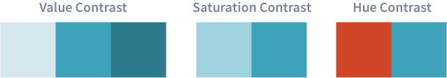
How our brains perceive contrast depends on the context. The higher the contrast between objects, the more different we think they are.1 For example, take a look at the following graph:
我们的大脑根据不同的情况可以感知到不同的对比。物体间的差别越大,我们越能明显的区分它们 2。比如我们看看下面幅图:
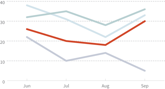
Anything stand out to you? Probably the red line, for a few reasons. First, the red line is more saturated than the other lines. Second, red and blue are good contrasting colors. Third, to our eyes, reds and yellows come to the foreground while blues recede to the background.3
有没有什么东西比较突出?可能是这条红线,有这么几个原因:首先这条红线比其他的颜色饱和度更高。其次,红色和蓝色是经典的对比色。此外,对我们的眼睛来说,红色和黄色处于视觉前端的位置,蓝色在后端充当背景。
Because of the high contrast between the red line and everything else, our brains will naturally focus on it, and we’ll probably think that there’s something special about the red line. Having the red line stand out like this is fine if there’s a good reason for doing so. For example, if each line represents the level of happiness over time in different neighborhoods, then the red line can highlight your neighborhood. However, if it turns out that there’s nothing special about the red line, then it winds up being distracting and confusing.
由于红线和其他部分的强烈对比,我们的大脑自然而然的关注在红线上,于是我们可能会觉得红线有些与众不同的地方。如果有合理的理由,红线就算比较突出也没什么。比如说,每一段都代表了不同区域一段时间内的幸福指数,那红色的这部分相当于被强调了。然而,事实上红线却没有任何特别之由于红线和其他部分的强烈对比,我们的大脑自然而然的关注在红线上,于是我们可能会觉得红线有些与众不同的地方。如果有合理的理由,红线就算比较突出也没什么。比如说,每一段都代表了不同区域一段时间内的幸福指数,那红色的这部分相当于被强调了。然而,事实上红线却没有任何特别之处,所以它只是分散了精力和令人迷惑。处,所以它只是分散了精力和令人迷惑。
Now take a look at the following map which shows the level of excellence in different parts of a land called Relethounia:
现在看一下这个地图,它展示了R区域内的:
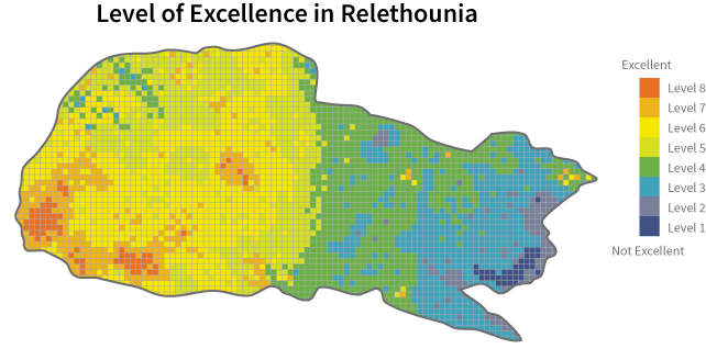
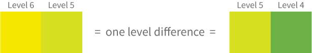
What stands out to you this time? Maybe that there seems to be some sort of division between the western and the eastern parts of the country? This apparent division is the result of the relatively high contrast between the light green and the dark green areas. So it seems like there’s a bigger difference between these two parts than between, for example, the yellow and the light green areas. But when we look at the legend, we see that the light green parts differ from the yellow and the dark green parts by the same amount: one level of excellence.
这次哪里更突出?或许在西部和东部间有种分界?这个明显的分界是由于浅绿色和深绿色之间相对强烈的对比。所以看起来这两个部分的差异大于黄色和浅绿色的差异。但如果我们看图例,我们发现黄色与浅绿色之间的差异和浅绿色与深绿色之间的差异都是一个优秀度。
So be careful with color and contrast. When people see high contrast areas in your graphs, they’ll probably attach some importance to it or think there’s a larger difference, and you want to make sure your graphs meet that expectation.
所以请小心颜色与对比,当人们看到你图中存在强烈的对比时,他们可能会认为这是由于存在了更大的差异。当你画图时,注意使你的图表可以达到你的预期。
Differences in Shape
形状的差别
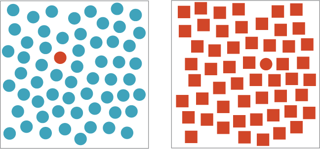
Our brains have a much harder time telling the difference between shapes. To illustrate, see how long it takes you to find the red circle in each of the figures below:
我们的大脑分辨图形需要更长的时间。为了证明这一点,看看你需要多久从下面的图里找到红色的圆圈:
Adapted from: Healey, Christopher G., Kellogg S. Booth, and James T. Ennis. “High-Speed Visual Estimation Using Preattentive Processing.” ACM Transactions on Computer-Human Interaction 3.2 (1996): 4.
改编自: Healey, Christopher G., Kellogg S. Booth, and James T. Ennis. “High-Speed Visual Estimation Using Preattentive Processing.用快速视觉估计” ACM Transactions on Computer-Human Interaction 3.2 (1996): 4.
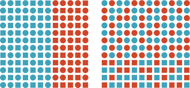
Did you find the circle faster in the first figure? Most of us do because our brains are better at differentiating between colors than between shapes. This is true even if some other factor is randomly changing and interferes with what we see.4 For example, see how long it takes you to find the boundary in each of the figures below:
你有没有觉得找到第一张图的圆圈更快?我们大部分人都会这样,因为大脑更善于区分颜色而非形状。即使一些因素随机变化后依旧如此。比如下图,你需要用多长时间来发现下面每个图中的界限:
Adapted from: Healey, Christopher G., Kellogg S. Booth, and James T. Ennis. “High-Speed Visual Estimation Using Preattentive Processing.” ACM Transactions on Computer-Human Interaction 3.2 (1996): 5.
改编自: Healey, Christopher G., Kellogg S. Booth, and James T. Ennis. “High-Speed Visual Estimation Using Preattentive Processing.” ACM Transactions on Computer-Human Interaction 3.2 (1996): 5.
Most of us find the color boundary (between red and blue) in the left figure more quickly than the shape boundary (between circles and squares) in the right figure, even though both figures have another factor that’s randomly changing and interfering with our ability to detect the boundary. In the left image, the objects are organized by color while the shape is randomly changing. The reverse is true in the right image: the objects are organized by shape while the color is randomly changing.
我们大部分人会觉得左图里颜色的界限(红色和蓝色)比形状的界限(圆圈和正方形)更容易分辨,即便是两个图中都有其他因素随机改变作为干扰。在左边的图里,物体以颜色划分,形状随机变化。右边的图形正好相反:物体以形状划分,颜色随机变化。
All of this brings us to the question of whether or not it’s a good idea to use icons or pictograms in our visualizations because the simplest icons are defined by their form, not color. Luckily for us, the chapter on The Importance of Color, Font, and Icons offers some wisdom:
这使我们不禁怀疑在可视化中使用图标或者象形图是否可行,因为简单的图标都是定义形状而非颜色。所幸颜色,字体和图标的重要性 一章给我们提供了一些方法:
The rule should be: if you can make something clear in a small space without using an icon, don’t use an icon. […] As soon as anyone asks, “What does this icon mean?” you’ve lost the battle to make things ruthlessly simple.
规律是:如果在一小块空间里你可以不用图标表达清楚,那么就不要用图标。只要有人问起:这个图标是什么意思?那你就输了。
Icons can be a clever and useful way to illustrate an idea while making your infographic more attractive, but in order to be effective, they have to strike the right balance between detail and clarity. Too much detail leads to icons that are hard to distinguish from each other; too little detail leads to icons that are too abstract. Both overcomplicated and oversimplified shapes can lead to a confused audience.
图标可以帮助你描述一个想法更清楚,也使你的饱含信息的图表更加吸引人,但为了有效率,它们需要找到细节与简明之间的平衡点。太多的细节导致图标难以与其他图片的信息区分;太少的细节使图标过于抽象。过于复杂和过于简单的图形都会使观众困惑。
Now you be the judge. Good icons can communicate an idea without the benefit of color. Each of the three maps below shows the locations of hospitals and libraries in an area. Based solely on the icons, which map is the quickest and easiest for you to understand?
现在你来做裁判,一个好的图标可以不依靠颜色而传递信息。在以下三个地图中都依靠图标代表医院和图书馆的信息。仅仅看这些图标,你觉得哪个地图最直观容易理解呢?
Differences in Perspective
透视偏差
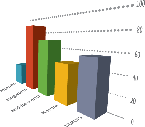
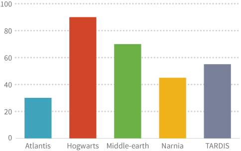
We live in a 3-dimensional world with 3D movies, 3D printing, and 3D games. It can be very tempting to add some of this 3-dimensional razzle dazzle to your 2-dimensional visualizations. Most of the time, though, people end up more dazed than dazzled by 3D graphs.
我们生活在3D的世界里,有3D电影,3D打印还有3D游戏。在传统的2D图表中,加一下3D的酷炫效果会非常吸引人,尽管大多数时候,人们被着3D的效果搞得晕乎乎。
As mentioned earlier, our brains already have a hard enough time distinguishing 2-dimensional shapes from each other. Adding a third dimension to these forms often adds to confusion as well. But don’t take our word for it. Which bar graph do you think is easier to read?
如前文提到的,我们的大脑本来就不善于分辨2D的形状,再引入第三维会增加困难。但别对这句话太当真,下面哪个图你觉得更容易理解?
Harder-to-read graphs aren’t the only reason to avoid 3D in your visualizations. The other reason is that our brains associate differences in perspective with differences in size. You’ve probably experienced this phenomenon many times, whether you’re looking down a street or up at a skyscraper: objects in the foreground appear bigger while those in the background appear smaller.
不容易读仅仅是尽量避免3D图表的原因之一。另一个原因是你的大脑认为大小的差别代表了存在差异。你可能已经经历过这种现象很多次,无论是望向路的尽头还是抬头看摩天大楼,离得近的物体看起来比离远得物体要更大。
For example, take a simple square table. You know that because it’s a square, all four sides are the same size. But when you look at it from the side:
举例来说,看这个普通的方桌,你知道它是正方得因为每条边都一样长,但假如你从另一个角度看:
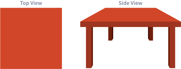
It seems like the side closer to you in the front is bigger than the side farther from you in the back.
它近的边看起来要远的边长。
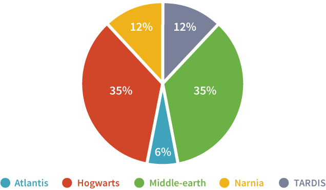
For this reason, many types of 3D visualizations can be misleading. In the pie chart below, which slice do you think is bigger: the red slice or the green slice? the blue slice or the yellow slice?
也正是由于这个原因,很多3D的可视化图表都存在一些误导。在下面这个饼状图中,哪一块儿你觉得更大一点呢,是红色的那部分还是绿色的?是蓝色的还是黄色的?
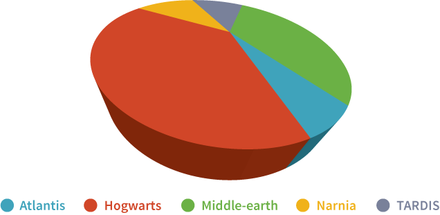
In terms of which piece represents more data, the red slice and the green slice are actually the same size. As for the blue and the yellow slices, the yellow slice is bigger: in fact, it’s twice as big as the blue slice. This is not clear from the 3D pie chart because of the way perspective distorts the size of the slices, but it is clear when we look at the same pie chart in 2D form:
关于到底哪块代表更多内容,红色的部分其实与绿色的完全相同。黄色的部分比蓝色的部分要大,实际上黄色是蓝色的两倍大。但这张3D饼状图扭曲了它们的关系,没有展示清楚这些关系,反倒是通过2D饼状图,我们可以很直观的得到正确的信息:
So unless you have a really, really, really good reason to use 3D graphs, it’s better to avoid them. But just because 3D graphs aren’t great doesn’t mean 3D is bad in general. For example, 3D visualizations can be very useful in some types of scientific modeling, such as a 3-dimensional model of the brain that highlights active regions, or a 3-dimensional map that models the topography of an area. There are definitely instances when 3D enhances a visualization. Just make sure the 3D you add actually helps your audience see what you’re trying to show instead of getting in the way.
所以说,除非你有非常非常重要的理由来使用3D图表,尽可能避免它们。但也不能说它总是不好的。举例来说,3D可视化图表在一些科学建模中可以非常有价值,比如标记了被激活区域的大脑3D模型,或者是一张标识一个地区的地形的3D地图。只要确保你加入的第三维确实帮助观众理解你想传达的信息。
How We Compare Differences
我们如何比较差异?
So what have we learned so far? That our brains are pretty good at seeing differences in color and contrast, but less good at interpreting differences in shape and perspective. Generally speaking, it takes us longer to understand a data visualization when there are more differences to process. So help a brain out and minimize the differences! One way to do this is to be consistent in your graphs.
目前我们都学到了什么?我们的大脑十分擅长区分颜色和对比度的不同,而不那么擅长区分形状和关系的不同。一般来说,一张数据可视化图标里的对比越多,我们也要相应花更多的时间去理解它。所以帮我们的大脑一把,减少差异吧!方法之一就是保持你图标之间的一致性。
Consistent Alignment
一致对齐
Our brains are fairly good at comparing differences in length, but only when things share a common reference point.5 For example, try to compare how long the bars are in the following graph:
我们的大脑很擅长比较长度的不同,但前提是物体有一个共同的参照系。6比如说,让我们来比较下图里的条形图长度:
Now try to do the same thing for this graph:
现在再来看同样的东西在这幅图里:
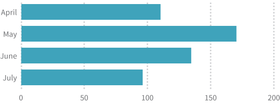
Wasn’t it easier to compare the bars in the second graph? Even though both bar graphs have a horizontal axis with labels and tick marks, the second graph minimizes the differences our brains have to process by making all of the bars start from the same reference point. Consistent alignment allows our brains to focus on the lengths without having to worry about different starting points for each bar.
是不是第二幅图里更容易比较哪一条更长?尽管两幅图中的条形图都有垂直于条形图的标签和刻度线,第二幅图通过将所有条形图从同一参照点开始,简化了我们大脑所需要的处理。一致对齐原则使我们的大脑可以专注于长度而不需要受到不同起始点的困扰。
Consistent Units
一致的单位
There may come a time when you want to show two sets of data in the same graph: something like a double line graph or a double bar graph, for instance. This is fine as long as you stick to the principle of consistency.
有的时候你会在同一张图表里展示两组数据:像双折线图或双条形图。只要你可以坚持一致性原则就都是可以的。
For example, the following bar graph compares how much it would cost to buy a few magical things in the United States versus the United Kingdom:
比如说,下面的这个条形图比较了在美国和英国买一些神奇的东西花费的区别:
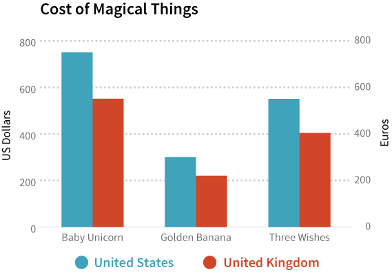
It seems like things are a bargain in the UK! But hold on because in this graph, it’s not enough to simply compare the bar lengths. There’s another difference we have to account for: the different units on the vertical axes. On the left side, the units are in US dollars. On the right side, the units are in euros. So in order to accurately compare prices, we need to either convert dollars to euros or euros to dollars. Some people can do this kind of currency conversion on the spot, and they are to be commended for their admirable math skills. The rest of us are going to look at that task and wonder why the maker of this bar graph is being so cruel to us. So don’t be cruel. Convert different units to consistent units so that your audience doesn’t have to. Like this:
这样看起来在英国买东西还真是赚到了!不过等等,因为在这张图里,要比较的不仅仅是图形的长度。还有另一个因素需要考虑进来:纵轴的单位。左侧显示的是美元为单位,右侧是欧元为单位。因此要是想准确的比较两者的区别,我们需要将二者进行转换。有些人可以在脑子里实时的进行转换,他们的数学一定是好的过分。对于其他人来说,不要太为难自己。像下面的图里那样把单位换算成一致的,省得观众再耗费精力:
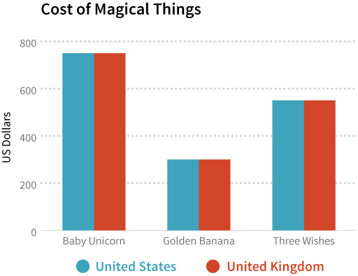
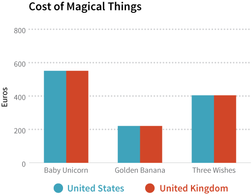
As it turns out, magical things cost the same in the US and the UK.
如图里所示,实际上这些神奇的东西在美国和英国的价格是一样的。
Consistent Scales
一致的数值范围
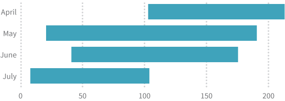
In addition to having consistent units, your graphs should have consistent scales. For example, the bar graph below compares how long it takes an Earthling and a Martian to master different superpowers:
除了单位要一致之外,你的图表里也需要有一致的数值范围。举例来说,下面的条形图比较了地球人和火星人掌握一门超能力所需要的时间:
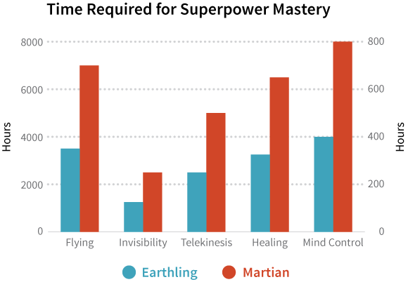
The heights of the bars make it seem like Martians take longer to master superpowers, but again, the vertical axes are different. Even though the units are consistent this time (both axes use hours), the scales are different. On the left side, the scale is in thousands of hours for Earthlings. On the right side, the scale is in hundreds of hours for Martians. The same data with consistent scales would look like this:
从高度来看,好像火星人要花更久时间才能学会超能力,但是我们仔细看纵轴是不一样的。尽管这次的单位是一致的,可是数值范围却不同。在图表的左边,地球人是以1000小时为单位的;右边的火星人,他们的数值范围是以每100小时。如果把数值范围调整一致的话,图就看起来是这个样子了:
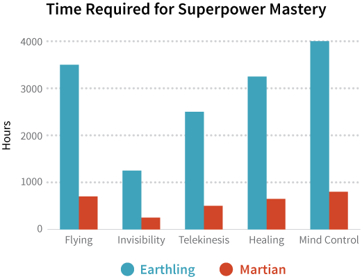
A graph with consistent scales makes it visually obvious that Martians master superpowers much more quickly than Earthlings do. Maybe it’s because they have less gravity on their planet.
这张统一范围的图表非常明显的显示了火星人学习超能力的时间远快于地球人。或许是因为他们星球的重力更小吧。
Transparency
透明性
When it comes to data visualization and transparency, keep in mind that the data we show are just as important as the data we don’t. We want to give readers enough context and any other additional information they may need to accurately interpret our graphs.
当谈到数据可视化和透明性时,需要注意的是我们展示的数据和我们没有展示的数据同样重要。我们希望给读者足够的上下文和任何可能帮助他们准确理解我们图表的额外信息。
Cumulative Graphs
累计图
A cumulative value tells you how much so far: it’s a total number that adds up as you go along. For example, let’s say you’re keeping track of how many superhero sightings there are in your neighborhood:
累积值告诉你到现在一共多少:是从开始每一期加起来的总计。比如说,我们假设你在统计有多少英雄片电影在你家门口拍摄:
|
Month |
Number of Superhero Sightings |
Cumulative Number of Superhero Sightings |
|---|---|---|
| January | 60 | 60 |
| February | 40 | 100 = 60 + 40 |
| March | 38 | 138 = 60 + 40 + 38 |
| April | 30 | 168 = 60 + 40 + 38 + 30 |
| May | 25 | 193 = 60 + 40 + 38 + 30 + 25 |
| June | 26 | 219 = 60 + 40 + 38 + 30 + 25 + 26 |
| July | 20 | 239 = 60 + 40 + 38 + 30 + 25 + 26 + 20 |
| August | 18 | 257 = 60 + 40 + 38 + 30 + 25 + 26 + 20 + 18 |
| September | 30 | 287 = 60 + 40 + 38 + 30 + 25 + 26 + 20 + 18 + 30 |
| October | 62 | 349 = 60 + 40 + 38 + 30 + 25 + 26 + 20 + 18 + 30 + 62 |
| November | 75 | 424 = 60 + 40 + 38 + 30 + 25 + 26 + 20 + 18 + 30 + 62 + 75 |
| December | 90 | 514 = 60 + 40 + 38 + 30 + 25 + 26 + 20 + 18 + 30 + 62 + 75 + 90 |
|
月份 |
英雄片电影数量 |
累计英雄片电影数量 |
|---|---|---|
| 一月 | 60 | 60 |
| 二月 | 40 | 100 = 60 + 40 |
| 三月 | 38 | 138 = 60 + 40 + 38 |
| 四月 | 30 | 168 = 60 + 40 + 38 + 30 |
| 五月 | 25 | 193 = 60 + 40 + 38 + 30 + 25 |
| 六月 | 26 | 219 = 60 + 40 + 38 + 30 + 25 + 26 |
| 七月 | 20 | 239 = 60 + 40 + 38 + 30 + 25 + 26 + 20 |
| 八月 | 18 | 257 = 60 + 40 + 38 + 30 + 25 + 26 + 20 + 18 |
| 九月 | 30 | 287 = 60 + 40 + 38 + 30 + 25 + 26 + 20 + 18 + 30 |
| 十月 | 62 | 349 = 60 + 40 + 38 + 30 + 25 + 26 + 20 + 18 + 30 + 62 |
| 十一月 | 75 | 424 = 60 + 40 + 38 + 30 + 25 + 26 + 20 + 18 + 30 + 62 + 75 |
| 十二月 | 90 | 514 = 60 + 40 + 38 + 30 + 25 + 26 + 20 + 18 + 30 + 62 + 75 + 90 |
The first column of values gives you the number of sightings in each month, independent of the other months. The second column gives you the number of sightings so far by adding the numbers as you go down the column. For example, in January there were 60 superhero sightings, so the total so far is 60. In February there were 40 sightings, which means the total so far is 100 because the 40 sightings in February get added to the 60 sightings in January. And so on and so forth for each month that follows.
表格中的第一列数值给我们了每个月数量的观测值,独立于其他月份。第二列值给了截止到这个月累计观测到多少。比如说,一月份有60次英雄片的拍摄,所以截止到一月一共也是有60次英雄片拍摄。二月份有40次拍摄,所以说总共是100次,因为累计了一月60次和二月40次总共的拍摄次数。依此类推。
Why are we doing all this math? Because there’s something called a cumulative graph, which shows cumulative values.
为什么我们要解释这些数学?因为有一种累计图,可以表示累计值。
If you’re going to show people a cumulative graph, it’s important that you tell them it’s a cumulative graph.
如果你要给别人展示累计图,声明这个图是累计值非常重要。
Why? Because this is what a regular line graph of the monthly, non-cumulative values looks like:
为什么?因为一个正常的月折线图,非累计值是这样的:
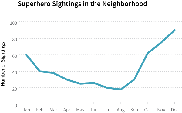
Notice how the line dips and rises: the number of monthly sightings generally decreases through August, then increases until the end of the year. Superheroes are apparently busier during the holiday months.
请注意在这里线条有升有降:每月拍摄的次数直到八月前都在减少,然后又一直增加。
Compare the regular line graph above with the cumulative graph below:
比较一下普通折线图和累计图:
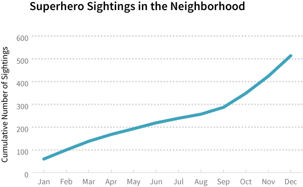
Do you see how the general decrease in superhero activity from January through August is not obvious in the cumulative graph? The line in the cumulative graph keeps going up because the numbers keep adding up and getting bigger. This upward trend masks other patterns in the data. It’s easy to look at a cumulative graph and mistakenly think it’s showing a trend that consistently increases when that’s not really the case.
你感觉到从一月到八月每个月的拍摄数量减少在这张累计图里并不明显了吗?累计图的线不断向上延伸因为数字一直在累加变大。这种向上的趋势掩盖了数据中的其他特征。看到一张累计图不断的增加很容易让人误解为每月都在增加,而事实上很可能不是如此的。
So when it comes to cumulative graphs, if you show it, let them know it, or else people might think the numbers are going up, up, and away.
所以说,如果需要用到累计图,一定要让读者清楚,不然他们只会觉得数字不断增加。
Context
背景知识
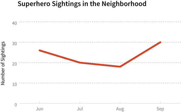
Without context, the stories our graphs tell have no point of reference that we can use to make a comparison. For example, is the following trendline average or unusual?
没有背景知识,我们的图表没有可供衡量的标准,所以就讲不出。比如说,下面这个趋势图是普通的还是异常的?
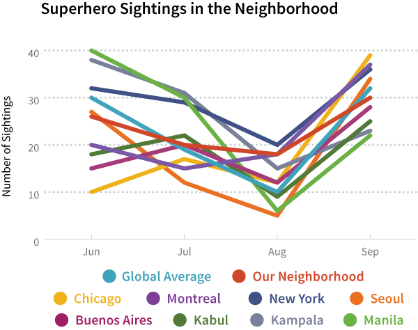
Alternatively, too much data can overwhelm an audience. In this case, the context gets lost among all the information and instead becomes an overcomplicated truth. For example, isn’t it harder to pick out the red trendline in the graph below?
另一方面,太多的数据也会使观众承受不住。这种情况下,背景信息在过多的事实中掩盖。举例来说,在下图中找到红色的线是不是很困难?
This is why data visualization is challenging! You have to figure out how to present your data in a way that allows readers to clearly see trends and accurately compare differences. For example, let’s take a look at the following graph:
这是为什么数据可视化如此富有挑战!你必须弄清如何展示这些数据,从而使读者清楚的了解趋势并准确的比较差异。比如说让我们看看以下这幅图:
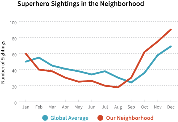
If you want to show your neighbors how the number of superhero sightings has changed over time, then presenting data that runs the course of a year instead of a few months provides more context. And instead of showing trendlines for dozens of cities around the world, your graph will be less cluttered and more relevant to your audience if you just show the trendline for your neighborhood. Finally, it’s a good idea to include some point of reference—like a trendline for the global average—so that your neighbors get a sense of how typical or atypical their neighborhood is.
如果你想向你的邻居展示,在你家周围拍摄英雄片的次数,然后展示一年的数据而非短短几个月显得不够具体。与其把12个城市的趋势线全在一张图里画出来,只展示自己的附近区域的拍摄数量可以使你的图表更加清晰易读。最后,再加上一些参照系——比如说全球的平均值趋势线——这样你的邻居就可以感觉出他们的小区是典型的还是不典型的了。
The next and last chapter of this book goes into further detail about the importance of context and points out other ways graphics can mislead an audience. Just remember: being consistent and transparent goes a long way in your visualizations.
下一章,也是本书的最后一章,我们会继续深入解释背景信息和其他可能产生误解的制作图表的方法。但只要记住:保持一致和透明在数据可视化中有一段很长的路要走。