Chapter 13
第十三章
Graphing the Results of Checkbox Responses
绘制复选框选择结果
By Ellen Cooper
著:Ellen Cooper,译:郁浮
This chapter focuses on checkbox responses or multiple response questions, where a question can be answered with more than one answer, if applicable.
本章主要讨论复选框选择问题、或者称为多项选择问题,这类问题可以有多个答案。
Checkboxes Vs. Radio Buttons
复选框 VS. 单选框
Let’s say you’re doing a survey and you’re interested in what multimedia devices your respondents have used over the last six months. You would use a checkbox response question if you wanted to find out all of the multiple devices that people used over the six-month period. A radio button only allows respondents to select a single answer, so you could only use it to find out, for example, which one device a person used most often during that same six-month period. Each type of question has merit; which you should use just depends on the purpose of your question and how you are going to use the results.
假设你对人们在过去六个月内使用了什么多媒体设备十分感兴趣,决定进行一次抽样调查。如果你想知道过去六个月人们使用过的所有多媒体设备,最好采用复选框。单选框只允许受访者选择一个答案,因而,采用单选框我们只能了解到,比方说,过去六个月人们使用哪个设备最频繁。每种类型的问题都有它的优点,具体应该使用哪种取决于,你设置该问题的目的和你想怎样使用调查结果。
What a Checkbox Question Really Is
复选框问题到底是什么样的
So here’s the most important thing to know about checkbox questions, and it’s why you have to consider how you graph the results of checkbox questions differently than you do the results of other types of questions. Checkbox questions aren’t really their own question type! They’re actually just a shorthand way to write a series of yes/no questions. A respondent checks a box if an answer choice applies and leaves it blank if it doesn’t.
下面我们将要介绍复选框问题最重要的特征,以及在结果绘制的时候,为什么要将复选框问题与其它类型的问题区别对待。复选框问题实质上不是一个单纯的问题类型,而是很多个yes/no问题的简写。受访者分别检查每个框、如果答案是肯定的就打勾、否则直接留白。
We have the checkbox format because it makes surveys more streamlined and easier to understand. In the example below, we asked, “Which of the following electronic devices have you used in the past 6 months? Please select all that apply.” The premise behind the question is that it’s likely that a respondent could use more than one electronic device over a 6-month period, such as a cell phone and a tablet.
我们之所有要采用复选框格式,是因为它可以使得问卷调差更加的精简、更易于理解。下面的例子中,我们的问题是“过去六个月中,你使用过下列那些电子设备?多选。”这个问题的前提是,受访者过去六个月中,可能使用过一种以上的电子设备,比如说手机和平板电脑。
If we were to pose this as a series of yes/no questions, it would read something like this:
如果我们把这个列为一系列的是/否问题,就会得到如下结果:
| In the last 6 months, have you used a/an: | |
|---|---|
| Desktop PC? | Y / N |
| Desktop Mac? | Y / N |
| iPad? | Y / N |
| Tablet (other than an iPad)? | Y / N |
| Laptop (Mac or PC)? | Y / N |
| Cell phone? | Y / N |
| 在过去6个月中,你有使用过下列电子设备吗? | |
|---|---|
| 台式PC机? | 是/否 |
| 台式Mac电脑? | 是/否 |
| iPad? | 是/否 |
| 平板电脑(除iPad以外)? | 是/否 |
| 笔记本电脑(Mac或PC)? | 是/否 |
| 手机? | 是/否 |
With the checkbox question, survey respondents only need to check the answers that apply to them, while in a series of yes/no questions, they would need to respond to every question, even if all their answers were “No”. With a checkbox question, you can simply provide a “None” option at the bottom of your choice list to handle this situation. When several yes/no questions are related, checkbox questions also prevent repetition of instructions, since all the questions are grouped into one.
在复选框问题中,受访者只需勾选合适的选项,然而如果是一系列的是/否问题,即使所有的答案都是否,他们也需要一个一个做出选择。而在多选问题中,你只需要在选项最后提供一个“以上都不符合”选项就可以轻松解决这个问题。当数个是/否问题相互关联的时候,多选问题可以避免重复提示类似问题,因为所有问题都分在了一个组内。
These changes can help improve survey readability, flow, length, and overall response rates. However, if you want to handle the resulting data correctly, it is very important for you to remember that the underlying structure of a checkbox is actually a series of dichotmous questions.
这些特征可以帮助提高调查的可读性,流畅性,缩减问卷长度从而提高回复率。但是,如果你想正确处理数据结果,很重要的一点是你要记住多选问题实际上是一系列是否问题的组合。
How Checkbox Answers are Received
复选框的答案是怎样汇总的
How your results or raw data are compiled will, of course, depend on the program you are using to design and distribute your survey. One of the more common formats is shown in the table below; this particular data structure reflects how a checkbox question serves as a quick way to represent a series of yes/no questions. A “1” is shown when a device was selected and a “0” if a device was not selected.
你的问卷答案和原始数据的汇总方式取决于你设计和分发问卷的流程。下表是一个比较常见的汇总格式,这种数据结构反映了复选框问题是怎样便捷的展示一系列是/否问题的集合的。当选项被勾选时记1,否则记0。
| Date | Q1_PC | Q1_Mac | Q1_Tablet | Q1_iPad | Q1_Laptop | Q1_Cellphone | Q1_None |
|---|---|---|---|---|---|---|---|
| 10/02/2013 | 1 | 0 | 1 | 0 | 0 | 1 | 0 |
| 10/01/2013 | 0 | 1 | 0 | 1 | 1 | 1 | 0 |
| 09/30/2013 | 1 | 0 | 0 | 1 | 0 | 1 | 0 |
| 09/30/2013 | 1 | 0 | 1 | 0 | 0 | 1 | 0 |
| 09/30/2013 | 0 | 1 | 0 | 0 | 1 | 1 | 0 |
| 09/30/2013 | 0 | 1 | 1 | 0 | 0 | 1 | 0 |
| 09/30/2013 | 1 | 0 | 0 | 0 | 1 | 1 | 0 |
| 09/27/2013 | 1 | 0 | 0 | 0 | 1 | 1 | 0 |
| 09/26/2013 | 1 | 0 | 0 | 0 | 1 | 1 | 0 |
| 09/26/2013 | 0 | 0 | 0 | 0 | 0 | 0 | 1 |
| 6 | 3 | 3 | 2 | 5 | 9 | 1 |
You might also receive results like this:
你也有可能收到这样的答案:
| Date | Response |
|---|---|
| 10/02/2013 | PC, Tablet, Cellphone |
| 10/01/2013 | Mac, iPad, Tablet, Cellphone |
| 09/30/2013 | PC, iPad, Cellphone |
| 09/30/2013 | PC, Tablet, Cellphone |
| 09/30/2013 | Mac, Laptop, Cellphone |
| 09/30/2013 | Mac, Tablet, Cellphone |
| 09/30/2013 | PC, Laptop, Cellphone |
| 09/27/2013 | PC, Laptop, Cellphone |
| 09/26/2013 | PC, Laptop, Cellphone |
| 09/26/2013 | None |
| 日期 | 答案 |
|---|---|
| 10/02/2013 | 个人电脑, 平板电脑, 手机 |
| 10/01/2013 | Mac, iPad, 平板电脑, 手机 |
| 09/30/2013 | 个人电脑, iPad, 手机 |
| 09/30/2013 | 个人电脑, 平板电脑, 手机 |
| 09/30/2013 | Mac, 笔记本电脑, 手机 |
| 09/30/2013 | Mac, 平板电脑, 手机 |
| 09/30/2013 | 个人电脑, 笔记本电脑, 手机 |
| 09/27/2013 | 个人电脑, 笔记本电脑, 手机 |
| 09/26/2013 | 个人电脑, 笔记本电脑, 手机 |
| 09/26/2013 | 无 |
Or like this:
或者像这样:
| Date | Q1_PC | Q1_Mac | Q1_Tablet | Q1_iPad | Q1_Laptop | Q1_Cellphone | Q1_None |
|---|---|---|---|---|---|---|---|
| 10/02/2013 | Q1_PC | Q1_Tablet | Q1_Cellphone | ||||
| 10/01/2013 | Q1_Mac | Q1_iPad | Q1_Laptop | Q1_Cellphone | |||
| 09/30/2013 | Q1_PC | Q1_iPad | Q1_Cellphone | ||||
| 09/30/2013 | Q1_PC | Q1_Tablet | Q1_Cellphone | ||||
| 09/30/2013 | Q1_Mac | Q1_Laptop | Q1_Cellphone | ||||
| 09/30/2013 | Q1_Mac | Q1_Tablet | Q1_Cellphone | ||||
| 09/30/2013 | Q1_PC | Q1_Laptop | Q1_Cellphone | ||||
| 09/27/2013 | Q1_PC | Q1_Laptop | Q1_Cellphone | ||||
| 09/26/2013 | Q1_PC | Q1_Laptop | Q1_Cellphone | ||||
| 09/26/2013 | Q1_None |
All three of the above examples represent the same answers, but they’re formatted in different ways. Since different survey collection tools format checkbox responses in different ways, you may need to reformat your data to match the specific format required by the visualization software you are using.
以上三个例子都代表了同一个问题的相同答案,但是他们是以不同的方式展示的。由于不同的调查问卷收集工具用不同的方式汇总答案,你也许需要给你的数据重新编排格式来匹配你所使用的可视化软件。
Let’s take a look at a summary of possible responses to the checkbox question posed above.
现在让我们来看看对上面多选题答案的汇总,如下所示:
| Table 1 Electronic Devices Used | Total |
|---|---|
| PC | 421 (84%) |
| Mac (desktop) | 300 (60%) |
| Tablet (any kind) | 285 (57%) |
| iPad | 185 (37%) |
| Laptop | 200 (40%) |
| Cell phone (any kind) | 450 (90%) |
| 表1 使用的电子产品 | 总计 |
|---|---|
| 个人电脑 | 421 (84%) |
| Mac | 300 (60%) |
| 平板电脑 | 285 (57%) |
| iPad | 185 (37%) |
| 笔记本电脑 | 200 (40%) |
| 手机 | 450 (90%) |
You may notice that the total number of responses (1,841) is greater than the number of people that did the survey (N=500)! Why? It’s because of the whole “a checkbox is really a bunch of yes/no questions rolled into one” thing. The total possible number of checked boxes in a checkbox question? It’s the (# of “real” answer options) X (# of respondents). (Here, a “real” answer option means one that isn’t “None,” “N/A” or “Prefer not to Answer,” since selecting one of those options would prevent a person from choosing any other answers in additional to that.) For this survey, there were 6 device options (aside from “None”) that a person could select and there were 500 people that answered the survey. So the total number of boxes that had the potential to get checked during the survey was 3000, not just 500.
你可能注意到了答案总数1,841比受访人总数500要大,这是因为多选题是一系列是/否问题的集合。多选题答案的总数是受访者选择的使用电子产品数量的加总。对于这个调查问卷来说,有6个电子产品选项,有500个受访者,所以理论上来说所有答案的加总数量最大可以达到3,000而非500。
Displaying Your Results
展示你的结果
Since the total number of responses is greater than the number of respondents, you need to use some caution when creating graphs based on these data. There are a few different ways to illustrate your results, depending on what your overall question of interest is.
当你基于这些数据绘制统计图时要注意,因为答案的总和比受访人总数大。调查结果展示方法有多种,具体采用哪一种取决于你对答案的哪方面感兴趣。
Bar Charts
条形图
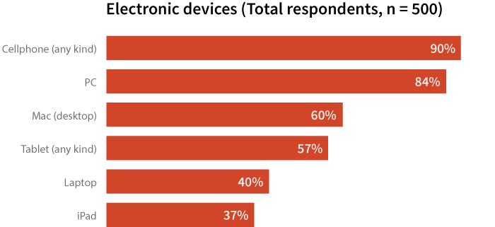
One way is to construct a bar graph and base the percentages on the number of respondents that selected each answer choice, like in the graph below. Clearly, cellphones (90%) and PCs (84%) are the most commonly-cited electronic devices used in the past six months.
描述方法之一是制作一个条形图,然后根据每一个选项的答案所占受访者总数的百分比来得出调查结论。如下图所示,手机(90%)和个人电脑(84%)是过去六个月中使用最频繁的电子产品。
However, the fact that the total adds to more than 100% can be unsettling for some. An alternative way to illustrate the results is to base the percentages on the total mentions (1,841). Analyzing results based on mentions is useful when you want the percentages to total 100%.
然而,这种百分比加起来超过100%的情况可能会让人觉得奇怪。另外一种描述方法是基于总答案中各个电子产品所占百分比来分析统计。当你想让百分比总和为100%时,这种方法尤为有效。
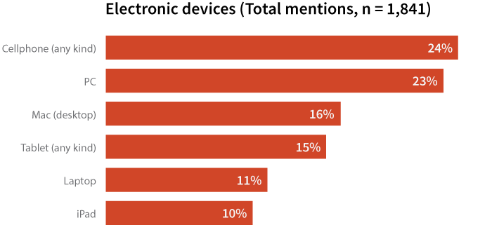
Keep in mind that this way of displaying data is based on the number of mentions of a device, not the number of consumers who use that device. While you may be tempted to say, “24% of consumers used a cellphone in the past six months,” the bar chart above isn’t actually displaying that information.
请记住这种展示数据的方法是基于电子产品被选择的次数,而不是使用该电子产品的受访者数量。你很有可能根据这张表得出“有24%的消费者在过去6个月中使用了手机”的结论,但事实上这个条形图反映的并不是这个信息。
Rather than the number of respondents (500), the chart shows the number of responses (1,841) to our survey on electronic devices. So, it would be better to say, “Based on all devices mentioned, cellphones were mentioned approximately one-quarter (24%) of the time, followed closely by PCs (23%).” This percentage represents the number of cellphone mentions (450) out of the total mentions (1,841) and accurately reflects the information on display.
由于这张图的样本总体是1841个有效答案而非500个受访者,所以以下结论会更为合适:在所有被提到的电子产品中,手机在24%的情况下被提到,其次是个人电脑23%。这一比例代表了手机在1841个有效答案中被提及了450次。
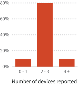
Depending on your question of interest, you can also group your data. Maybe you’re more interested in reporting how many devices people used rather than exactly what devices were. You could make a column chart like the one below.
基于你所感兴趣的问题的不同,也可以给你的数据分组。如果你对人们使用了多少种电子产品的兴趣程度胜于他们使用了哪些种类的电子产品,可以考虑制作如下的柱状图:
Warning about pie charts and checkbox questions
关于饼状图和复选框问题的提示
Don’t use pie charts if you’re basing your percentages on the number of respondents that selected each answer choice! Pie charts are used to represent part-to-whole relationships and the total percentage of all the groups has to equal 100%. Since the possible sum of the percentages is greater than 100% when you base these calculations on the number of respondents, pie charts are an incorrect choice for displaying these results.
不要根据受访者选择的每个选项的百分比来绘制饼状图。饼状图是用来描述部分和全部的关系,全部的百分比之和必须等于100%。如果基于受访者选择的每个选项的百分比来绘制饼状图,这些百分比加总起来有可能大于100%,从而导致描述结果不准确。
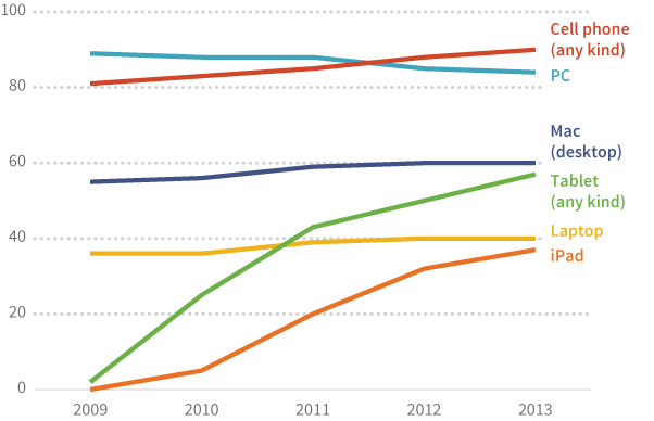
Over Time
时间序列数据
If your checkbox responses have been collected over a period of time, say 2009–2013, you could display the responses in a line chart as shown below.
如果你在某一时间段内多次收集该多选题答案,比如从2009年至2013年,你可以用如下折线图来描述调查结果。
Attitudinal Measurements
态度衡量
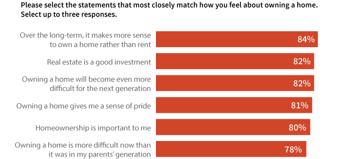
So far, we’ve been looking at the use of checkbox questions to gather data on basic counts (e.g. electronic devices used). Checkbox responses can also be used to assess agreement with attitudinal statements. The graph below shows attitudes of homeowners towards owning their home. In this case, since the statistic of interest is what percentage of homeowners agree with each statement, it is probably best to keep the graph as is, with the total exceeding 100%.
截至目前为止,我们一直讨论的是,如何采用复选框问题来收集计数类数据(例如:使用的电子产品数量)。复选框问题也可以用来完成态度一致性状态的评估。下图描述了房主对于拥有自己的房子的态度。在这种情况下,由于我们感兴趣的统计量是,同意每种陈述的房主的百分比,因此即使百分比总和查过100%,我们也最好是维持图的原状。