
Chapter 12
第十二章
Deciding Which and How Much Data to Illustrate
决定哪些和多少数据需要显示
By Margie Henry
Let’s lay some groundwork for successful data presentation. If done thoughtfully, it will go a long way in helping you determine which aspects of your data to visualize and how. We’ll begin with a little brainstorming. You can do this in just a few thoughtful moments alone or working as a team. Your work here is two-fold: define your message and define your intended audience. You can flip this sequence around, but we’ll begin with defining your message.
让我们为成功数据展示奠定一些基础。如果深思熟虑做,将在很长的一段时间内帮助你确定哪个方面的数据可视化及如何实现数据可视化。让我们先开始一个小小的头脑风暴。你可以是独自思考做这个,也可以将其作为一个团队的工作。你需要做两件事:定义你的信息,定义你的听众。你可以颠倒这个顺序,但是我们将从定义你的信息开始。
Determine Your Message
确定你的信息
Before tackling which data to present, take a few minutes to decide what you want to say. Close down your latest social media craze, step back from your computer, and consider the exact message you want to communicate. Ask yourself, “What do I know, what does it mean, and why do I believe it’s important?”
在处理哪些数据展示之前,花几分钟来确定你想说什么。关闭你最新的狂热社交媒体,回到你的电脑前面,并且思考你想转达的最准确的信息。问你自己“你知道哪些,它意味着什么,为什么我认为它很重要”。
Consider a dataset containing observations on different types of caffeinated beverages and the effects of their consumption. Don’t stop at “caffeine affects the body.” You never want to present information that solicits a “well, duh” response. Dig deeper. Be more specific. What do your data say about how caffeine affects the body? Are the effects all good, all bad, or maybe an interesting combination of both? Do the effects change with a person’s age and/or sex? Are some caffeinated beverages better or worse for overall health? Your answer should be concise: short, sweet, and to the point. A statement such as “Coffee has an ability to reduce the risk of certain diseases and ailments when consumed in moderation because it contains key antioxidants.” goes a lot further than our original example. Even better, it establishes a pretty clear focus for our visuals and some common language to use with our audience.
思考一个数据集包含不同类型的含咖啡因的饮料,及对消费效果观察。不要停留在“咖啡因会影响身体”。你不想要呈现的信息得到‘嗯,啊’的反应。深层次的挖掘更具体的内容。你的数据说咖啡因如何影响身体了吗?影响都是好的,都是坏的,或者是两者有趣的结合?影响会随着人的年龄或者性别有所改变?含咖啡因的饮料对这个健康来说是更好还是更坏?你的回答必须是简明的:简短的、贴切的、直接的。例如:在适度的消耗下,咖啡有减少某些疾病风险的能力,因为他包含重要的抗氧化剂。比我们最初的例子更进一步。更重要的是,它为可视化建立了相当明确的重点,让我们与观众有公用的语言。
Right about now you should be having a flashback to English 101. That’s because determining your key message is just like writing a good thesis statement. If you can’t summarize your key message in a few concise sentences then you probably need a better grasp of the topic. Sound harsh? Maybe, but not as harsh as presenting information to a crowd of your yawning disinterested peers. Fight the urge to skip this step! If you’re the paper-and-pencil type, go ahead and write your message down! You can use it as a reference throughout your data visualization process.
现在你可能有幻觉回到英语101。这是因为决定你的关键信息就像写一篇好的论文。如果你不能用几个简洁的句子总结你的关键信息,那么你可能需要更好的掌握主题。听起来很残酷吗?也许,但是没有比把信息呈现给一群打哈欠的同事那么残酷。全力跳过这一步!如果你是纸和铅笔类型的,开始写下你的信息!你可以把它作为整个数据可视化过程中的参考。
Simply put, your chances of creating a compelling, well-organized visual argument are immeasurably greater if you begin with a clear and focused message.
简而言之,你创建一个引人注目的机会,如果一开始你有一个清晰明确的信息,那么组织良好的视觉论点将是无可估量的。
Understand Your Audience
了解你的听众
You’ve determined your message. Let’s now consider the importance of understanding your audience. This knowledge will go just as far in helping you determine which and how much of your data to illustrate.
你决定了你的信息。现在让我们考虑了解你的观众有多重要。这些知识将帮助你确定哪些和多少数据需要显示。
Take another couple of minutes and ask yourself “what information is most valuable to my audience,” “what role will my visuals play in this dialogue,” and “what action(s) do I want to incite?” Would you spend time explaining algebra to a group of engineers? (The correct answer is no.) What would be the point? The better you know your audience, the better your chances of creating a successful visual presentation.
再花两分钟,问问自己“对于我的观众来说,什么信息是最重要的”,“在这个对话中,我的可视化效果会扮演什么角色”及“我想要煽动什么行为?”你需要话时间对解释一群工程师解释线性代数吗?(答案是否定的)那么什么是重点呢?你越来了解你的听众,你越有可能创造一个成功的视觉呈现。
Let’s imagine presenting data on “Environmental Conservation in the New Millennium” in the following scenarios: (1) on a small-scale blog visited mostly by lay environmentalists; (2) in a classroom of high school students; and (3) at a fundraising event for an environmental conservation organization. Would you create and explain your data the same way to each audience? Hopefully not. You should be able to make a few assumptions about what’s most relevant to present even if you’ve never met a single audience member.
让我们想象一下在“环境保护在新千年”上数据呈现的情景:(1)在小规模的博客上,访问中主要是环境保护主义者;(2)在高中学生的课堂上;(3)在一个环境保护的筹款活动会上;你会以相同的方式向你的观众创建和解释数据吗?希望不是。你应该能够一些最相关的假设,即使你没有见过任何一个观众。
In our first scenario, we can assume visitors are already interested in conservation. They may have spent time doing actual research. A portion are return visitors who may rely on your specific perspective; they might see you as a content area expert. Your site is, most likely, not the only blog on which they rely, but one day it could be their favorite! At minimum, we can assume they’ve stumbled upon your blog intentionally, and not because of issues with autocomplete. In this instance, breadth and depth are key. You can take more time to explore, deconstruct and restructure the data. If the intention of your site is to incite further exploration, you can presents visuals that pose questions or make viewers question their own beliefs.
在第一个场景中,我们可以假设访问者已经对环保感兴趣。他们可以花费时间做实际的研究。部分可能是回头客,他们依赖你(所研究)的特殊场景。他们可能会把你看做这个领域的专家。你的站点可能不是他们唯一依赖的博客,但是有一天可能成为他们最喜欢的。至少,我们可以假设,他们故意偶然发现你的博客,并不是因为自动提醒。在这种情况下,广度和深度是关键。你需要有更多的时间去探索、解析、重组数据。如果你网站的意图是引发更深层次的探索,你可以呈现可视化的信息,提出问题或者让质疑自己的信仰。
Our high school student scenario is a bit different. You can assume that your audience possesses very little familiarity with the topic. (Though, as always, some members will know more than others.) Attendance may be mandatory, not voluntary: keeping their interest will be key. You’ll want to present fascinating, high-level, attention-grabbing visuals, that address immediate and pressing issues. Approach your vocabulary carefully: explain less-common terminology, and include more visual indicators of good/bad, positive/negative. Your visual display is intended to clearly present the importance of conservation, leaving little room for doubt.
我们的高中学生场景会有点不同。你可以假设你的听众有一点了解这个话题。(尽管通常有一些成员可能了解得更多)出席可能是强制的,而不是自愿的。让他们感兴趣是关键。 你想要呈现迷人的、高水平的、吸人眼球的可视化信息,直接跑出问题。小心使用的词汇:解释不常用的专业术语,包含好/坏,正/负的视觉指标。你的可视化信息需要清晰的展示环境保护的重要性,没有质疑的余地。
At last, we have our fundraiser attendees. This audience needs to feel that environmental conservation is a cause worthy of their monetary support. It will likely be a mixed crowd: interested donors, their disinterested partners (who just came for free food and drinks), field experts, employees, and interns. You can assume they’ll expect a balance of sentiment, the need for urgency, and solid fact. We’ve assumed the crowd is mixed, so you’ll want to use language that is both familiar and easily understood while not appearing condescending. This audience expects to have their interest in the importance of conservation confirmed and your visuals should accommodate this. As with your student group, leave no obvious question unanswered.
最后,还有我们的募捐活动参与者。这种观众需要让他们觉得环境保护值得他们投入资金。这个可能是一个混合的人群:感兴趣的投资者,他们无私的合作伙伴(仅为免费的食物和饮料而来),领域专家,员工和实习生。你可以假设他们急需一个确凿的事实来达到情感的平衡。我们假设这个群体是混合的,所以你需要使用通俗易懂的语言,而不要出现晦涩难道的(高深的语言)。这些观众的兴趣在保护确定的重要性上,你的视觉效果应该适应这一点。作为你的学生群体,没有留下任何明显的没有回答的问题。
Presenting emotion-driven content doesn’t mean leaving out key facts if they don’t fit into your ideal storyline. Be extra careful when sharing cause-driven content, and do your best to ensure that your values don’t interfere with an accurate presentation of the data!
显示情感驱动的内容并不意味着离开了关键的事实,如果他们不适合你的里面故事情节。当分享事件驱动的内容时,格外小心,尽你最大的努力确保你的价值观在一个准确的数据面前不被干扰。
Now that we’ve discussed the importance of determining a key message and understanding its audience, let’s delve into deciding which data to illustrate.
既然我们已经讨论了确定关键信息的重要性和理解它的观众,让我们深入研究展示哪些数据。
Deciding Which Data to Illustrate
决定展示哪些数据
You can begin the process by expanding your key message into a narrative or story. Our goal is to present a sequence or set of facts which gradually leads your audience to the key message. The data you choose to illustrate should set the context, establish the main points of interest, and explain how these are interconnected. Be intentional in what you present, but do not censor data to further your argument. Your visual story should be based on what the data—and not only what you want to—say.
你可以开始这个过程,通过扩展你的关键信息到叙事或故事。我们的目标是列出一个序列或者一组事实,逐渐引导你的观众去关键信息。你选择展示的数据需要有上下文联系,建立主要的兴趣点解释这些是如何关联的。有意的呈现(数据),但是不要在更远的论点上论证数据。你的视觉故事应该基于数据而不仅是你要想什么。
Take, for example, the following table presenting the I.Q. scores of children who were adopted at a young age and the socioeconomic status (based on income and occupation) of both their adoptive and birth parents. These data are taken from C. Capron and M. Duyme’s 1989 study, “Children’s IQs and SES of Biological and Adoptive Parents in a Balanced Cross-Fostering Study,” published in the European Bulletin of Cognitive Psychology.
例如, 下面的表展示了儿童时代被收养的孩子们的智商分数,及收养父母和亲生父母的社会经济地位(基于收入和职业)。数据来源于1989年C. Capron和M. Duyme’s的研究中。“孩子们的智商与亲生父母、养父母的社会经济地位在交叉培养平衡的研究”发表在欧洲认知心理学公告上。
| I.Q. | Adoptive Parent SES | Birth Parent SES |
|---|---|---|
| 136 | High | High |
| 99 | High | High |
| 121 | High | High |
| 133 | High | High |
| 125 | High | High |
| 131 | High | High |
| 103 | High | High |
| 115 | High | High |
| 116 | High | High |
| 117 | High | High |
| 94 | High | Low |
| 103 | High | Low |
| 99 | High | Low |
| 125 | High | Low |
| 111 | High | Low |
| 93 | High | Low |
| 101 | High | Low |
| 94 | High | Low |
| 125 | High | Low |
| 91 | High | Low |
| 98 | Low | High |
| 99 | Low | High |
| 91 | Low | High |
| 124 | Low | High |
| 100 | Low | High |
| 116 | Low | High |
| 113 | Low | High |
| 119 | Low | High |
| 92 | Low | Low |
| 91 | Low | Low |
| 98 | Low | Low |
| 83 | Low | Low |
| 99 | Low | Low |
| 68 | Low | Low |
| 76 | Low | Low |
| 115 | Low | Low |
| 86 | Low | Low |
| 116 | Low | Low |
Let’s discuss two possible narratives that you could create from this dataset: “Children’s Intelligence Limited by Adoptive Parents’ SES,” and “Adopted Children’s Intelligence Influenced by Both Biological And Adoptive Parents’ SES”.
你可以从这个数据集合创建表单,让我们来讨论两种可能的情况:“孩子的智力受限于养父母的社会经济地位”,“被收养的孩子的智力受亲生和养父母的社会经济地位的影响”。
Children’s Intelligence Limited by Adoptive Parents’ SES
孩子的智力受限于养父母的社会经济地位
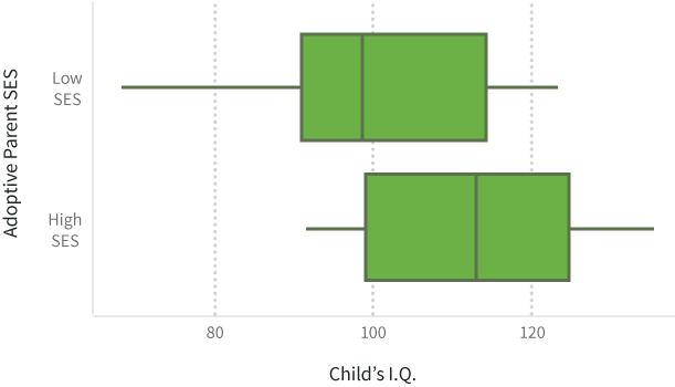
We can create a story supporting the first message by solely looking at the adoptive parents’ socioeconomic status: children of those adoptive families with a high SES had a mean I.Q. of nearly 112 whereas those adopted by a low SES family had a mean I.Q. of 99. But, this narrative would only include half of the relevant information: it leaves out entirely the SES of the child’s biological parents. Understandably, this could play just as big a role as the family’s socioeconomic status would likely impact the level and quality of prenatal care, and, in turn, the in utero development of the child.
我么可以创建一个故事支持第一个信息,只看收养父母的社会经济地位:这些收养家庭的孩子,拥有高社会经济地位的平均智商高的近112,低社会经济地位的平均智商99。但是这些说法可能仅仅包含一半的相关信息,它完全漏掉了亲生父母的社会经济地位。可以理解的是,它可能发挥一样大的作用,家庭的社会经济地位可能会影响产前护理的水平和质量,反过来影响在子宫里发育的孩子。
Adopted Children’s Intelligence Influenced by Both Biological And Adoptive Parents’ SES
被收养的孩子的智力受亲生和养父母的社会经济地位的影响。
A little more boring of a title, but far more accurate. When we include both the adoptive and biological parents’ SES we get a much better picture of the impact that each has on the child’s I.Q. Specifically, we see:
多无聊的一个标题,但非常准确。当我们包含养父母和亲生父母的社会经济地位的时候,我们获取到更多影响每个孩子智商的照片,我们看到:
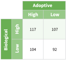
So, more correctly, a child’s I.Q. is a function of both his or her biological and adoptive parents’ socioeconomic status. If both have a high SES, the child’s I.Q. will tend to be the highest. If one has a high SES and the other a low SES (it doesn’t matter which set of parents has which), the child will typically have an average I.Q. And finally, if both have a low SES, the child will tend to have a below-average I.Q.
所以,更准确的说, 孩子的智商是一个他或她的生父母和收养父母的社会经济地位的函数。如果两者都有高社会经济地位,孩子的智商往往是最高的。如果有一个高社会经济地位,一个低社会经济地位(无论哪个父母),孩子通常会是平均智商,如果两个父母都是低社会经济地位,孩子的智商会低于平均水平。
Our first example is a clear illustration of what happens when you create a story based on what you want to say, and not what the data say. Unfortunately, applications of data such as this are neither uncommon nor farfetched. We see this done on the news and during casual conversation. The omission of key facts and related variables creates a visual that is full of misinformation. It lacks credibility and presents obvious biases. The second instance presents far less outright bias, is a plausible story based on the data available, presents context, introduces all variables, and explains how the variables are connected. Although it will usually result in a less-sensationalized title, a full presentation of all relevant data is the only way to maintain a credible and airtight argument.
我们的第一个例子明显的显示出,创建的故事基于你想说什么,而不是基于数据。不幸的是,应用程序的数据像这样既不常见也不牵强。我们看见这些在新闻上合随意的交谈中。关键信息和相关变量的疏漏,创建了一个充满错误的可视化信息。他缺乏可信性,出现明显的偏见。第二个例子显得更加偏见,貌似是基于有效数据的可信故事,介绍了所有变量,解释数据如何关联。尽管它通常不会导致耸人听闻的标题,但是一个完整演示稿的所有相关联数据是维持一个可信的、无懈可击的论点的唯一途径。
决定展示多少数据
In previous sections we’ve gone over how to determine a key message, the importance of identifying the audience, and a process for isolating facts to illustrate. We can work on determining how much of our data we need to visualize.
在前面的章节中,我们重温了一个关键的点, 识别观众以及分离要阐述的重点的重要性. 我们就可以继续确定多少数据是我们需要可视化的。
If illustrating data is supposed to make information more digestible, then care should be taken not to present more than the audience expects, or more than they need to be able to understand your message. As you decide how much data to illustrate, keep in mind the idea that more is not always synonymous with better unless it’s meaningful and presented in support of your key message. In most instances, your visuals will be taken as part of a narrative, contents in a storehouse, or maybe a combination of both.
如果说明数据应该是使信息更加容易理解, ,然后应该小心不要超过观众预计,或者超过他们需要能够理解你的信息。 当你决定多少数据来说明, 记住这个多并不是好的同义词,除非它是有意义并且能够支持你的关键信息。 在大多数情况下,你的可视化会作为描述或者宝库内容的一部分,或者是两者的结合。
As previously discussed, a narrative is a simply a story presenting a sequence of facts which gradually lead your audience to the key message. When you think of the narrative, think of written reports, PowerPoint presentations, and individual articles in newspapers and magazines or online. You want to illustrate just enough data for your audience to easily identify and understand your perspective without becoming exhausted. Each illustration should have a specific purpose. Avoid including visuals simply because they impress. As a test, try removing one or more illustrations or rearranging the presentation order. Does your narrative still make sense? Each illustration should stand alone, without too much verbal or written explanation, but if it doesn’t add to the audience’s understanding, it’s probably not needed.
正如前面讨论的,叙事是一个简单的故事呈现一系列逐渐引导听众到关键信息的事实。当你想到叙述,认为书面报告、演示文稿、和个人在报纸和杂志或网上的文章。你想说明你的听众足够多的数据很容易识别和理解你的观点而不变得空洞。每个插图应该有一个特定的目的。避免包括视觉仅仅是因为他们留下深刻印象。作为一个尝试,试着删除一个或多个插图或重新安排表示顺序。你的故事仍然有意义吗?每个插图应该独立,没有太多的口头或书面的解释,但是如果它没有帮助听众理解,它可能不太需要。
For the audience members wanting more, you can always provide links or references to additional takes on your data along with detailed commentary to contextualize and further explain the information. If you’d like to impress a technically savvy audience, a graphical appendix could be even be shared as a GitHub repository or a gallery of code gists hosted on bl.ocks.org.
当听众需要了解更多的时候, 你总是可以提供链接或参考附加在数据和详细的评论中,通过这些上下文将进一步解释信息。 如果说你想要给那些对科技有格外悟性的听众一个深刻的印象, 一个图形化的类似 GitHub仓库或者是一系列托管在bl.ocks.org的代码片断的展示 的附录可以分享出来.
A storehouse, on the other hand, can be thought of as an information repository. Usually consisting of multiple narratives and stand-alone content, this is an example of when more can be better. Unlike those of a narrative, storehouse visitors are less susceptible to data fatigue. They respond well to large quantities of data because they expect to spend time building or enhancing their understanding of a topic. The storehouse doesn’t need to focus on presenting a single message. Its audience seeks new treatments of data, a diversity of perspectives, and various dissections of a topic or content area. In the storehouse scenario, the main criterion for deciding how much data to illustrate should be whether something will create redundancy. If you illustration fails to add something new to the mix or to expand on a topic, it can likely be omitted.
一个仓库,另一方面,可以被认为是一个信息的存储库。通常由多个故事和独立的内容,这是更多的一个例子可以更好。与叙事的不同,数据仓库的游客不太容易疲劳。他们对大量的数据做出了积极回应,因为他们希望花时间建立或加强他们对主题的理解。仓库不需要专注于提供一个信息。观众寻求新的处理数据的方法,多样的观点,以及各种主题或者内容的剖析。在仓库场景下,决定多少数据去说明的主要标准是这些东西是否冗余创建。如果你说明不能添加新的东西混合或扩大的话题,它可能可以省略。
To exemplify, let’s imagine a cinephile and store manager. Both are browsing a blog filled with upcoming movie release dates, reviews, and critiques of directors. The cinephile spends hours on the site, soaking up each and every visual and reading through its content. The manager simply wants to know what popular movies he should order for the next holiday season. The manager probably wouldn’t want to spend hours trying to find his answer. For our cinephile, more is better; for the manager, less is more.
例证,让我们想象一个cinephile和商店经理。都是浏览博客充满了即将到来的电影发布日期,评论和批评。cinephile花时间在网站上,吸收每一个视觉和阅读其内容。经理只是想知道流行的电影他应该为下一个假期。经理可能不需要要花费几个小时来寻找他的答案。对于cinephile,越多越好,对于经理,少即是多。
Editing and Revising
编辑和校正
Here’s a frequent and frustrating occurrence: you did your brainstorming, made a bunch of visualizations, and edited down to the best subset to include in your project. You were careful not to overwhelm your audience and you made sure that your illustrations covered the most important key points without being redundant.
这有一个频繁的和令人沮丧的事情:你做头脑风暴,让一群可视化,并编辑的最佳子集包含在您的项目中。你小心的不要压倒你的听众,你确保你的插图最重要的关键点没有一点冗余。
How maddening, then, to field questions in a presentation, or see comments in a story or blog post, calling for the very visualizations that you left on the cutting room floor! You second-guess your calls, resist the urge to argue with the person asking the question, grit your teeth and grumble.
多么令人发狂,然后在一个展示中一个专业问题,或者是一个故事,博文中的评论要求你提供更多可视化的展示,而然这些你已经被你剪下了。你讲出你的想法然后迫切的和这些提问题的人去争论吗,放弃吧,咬紧牙关,抱怨下就好了。
It’s okay. If you do a good job and engage your audience, they will naturally be curious and want more information. They might want to see the same data presented in a different way, to dig down, or to zoom out. If these questions mirror the decisions you were making in your selection process, that’s good news! It means you are on the same wavelength as your audience, and that they are involved and interested in the story your data tell.
好了,如果你做得很好,让你的听众参与其中,他们自然会感到好奇,想要更多的信息。他们可能希望看到相同的数据以不同的方式呈现,挖下来,或缩小。如果这些问题反映决定你的选择过程,在视线以外,年代好消息!这意味着你正在与你的听众相同的波长,和他们感兴趣的故事告诉你的数据。
There are several ways to keep (but de-emphasize) the visualizations that did not make the cut in your main collection. For slideshows, it is common practice to have a collection of extra slides after the “thank you” or conclusion slide that contain information that might be interesting but that won’t fit within the time limit. “Yes, I do have that broken down by [industry sector/year/country/gender],” you say confidently as you flip to the prepared slide. Voila!
这里有几种方法去保持(不再强调)可视化不在你的主要收集里面。幻灯片,经常的做法是在“谢谢”后面还有一些额外幻灯片或者结论幻灯片,包含有趣的信息,但是不适合有时间限制。“是的,我有,我打破了[行业/年/国/性别]”,当你你翻到准备的幻灯片时,你自信的说。
Another way to do this would be to publish interactive versions of your visualizations that allow the viewers to dive in and explore the information themselves. If you’re able to share the raw datasets, that’s even better! That way, those who wish to dig deeper and understand the data in new ways will have the option to do so. We’ll talk more about static and interactive graphics later in the Print vs. Web chapter.
另外一个方法是发布你的可视化交互版本,让访问者可以自己深入研究这些信息。如果你可以共享原始数据,那就更好了。这样,那些希望用新方式深入了解数据的就可以这么做了。我们将更多的讨论静态和交互图形在接下来的打印和web章节。
If you’re looking for early feedback and you’re not exactly sure where to turn, you can check out HelpMeViz, a community site where you can post your works-in-progress and receive friendly suggestions on how to improve. Getting feedback from your audience and revising your visuals to better fit their needs is all a part of the process!
如果你正在寻找早期的反馈,你可能不知道在哪转弯,你可以查看一下HelpMeViz,一个社区网站,你可以提交你的工作进度并且收到友好的改进建议。收集你的观众的反馈,校正你的可视化去更好的符合他们的要求是这个过程的一部分。