
第十五章
色彩、字体、图标的重要性
作者:Howard Coale,译者:谈修竹
Form (Frequently) Tyrannizes Function
形式(通常)决定功能
Listening to someone with a good voice sing a few bars of “I Want to Hold Your Hand” pretty much beats out the experience of hearing someone mutter “E=MC2” any day, but that preference isn’t a reflection on the value of the information in those two phrases. Rather, it describes how the experience of information can change the perception of its value. In other words, as information designers, we aspire to be singers, not mumblers. No, that doesn’t mean “change everything to make it pretty”: it means you must first and foremost acknowledge that you are not presenting information, you are designing an experience of information.
聆听拥有美妙嗓音的歌者唱几句“I Want to Hold Your Hand”,胜过某人整天喃喃自语“E=MC2”,但是这种偏爱,并未反映出这两个场景下信息的价值,相反说明了信息体验会改变对价值的认知。换句话说,作为信息设计者,我们立志成为那个美妙的歌者,而不是那个喃喃自语的人。别误会,这并不意味着我们要让任何东西变得优美。这意味着:你必须首先并且首要的意识到,你不是在呈现信息,你是在设计一个信息体验。
In this chapter, we’ll cover a few basic design principles and tools that can be used to sway, focus, clarify, enhance, and sharpen your audience’s experience and understanding of data (and specifically fonts, hierarchy, color and icons).
在这章里,我们将探讨一些基本的设计原则和工具,用来影响、聚焦、明晰、增强、塑造听众的体验,以及对数据的理解。我们会重点介绍字体、信息层级、色彩和图标。
The Myth of Objectivity
客观性的迷思
Before we dive into design fundamentals, we need to understand just how much design can impact the perception of information. At its heart, data visualization is a form of storytelling, and no story is ever told from an objective point of view. The graphic representation of data has been used just as effectively by dictators and terrorists to justify acts of violence as it has by scientists to report groundbreaking research.
在我们深入设计基础之前,我们需要理解何种程度上设计会影响到信息的认知。本质上,数据可视化是一种述说故事的形式,从来没有故事是从客观的角度述说的。科学家将数据图形化用于报告创新研究如同独裁者和暴力分子用于为暴力行为的辩护一样有效。
To that point, a critical rule in data visualization is to realize you’re creating, at some level, a biased point of view. If you don’t, you’ll have little chance of successfully judging the honesty, accuracy, elegance or utility of your solution. Even the most typical chart should seek to captivate and inspire that part of the human mind that yearns for meaning and narrative while in the act of seeking information.
从这点上说,数据可视化中决定性的准则是:认识到你正在创造,某种程度上,一个带有个人偏见的视角。如果你不能认识到这一点,你几乎没有可能成功的判断你的方案是否公正、精确、优雅、实用。在找寻信息的过程中,即使是最经典的图都能使人们渴望了解它的意义和故事。(译注:一图胜千言)
You might be a researcher reading this who wants to ask: “I’m making a graph to show how many times a rat turned left or right in a maze. Why does a graph that displays that information necessarily reflect a bias or a narrative perspective?” The answer is that though the data show the rat turned left 35 times and right 22 times, the way the presentation of that data is designed will — usually within one or two seconds — teach the viewer what is important and what is not. Being aware of that fact during the design process can make your graphic representations of data much more effective and puts you in a better position to think through what you want to express before, and while, you design.
正在阅读的你也许是一个研究人员,你可能会问:“我做了一个图形用来展示,在迷宫里耗子向左或向右转了多少次。展示这种信息的图表,为什么需要反映一种偏见或者一种叙事视角?”。答案是,虽然数据显示了耗子左转了35次、右转了22次,但是通过设计的数据呈现方式,在一两秒内,就能够告诉读者哪些是重要的,哪些不是。领悟到了这些,使得数据的图表呈现将更有效,同时你也能够在设计前、设计中,更好的去思考你想表达什么。
Fonts & Text
字体和文本
Legibility and Readability
清晰度和可读性
When designing the viewer experience for a given set of information, the most important rule of all is to strive for ruthless simplicity in every choice you make. In the “narrative” of the information you are presenting, the style of presentation should never demand attention (that is, the design should complement the data, not the other way around!). That applies to everything from the design of an illustrative representation like a chart to something as seemingly simple as font selection. In the world of typography, the balance between legibility and readability is a decision that a typographer makes when designing a typeface (more commonly known as a font). Not all fonts that are legible (i.e., one character can be easily distinguished from another) are necessarily readable (i.e., designed in such a way that supports and enhances reading so that the reader easily absorbs the text’s meaning without being distracted by the font).
当设计一段信息的观看体验时,最重要的准则是你的每个选择都要力求简洁。在你要呈现的信息述说中,呈现的风格不应该试图成为关注的焦点(也就是,设计必须服务于数据,而非相反!)。这个原则适用于每一点,大到设计图解描述如一个图表,小到简单如选择字体。在排版的世界里,当设计一个字体时,权衡清晰度和可读性是排版工人需要做出的决定。并不是所有清晰的字体(比如每个字符可以轻易的从其他字符中识别出来)必然的是易读的(比如通过某种方式的设计,能够支持和增强阅读体验,从而使读者更容易沉浸在文字含义里面,而不会被字体干扰的心烦意乱)。
For instance, there are many fonts that are designed specifically to stand out. For example:
例如,有很多字体特地设计得比较有特色,比如下图所示:
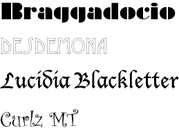
These “display typefaces” are good examples of fonts that are legible, but not readable. They were created to emphasize small pieces of text, like a title or heading, or to convey a specific style rather than communicate information quickly and transparently. In general, you should not use display fonts in data visualization because they create additional work for the reader. You can’t afford your viewer struggling for a second, or even half a second, trying to understand what something says. Nor you do you want a specific font skewing the meaning of your data because your audience automatically associates that font with a specific type of content. We’re looking at you, Charlie Brown, when we say no Comic Sans!
这些“酷炫字体”就是很好的例子,它们很清晰,但不易读。它们被创造出来用于强调一小段文字,比如名称或标题,或者传达某种特别的风格,而不是轻快简明的信息传递。一般来说,在数据可视化中,你不应该使用酷炫字体,因为它们给读者增加了额外的理解负担。你不应该让读者挣扎上一秒钟,甚至是半秒钟,只是为了理解信息的含义。你应该也不希望一个特别的字体歪曲了你的数据的意义,仅仅因为你的读者自动把这个字体联系到某类特别的内容。当我们说不要使用Comic Sans时,我们正在说你呢,Charlie Brown(译者注:关于这个字体,可以查看豆瓣帖子,http://www.douban.com/note/259659900)。
This is one way that data visualization and storytelling are similar. If your audience becomes too aware of the style in which a story is told, they may be distracted from the meaning, or the valuable details in the content. The bottom line is that you should use fonts that are legible and strive to present them in a readable fashion.
这就是数据可视化和讲故事相似的地方。如果你的听众更在意讲故事的方式,他们就不能专注到故事本身的意义,或者有价值的内容细节上。底线就是,你应该使用清晰的字体,并力求以可读的方式呈现。
Fonts for data visualization that do a good job of communicating the message without calling attention to themselves include Helvetica, Arial, and Gill Sans. In general, it’s best to use sans serif fonts for numbers in charts of any sort because serif fonts tend to have more “visual noise” to be interpreted. For example:
在数据可视化中,Helvetica、Arial、Gill Sans能更好的传递信息而不注重字体本身。一般来说,任何图表中的数字都最好使用无衬线字体,因为衬线字体都倾向于带来更多的视觉噪音,对可视化造成干扰。比如下面对比图:
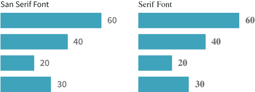
Believe it or not, your mind takes a fraction of a second longer to understand the numbers on the right than it does to understand the numbers on the left. Why? Serif fonts have stylistic variations in their endpoints, widths, curves and shapes that adds more for the eye to take in at any given moment.
不管你信不信,相对于左侧的数字,你需要多花几秒去理解右侧的数字。为什么?因为衬线字体在端点、宽度、弯曲、形状上有各种样式变化,从而在每一刻,都增加了眼睛接收到的信息量。

Since data visualization seeks to speed the process of insight, you want to stay away from anything that slows down the viewer’s understanding, even if by an infinitesimal amount.
因为数据可视化追求的是洞察信息的速度,你应该摒弃任何会迟滞读者理解的东西,即使它只是迟滞了极小的一丁点。
Hierarchy
层级
On the subject of speeding up comprehension, one of the designer’s greatest tools is use of hierarchy. Hierarchy refers to the ways in which we weight and organize information so that the audience can more quickly and easily scan and, more importantly, understand what they’re seeing or reading.
在加快理解方面,设计师的一个强大的工具就是使用层级。层级是一种我们用来权重评估和组织信息的方法,从而使得读者能够更快更方便的浏览信息,更重要的是理解他们所看到的和读到的信息。
Perhaps the most familiar application of hierarchy is the good old-fashioned outline that we all learned in grade school. By breaking the information into titles, headings, supporting information, and details, you create a clear map by which your audience can quickly scan the information, absorb the content, and look for the details they’re interested in.
也许层级最常见的应用,就是在我们上小学时,学习使用的老式的大纲。通过把信息分为标题、副标题、辅助信息、详情,你能构建一个清理的脉络,从而你的读者能够快速浏览这些信息,提取信息,并发现那些感兴趣的细节。
Data visualizations with a clear hierarchy tell the reader how to process the information and in what order, whether from the most important information to the least, or from the big idea to the supporting details. Hierarchy can also give your viewer the freedom to choose where to enter into a given set of information, which is especially useful when presenting large amounts of data.
拥有一个清晰层级的数据可视化,可以告诉读者如何处理信息,按什么顺序,是从最重要到最次要的,或是从大概念到佐证的细节。层级提供读者了解整体信息的一个切入点,尤其是当要呈现大量的数据的时候特别有用。
Fonts can help establish hierarchy through variations in size (11pt vs. 14pt), weight (bold, medium, regular), and emphasis (italics, capitals). Color, when used selectively and consistently, can also help delineate hierarchy by creating emphasis and guiding the viewer’s eye in a way that facilitates understanding. Other common tools include line breaks, bullet points, numbered lists, indentations, etc. The means and methods to establish hierarchy are endless, but remember that the guiding rule is ruthless simplicity in all things. You don’t want the tools you use to establish hierarchy to distract your audience from the data experience you’re trying to create.
字体可以帮助建立层级,通过字号(11磅相对14磅)、字重(粗体、中粗、常规)、强调(斜体、大写)等变化来实现。通过选择性或一致性的颜色,也可以帮助描述层级,通过制造强调和引导读者的视线,从而让信息更容易理解。其他常见的工具包括换行、项目符号、有序列表、缩进等。建立层级的方法是无穷的,但是请记住,指导原则是力求简化所有的东西。相信你肯定不希望在用工具建立层级后,反而让受众从你试图创造的数据体验中分心。
Color
色彩
Conceive in Black and White, Then Add Color
由黑白开始构思,然后添加色彩
To paraphrase the designer Paul Rand, if a design doesn’t make sense in black and white, it will make less sense when color is added. That’s not meant to imply that graphic representations of data should always be black and white. It only means that balance of line and solid, dark and light, layout and structure are the foundation on which any chart or visualization is built and, as such, the design of these elements needs to be able to stand on its own.
套用设计师保罗·兰德的话说,如果一个黑白设计没有意义,即使添加色彩意义也不大。这并不意味着数据的图形展示应该始终采用黑白。这只是说,平衡纤细与厚重、昏暗与明亮、布局与结构,是构建图表或可视化时的基石,如此,设计中的这些要素就能够支撑它们自己。
The assumption is that you are making visualizations because you want to provide clarity, insight, and context. Color is a tool, but it should never be the starting point. Instead, conceive and plan your charts and visualizations in black and white whenever possible. Then, apply color conservatively with the primary objective of highlighting and enhancing comprehension. Here are three basic tips to keep in mind when assessing how to use color in graphic representations of data.
我们假定,创造可视化是因为你想要提供清晰、有见解的背景。色彩是一个工具,但是绝不应该成为起点。相反的,尽可能的从黑白开始构建和规划你的图表和可视化。然后,审慎地采用色彩,把突出和强调含义作为首要目标。在数据图形呈现上,请记住评估如何使用色彩的三个小窍门。
Don’t Forget Gray
不要忘记灰色
Gray is one of the most important colors in your palette because it offsets the colors around it. In the world of information design, it is critical for modifying, clarifying and balancing almost any color palette, and taming the overall graphic comprehension of charts.
灰色是你调色板中最重要的颜色之一,因为它能调和周围其他的色彩。在信息设计的世界里,调整、明晰和平衡调色板中的颜色是非常重要的,依从图表整体的图形理解。

Colors Can Be Used to Express Value
色彩能够用于表达数值
Don’t forget that color can be used as a more conceptual axis to designate value. That said, when using colors to represent a scale, or gradations of value of any sort, look at what you’ve created with all the color/saturation removed. This helps guarantee that the various tints you are using appear as truly different values to the eye.
不要忘记色彩能够用做另一种概念维度来指明数值。就是说,当使用色彩来象征一个度量,或者任何数值的刻度,仔细观察当去除所有饱和度后的你的设计。这可以帮助确保你使用的多种色彩,在人眼中能够真正的用于区分不同的数值。

The Role of White Space in Reading Color
阅读色彩中空白空间的角色
If you were painting, you could merge colors in one seamless quilt. But in information design, every color you use must have a reason for being there and should be distinct. If you are creating a chart in which a very slow gradation or change from one color to another has meaning — as it might if representing climate data, election turnouts, or other continuous variables — then the changing and merging of colors is central to interpreting the data. However, in many cases, colors need to be distinct since they will represent a unique value or attribute, and to help the viewer’s eye read them as distinct and clear, the colors need room to breathe. That’s what white space can do for you.
如果你在绘画,你能够恰到好处的融合色彩。但是在信息设计中,你使用的每个色彩都必须有存在的理由,而且应该清晰区分。如果你在创建一个图表,用缓慢渐变或者有意义的颜色变化 - 它可能用来表现气候数据、选举人数或者其他连续变量 - 那么色彩的变化和融合对于解释数据就极为重要。但是,大多数场景下,色彩应该是完全不同的,因为它们代表一个独立的数值或者属性,从而帮助观看者通过人眼清晰并显著的读到,色彩就需要呼吸的空间。这正是空白空间能够为你做的。

Icons
图标
A Short History
简史
The first graphical user interface (GUI) was introduced by Xerox in 1981 in the Star workstation, also called the 8010 Information System, but the ideas that inspired it were first explored by one of its chief designers, David Canfield Smith, in his 1975 PhD dissertation titled, Pygmalion: A Creative Programming Environment. A couple years later, Steve Jobs famously “borrowed” the idea from Smith and Xerox for the Macintosh. Only a few decades later, two thirds of the seven billion people on Earth use mobile phones that are largely driven by graphic, icon-based interfaces.
第一个图形用户界面(GUI),由施乐于1981年在Star工作站中引入,也叫做8010信息系统,不过灵感来源于系统首席设计师之一,大卫·坎菲尔·史密斯,在他1975年题为“皮格马利翁:一个创新的编程环境”的博士论文中。若干年后,史蒂夫·乔布斯从史密斯和施乐那儿,知名的“借来”了这个创意,创造了Mac计算机。仅仅几十年后,地球上70亿人中,三分之二都使用着主要是通过基于图形、图标的接口驱动的移动电话。
Yet, simply drawn, easy-to-remember pictograms have been used since Neolithic times to represent information that was too complex to explain in a small amount of space. Within the practice of data visualization itself, iconography has been used as far back as the early 15th century, borrowing from other disciplines that sought precision and accuracy in drawings like architecture, military planning, cartography, alchemy, and astronomy.
然而,自新石器时代开始,简单画出的、易于记忆的象形图,就被用于在狭小空间记录复杂信息。在数据可视化实践中,早在15世纪初,图示法就已经开始被使用,借用自其他追求精度和准确度的学科,如建筑、军事规划、制图、炼丹术和天文学。
Use Skepticism & Lean Toward the Literal
保持怀疑、倾向字面化
The use of icons is now so widespread and commonplace that they are often added without much thought. People feel they should “just be there” in order for an app to feel like an app or a website to feel user-friendly. As a result, we often see them without ever wondering why they were put there in the first place.
现如今图标已经被广泛、不假思索的普遍使用。大家感觉它们应该“就在那里”,从而让一个应用感觉像一个应用,或者网站感觉像是用户友好的。因此,我们经常看到它们,从来不首先质疑它们为什么被放在那里。
Even so, when creating data visualizations, you should regard the use of icons with caution. If you can make something clear in a small space without using an icon, don’t use one. Why? Because icons can make things more obscure, not less. As soon as anyone asks, “What does this icon mean?”, you’ve lost the battle for simplicity. This is true for icons that are used as metaphorical identifiers in infographics or data visualizations, as well as for functional icons that perform a task or reveal more information within the context of an interactive graph or infographic.
即便如此,在创建数据可视化的时候,你也应该谨慎地使用图标。在一个狭小的空间,如果你不使用图标就能让事物很清晰,就不要使用。为什么呢?因为图标会更加晦涩难懂,而不是清晰易懂。当有人问,“这个图标是什么意思?” ,你已经丧失了简单。事实的真相是,在信息图或数据可视化中,图标用作隐喻标识,如同在交互图或信息图的背景下,功能性图标用于执行任务或提示更多信息。
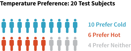
It would be very hard to misunderstand what the icons are meant to represent here: one person-shaped icon equals one person. This is a very literal representation, and that is why it is so easily understood. In fact, the more literal and simple an icon is, the better it is. It is a very similar issue to the one faced when selecting fonts: if the viewers spend too much time acclimating to an elaborate presentation, they will often miss the full value and substance of what is actually being presented. Here is another version of the same information:
很难误解这些图标用于表示什么:一个人形状的图标等于一个人。这是一个非常字面化的表述,这就是为什么它是如此容易理解。事实上,越是字面化的简单图标,图标就越好。和选择字体一样,这是一个非常相似的问题:如果观众花太多时间来理解一个精心制作的展示,他们往往会错过信息背后的真正价值和实质。这是相同信息的另一个版本:
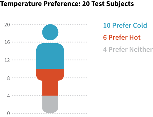
The exact same data is being conveyed here, but it takes the viewer slightly longer to understand it. Why? Before the viewer can correctly interpret the data, they have to create a complex metaphor in their head. First, they’re being asked to imagine that this icon represents all twenty test subjects, but they’re then also being asked to divide that metaphorical person by another set of criteria. As simple as they may seem, icons are still asking the mind to pretend they represent something else. The more you ask symbols to represent, the less literal and less clear they become. When it comes to using symbols and icons of any sort, stick to one simple meaning each.
使用的是完全相同的数据,但它需要观察者更久去理解它。为什么?在观众可以正确地解释这些数据前,他们必须在脑海中创建一个复杂的隐喻。首先,他们要去想象,这个图标代表所有20个测试对象,随后他们需要用另外一套标准去拆分这个人形隐喻。就像看到的这么简单,图标还代表其他含义,需要读者自行理解。符号表达的越多,符号就越不字面化越不清晰明了。当涉及到使用任何形式的符号和图标时,坚持每一个仅表达一个简单的含义。
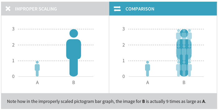
You should also make sure that if you use icons in graphs, you properly handle their sizing. A common mistake is to scale both dimensions of an icon, which leads to an incorrect visual comparison. In the image below, the height of the person figure has been tripled to indicate that Group B is three times the value of Group A. However, in order to keep the ratio of the image, the width has also been tripled. This results in the larger figure actually being nine times the size of the smaller one rather than just three.
你还应该确保,在图形中使用图标,要妥善处理好大小。一个常见的错误是同时缩放图标的两个维度,从而导致不正确的视觉对比。在下面的图像中,人像的高度已增加到三倍,用于表明B组是A组的三倍。但是,为了保持图像的比率,宽度也增加到三倍。这导致了较大的图实际上是较小的图的九倍,而不止是三倍。
Stay Cognizant of Future Needs
洞悉未来的需要
It is not uncommon for new traders to join an investment bank and have someone walk them through the company’s software on the trading floor, with the assurance: “Don’t worry, you’ll understand what all the icons mean after you’ve been here a few weeks.” A mass proliferation of icons across an interface or data visualization often indicates that options have been added after the overall planning, design and (in the circumstances of interactive data visualization) development has taken place.
这个情景并不罕见,新交易员加盟一家投资银行,有人带他们去交易大厅参观公司的软件,保证说:“别担心,几个星期后,你会明白所有的图标的意思“。不断增长的界面图标或数据可视化产品通常表明了,超越整体规划、设计和开发(交互式数据可视化的情况下)的选项增加已经发生了。
Here is a simplified example of the sort of icon-based fold-out palette one frequently finds in financial analysis dashboards that have gone through several versions in which capabilities have been added over time:
下面是一个简化的基于图标的折叠式面板例子,常用于财务分析仪表盘,经过几个版本,其中的功能就不断被添加。
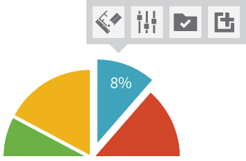
One of the greatest challenges in the graphical representation of data is how to ruthlessly simplify even while the complexity of choice for the viewer or user increases. As in the example above, sometimes icons are used to solve this problem; but as you can see, this can create another problem—confusion.
数据图形化展示的一个最大挑战是,如何力求简化,甚至在为用户提供更多复杂选项的情况下。如上述,有时图标被用来解决这个问题的;但正如你所看到的,这可能会制造另一个问题--混淆。
The best way to avoid this is take time during the initial conceptual work on any given data visualization to assess what the extreme requirements might be in future iterations. Ask yourself what options or views might be added in the future? Or, in the circumstance of complex interactive data views, what possible functionality might be introduced that would change the nature of the overall visualization?
要避免这种情况,最好的办法是在初期工作时,多花些时间评估未来哪些极端需求会被提出。问问你自己,有什么选项或意见可能会在将来被添加?或者,在复杂的交互式数据视图的中,有什么功能可能会被引入从而改变整个可视化本质?
These are just a few of the core guidelines for using icons in infographics or complex data visualizations.
这些都只是在信息图或复杂的数据可视化中使用图标的几个核心准则。